DITTO Daily

A cycle supplement brand defining a new standard in menstrual health.

Multiple capsules containing small brown beads inside, scattered against a white background.

The challenge

DITTO Daily are in an experimental phase for their performance marketing campaigns, and were keen to try fresh ideas which push their visual communications while still staying true to their brand ethos and values, as a health and wellness brand on a mission to set a standard in how we understand and manage our menstrual cycles.

The solution

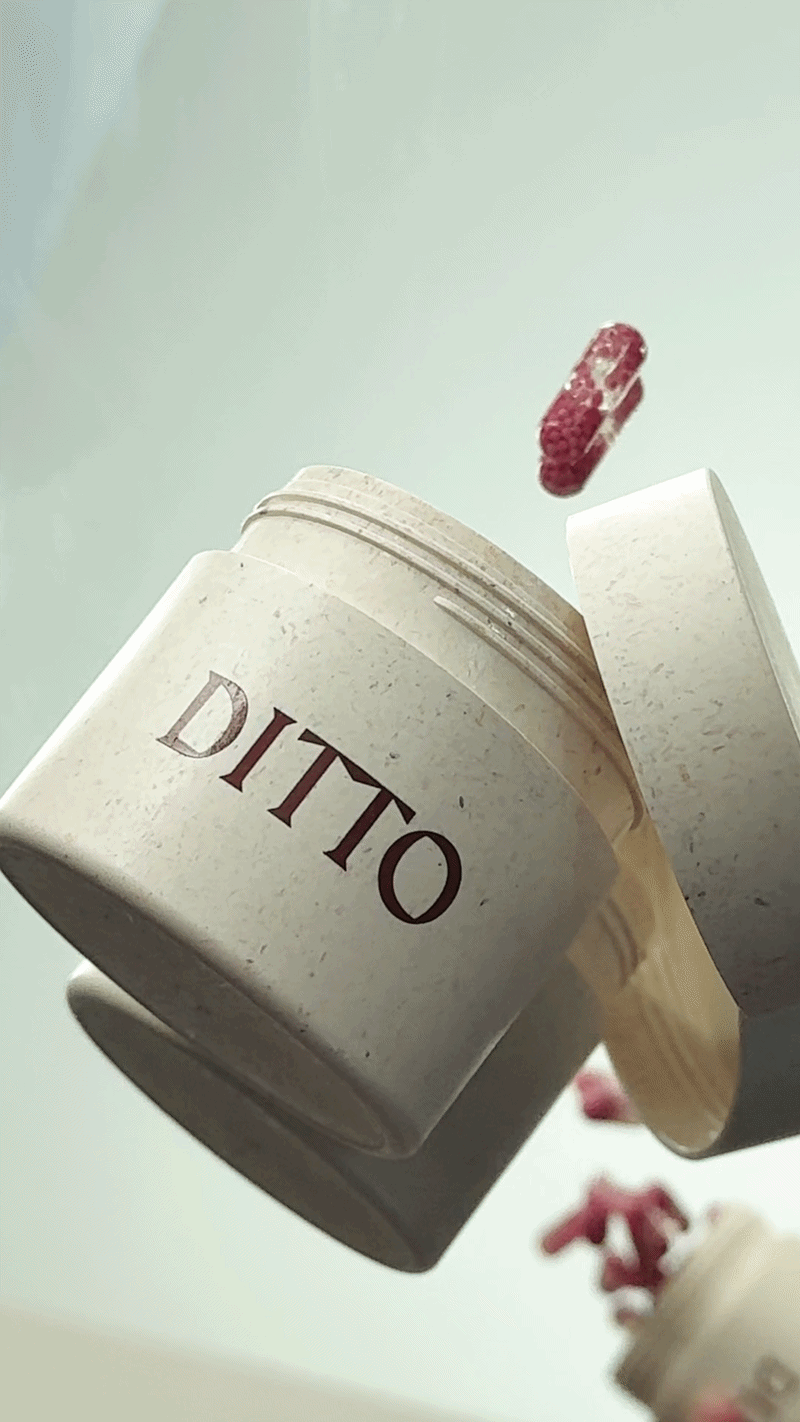
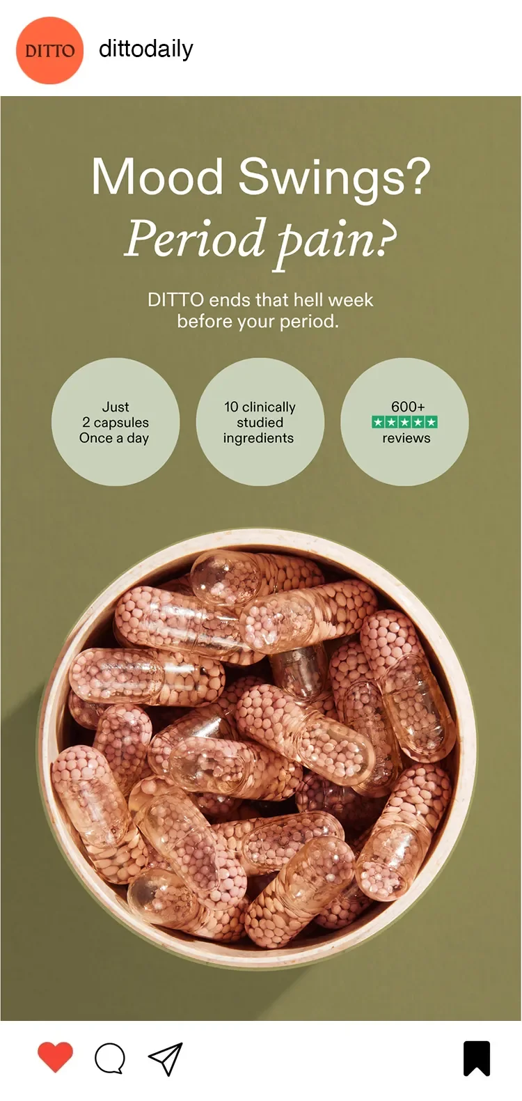
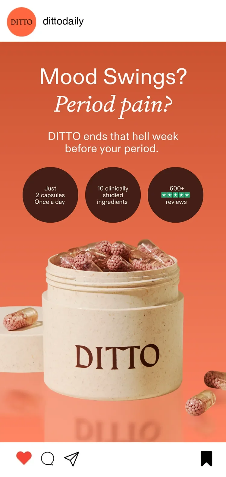
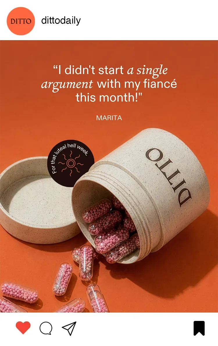
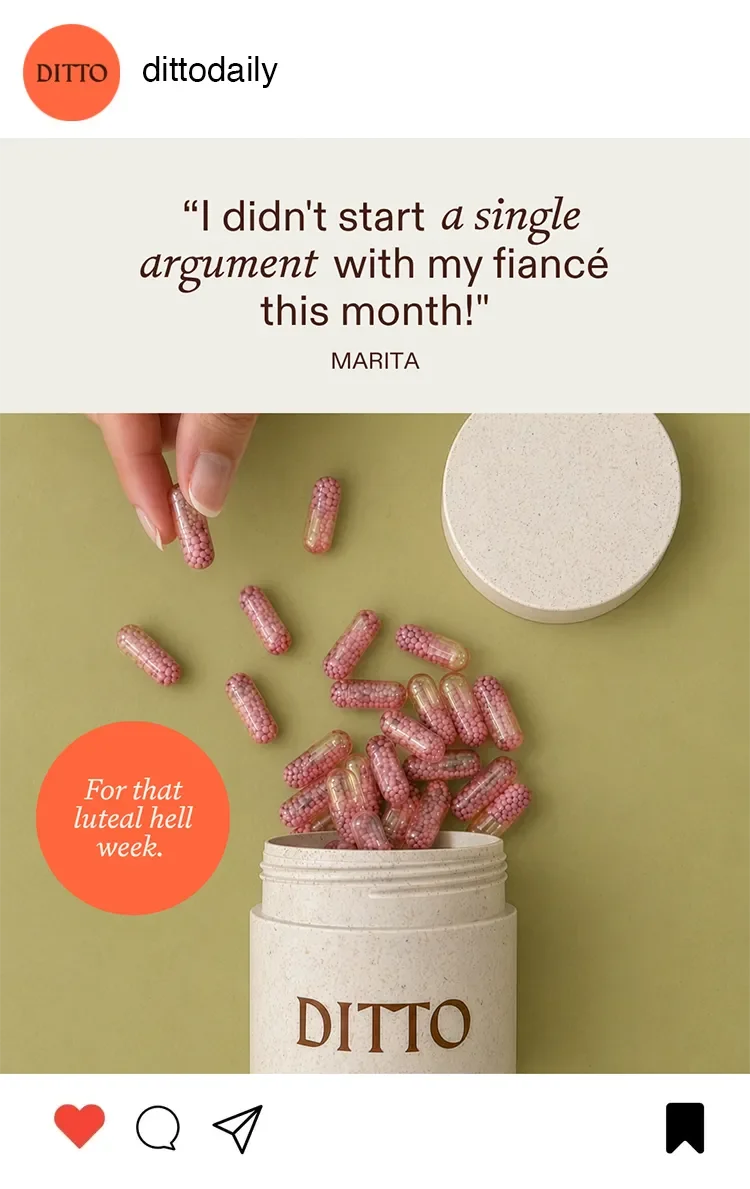
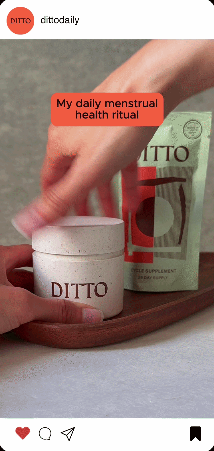
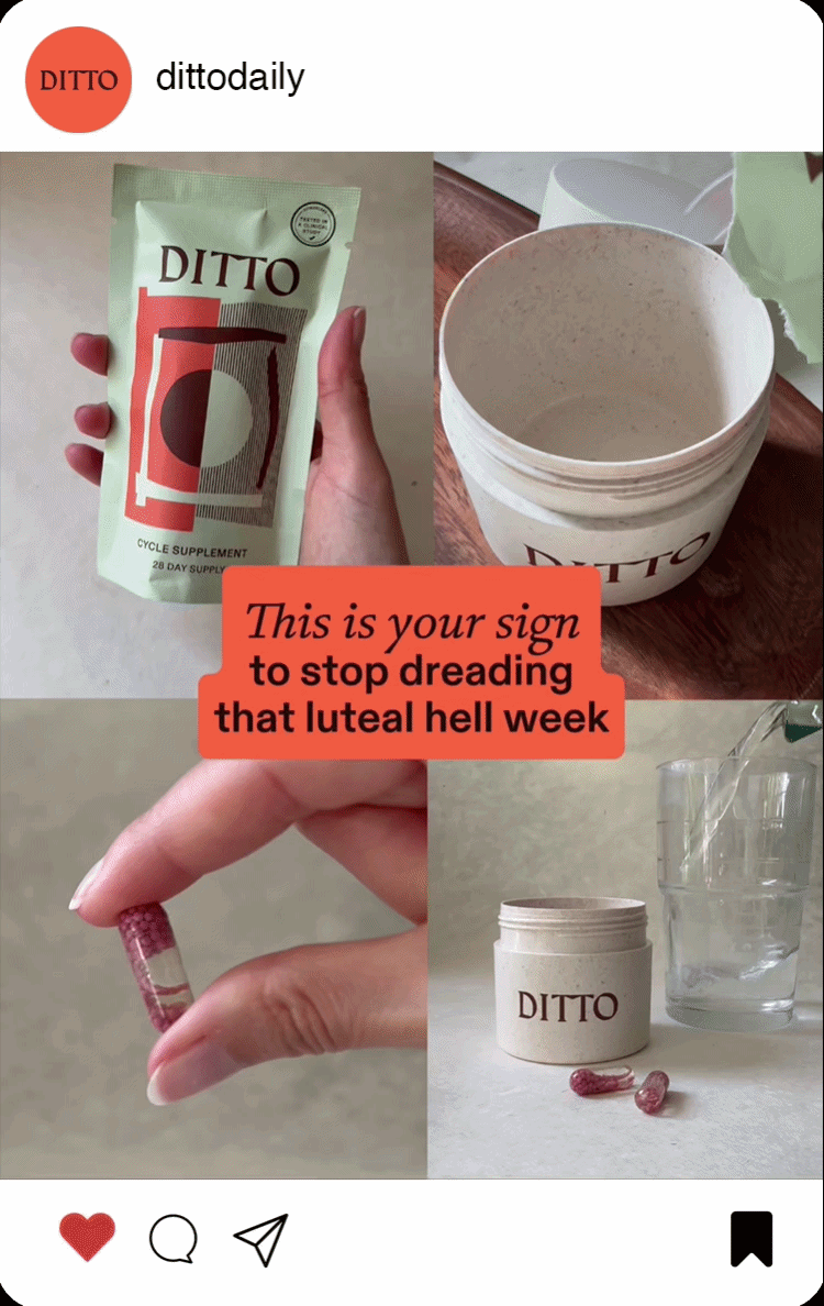
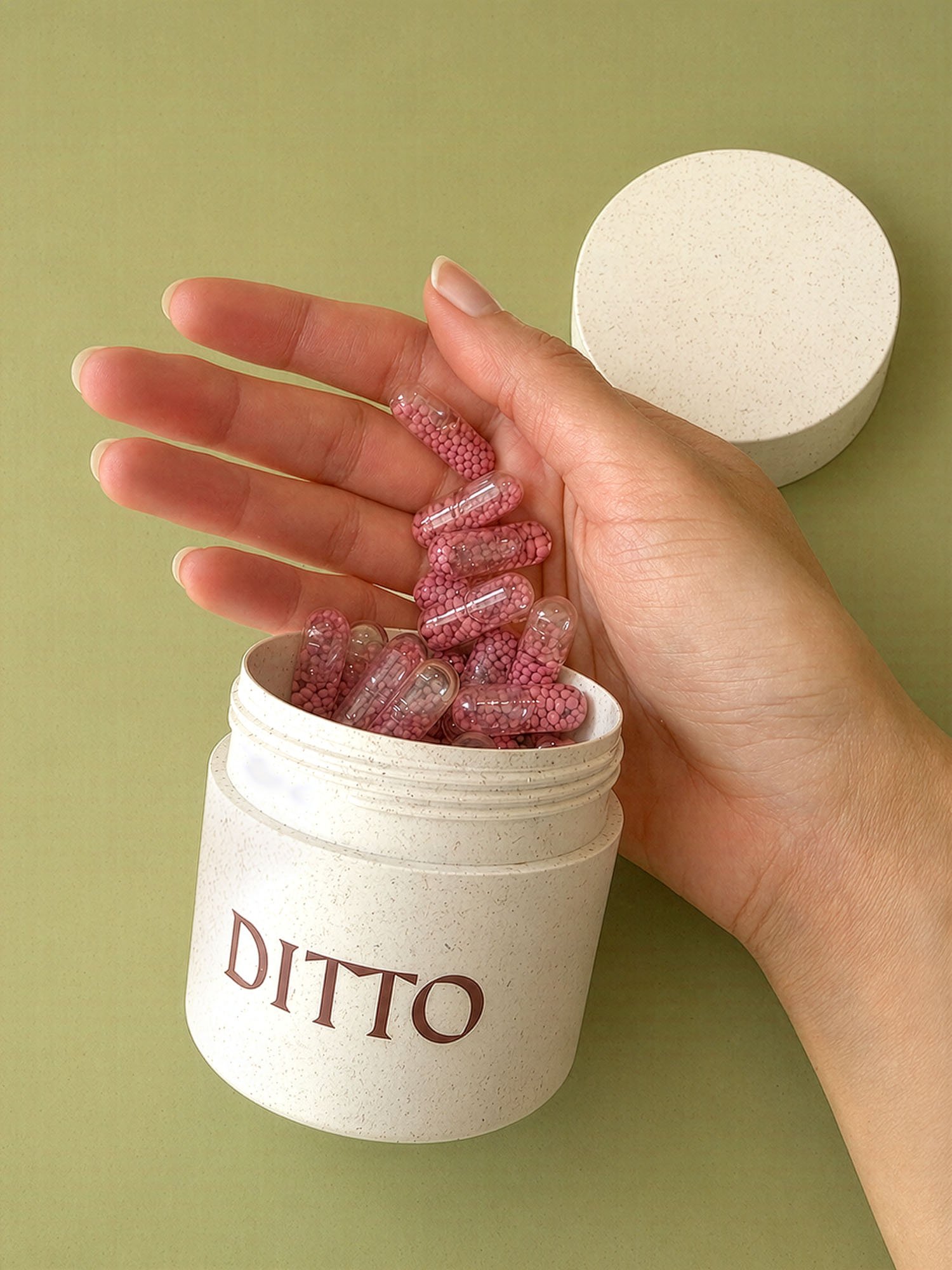
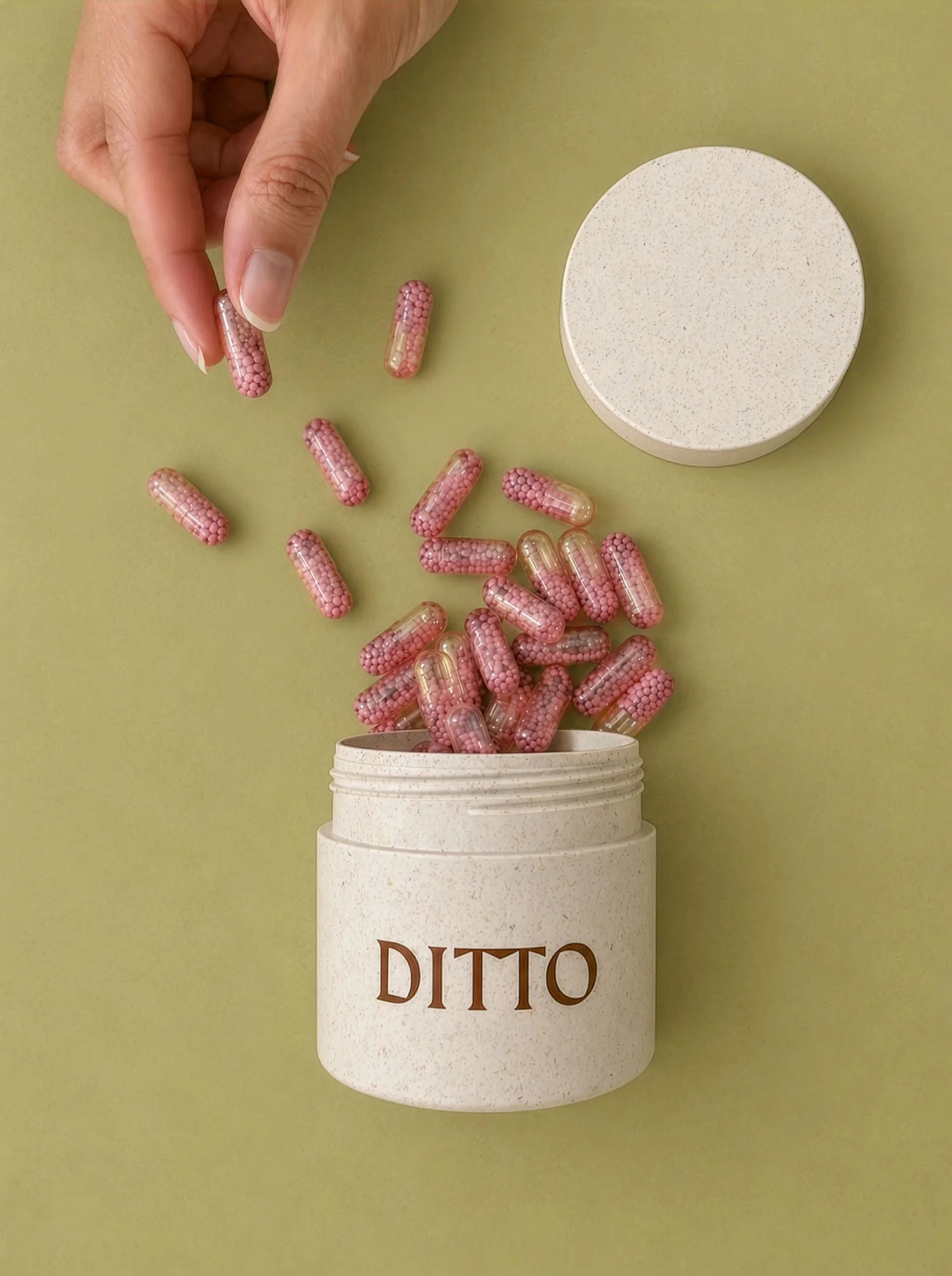
Working with the team, I began with image and video content creation making bold use of the brand’s colour palette, which set the tone for playful and engaging performance ad design, channelling viral ideas such as ‘This is your sign’ or ASMR-led styling.

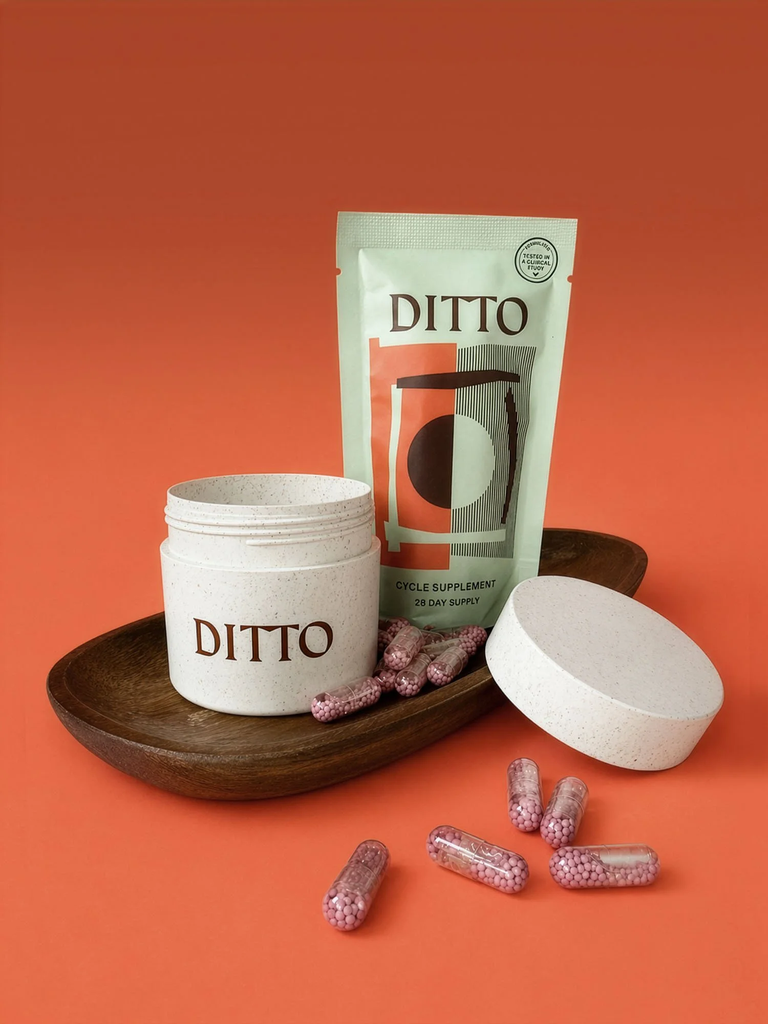
*Hero image supplied by the brand

Scope

Art direction, Artworking, Content creation, Lifestyle photography, Performance marketing design, Product photography, Social media design

A white speckled pill bottle lying on its side with a few pink and white caplet pills spilled out onto an orange surface.
A partially opened white package with black text and graphic design, labeled 'DITTO' and 'Cycle Supplement' on a red background, with several pink and purple capsules spilled out.
A package of Ditto cycle supplement standing on a wooden tray surrounded by open white containers and scattered pink and white capsules on an orange background.

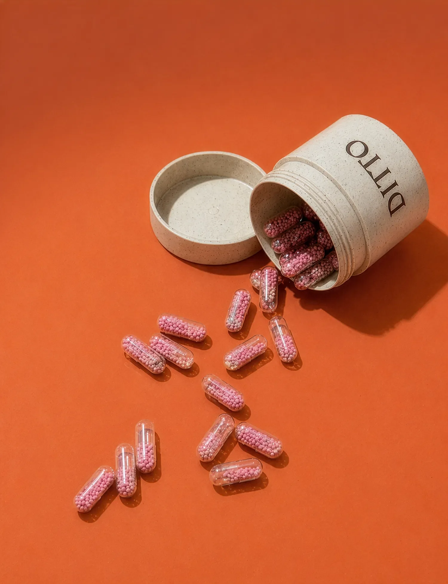
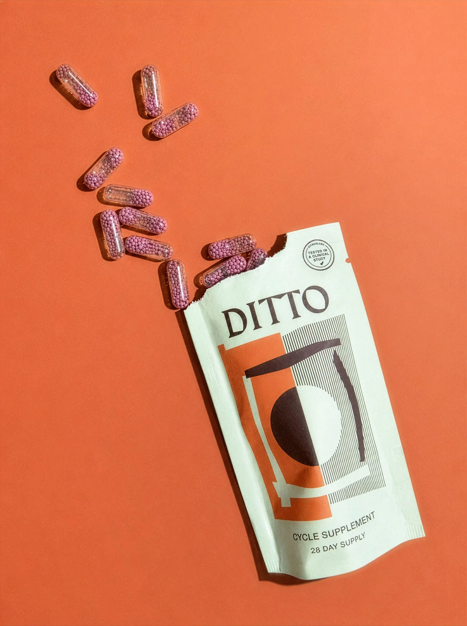
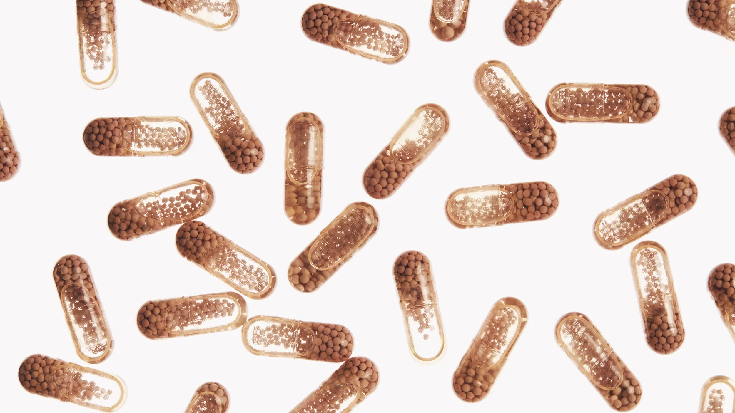
Biotechnology: DITTO Daily’s capsules are engineered “with an advanced technology to maximise absorption.”

A pill bottle labeled 'DITTO' with capsules spilling out.
A container filled with capsules containing tiny beads, used as dietary supplements.
A promotional image for DITTO, showing a pill container filled with pink, berry-shaped capsules. The background is orange, and text highlights the product's benefits for mood swings and period pain, along with key features like clinical studies, reviews, and dosage instructions.
A white pill bottle labeled "DITTO" is tipped over with pink capsules spilling out onto an orange surface. The background has a quote, "I didn't start a single argument with my fiancé this month!" attributed to Marita, and a black sticker that says, "For that luleal hell week" with a sun icon.
A white container labeled 'DITTO' with pink capsules spilling out, set against a light green background with a quote about avoiding arguments, and an orange circle with a phrase about tough weeks.
A person holding a white container labeled 'DITTO' with a pouch of 'DITTO' cycle supplement behind it, emphasizing a daily menstrual health ritual.
Collage of four photos with a red text overlay reading, "This is your sign to stop dreading that luteal hell week." Top left: a hand holding a green packet of Ditto cycle supplement. Top right: an open white container of Ditto supplement powder. Bottom left: a hand holding a small pink capsule. Bottom right: a white Ditto container with two capsules beside it and glass of water in the background.
A person's hand with gel capsules on fingers, and a container with similar capsules, next to a white jar with the word partially visible on the label, set against a green background.
A hand dropping pink capsule-shaped pills into a container labeled 'DITO' with a matching lid nearby, on a green background.

Design takeaways

  • Bridging design and content creation. Content creation is a relatively new skillset designers need in their arsenal, involving leading the ideation, art direction, shooting and editing of product-based content. This is a skillset I am increasingly working into my offering, and enjoy taking on for the experimental creative thinking required, helping brands combat visual fatigue caused by existing asset libraries.

  • Designing under a time crunch. With projects like social ad design, I am often only booked for a day or two, making efficient and seamless asset delivery even more important. Being able to adapt to a brand’s guidelines and turn around content quickly is something I am especially proud of.

Let’s work together

If you have a similar project you’d love a new design perspective on, get in touch with me at hello@chromakane.com – I look forward to finding out about your brand’s story.