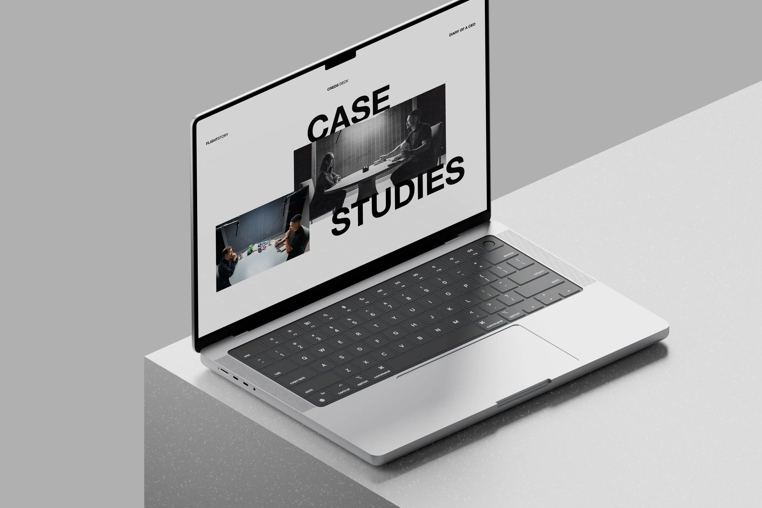
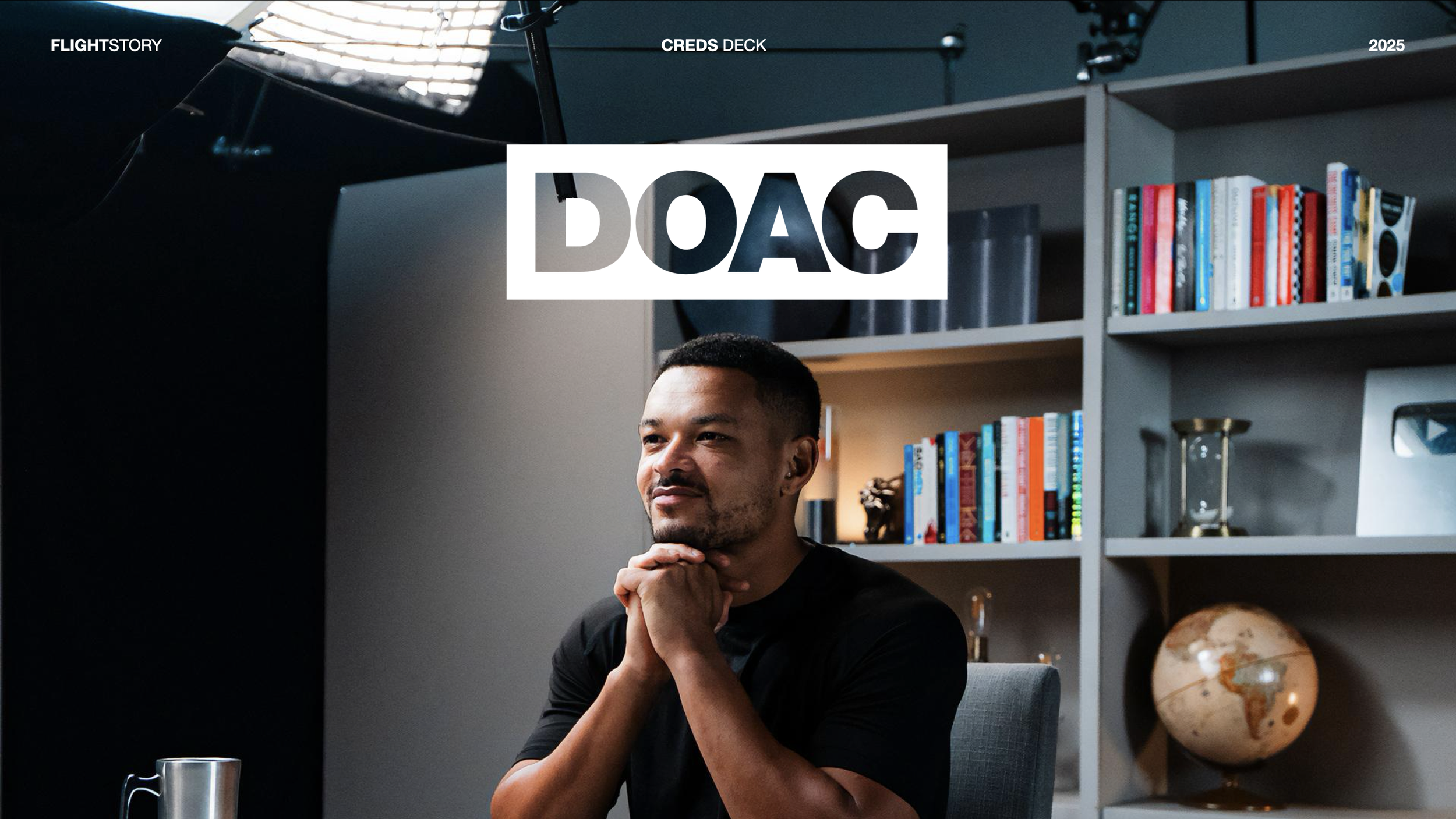
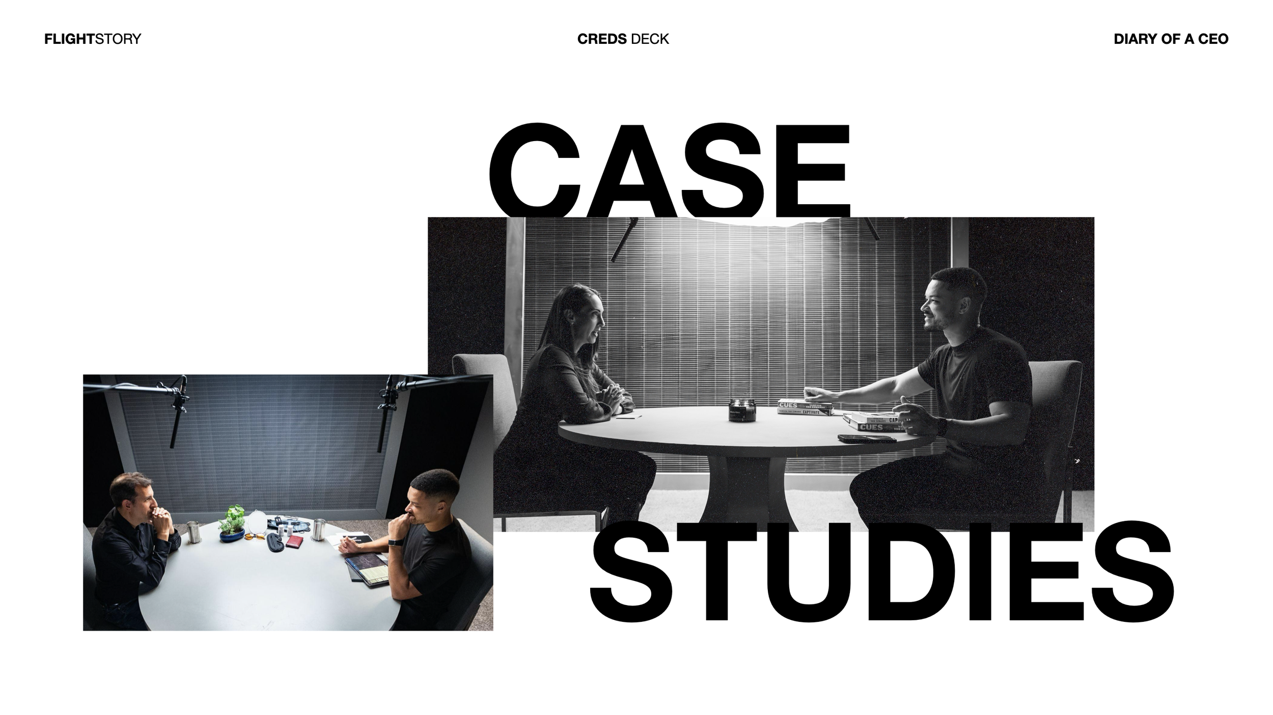
Flight Story
A podcast growth platform creating global media for a healthier and whole human experience.
The challenge
An innovative company growing at a rapid pace, needing to align branded marketing assets with their future vision.
The solution
Contracted by award-winning video production agency Sunday Treat, I was brought in to help refresh some of Flight Story’s Diary of a CEO presentation assets, based on existing templates and brand guidelines.
Scope
Editorial design, Infographics, Presentation design, Templating

Design takeaways
A bold design language helps capture attention quickly. Investors often review dozens of decks. Bold visuals, strong typography, and clear layouts help a presentation stand out immediately. This does not mean adding unnecessary effects or clutter. Bold design means: clear visual direction, confident use of space, strong headlines, memorable visuals, and focused messaging.
Working within the parameters of an existing style guide. In this case, the brand had an existing style guide with key templates to follow. Working within an existing style guide may appear restrictive at first, but those constraints often lead to stronger and more strategic design decisions: instead of starting from zero, I was able to learn how to communicate creatively within a defined system, and focus my attention on making sure key ideas and messages on each slide were delivered with impact and clarity.
Let’s work together
If you have a similar project you’d love a new design perspective on, get in touch with me at hello@chromakane.com – I look forward to finding out about your brand’s story.