Heights
A forward-thinking wellness supplement brand dedicated to simple, effective nutrition that supports your everyday health.
The challenge
I was brought on as a freelance graphic designer, to help the Heights team create paid social assets in multiple dimensions and styles – helping to inject creative variety across the board and consider fresh angles for using assets from existing libraries.
The solution
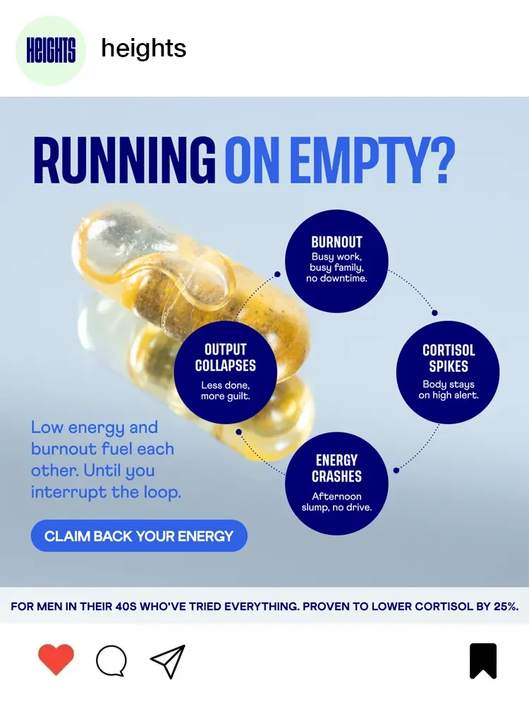
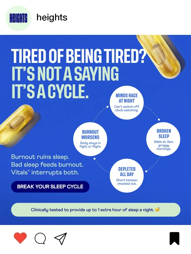
Over a four day period, I delivered over 200 individual and usable static performance marketing assets, incorporating the brand’s style guide elements and quickly adapting to the challenges of the brief. As part of the project, I used GenAI for image creation, particularly in helping portray specific target demographics.
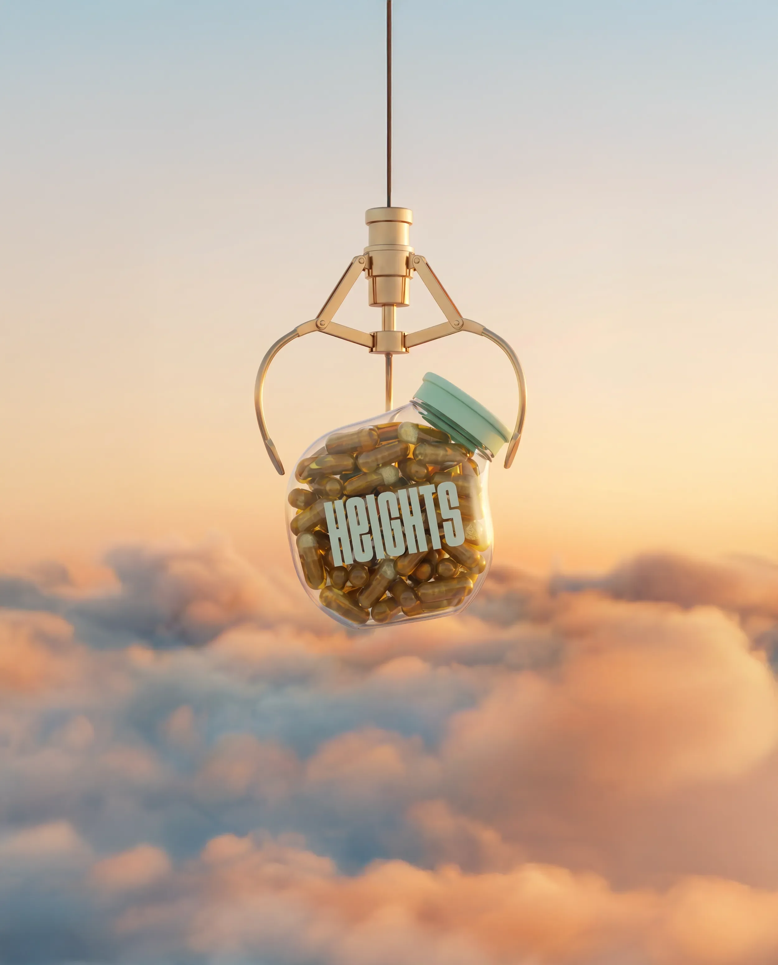
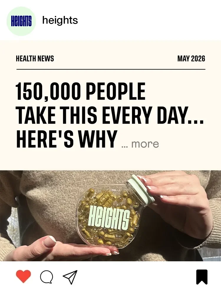
*Hero images supplied by the brand
Scope
Art direction, Artworking, Content creation, Performance marketing design, Social media design
200k+
Meta accounts reached for the highest performing ad creatives in this set.
Design takeaways
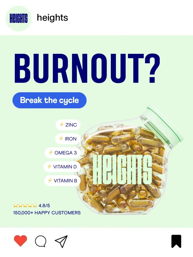
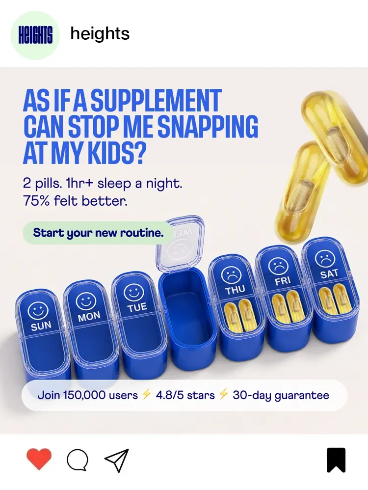
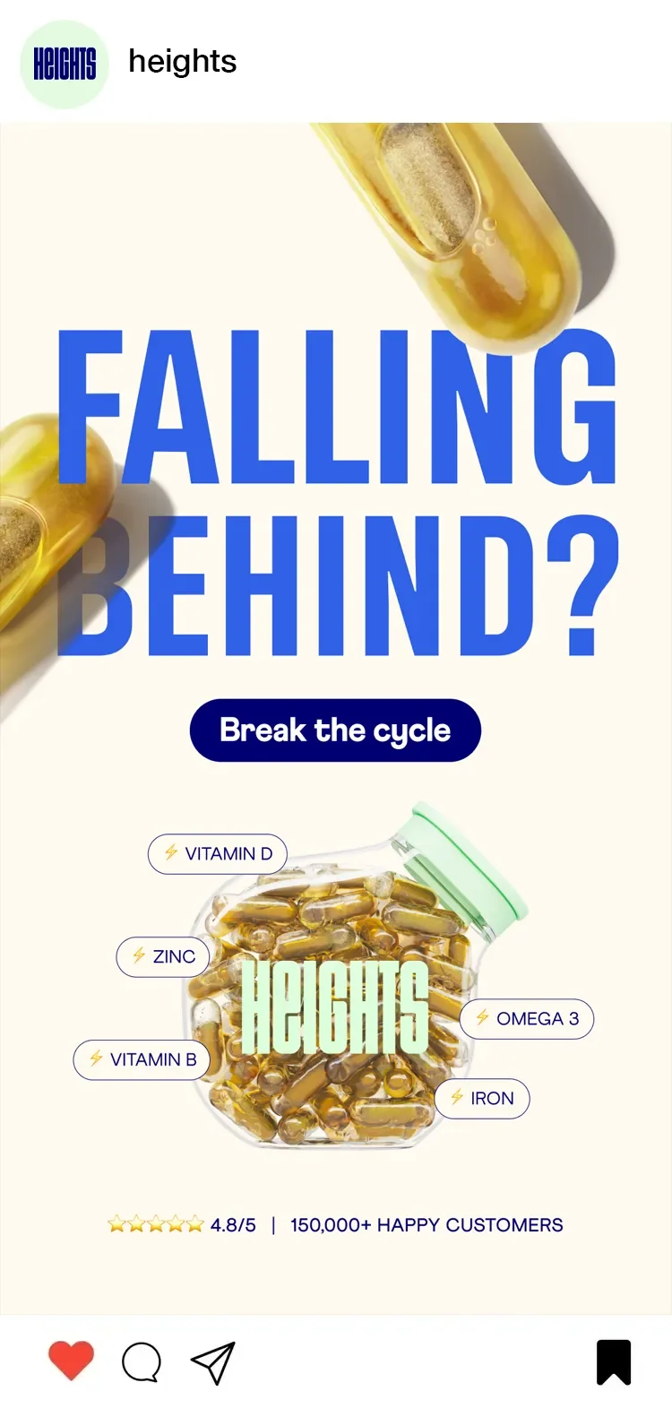
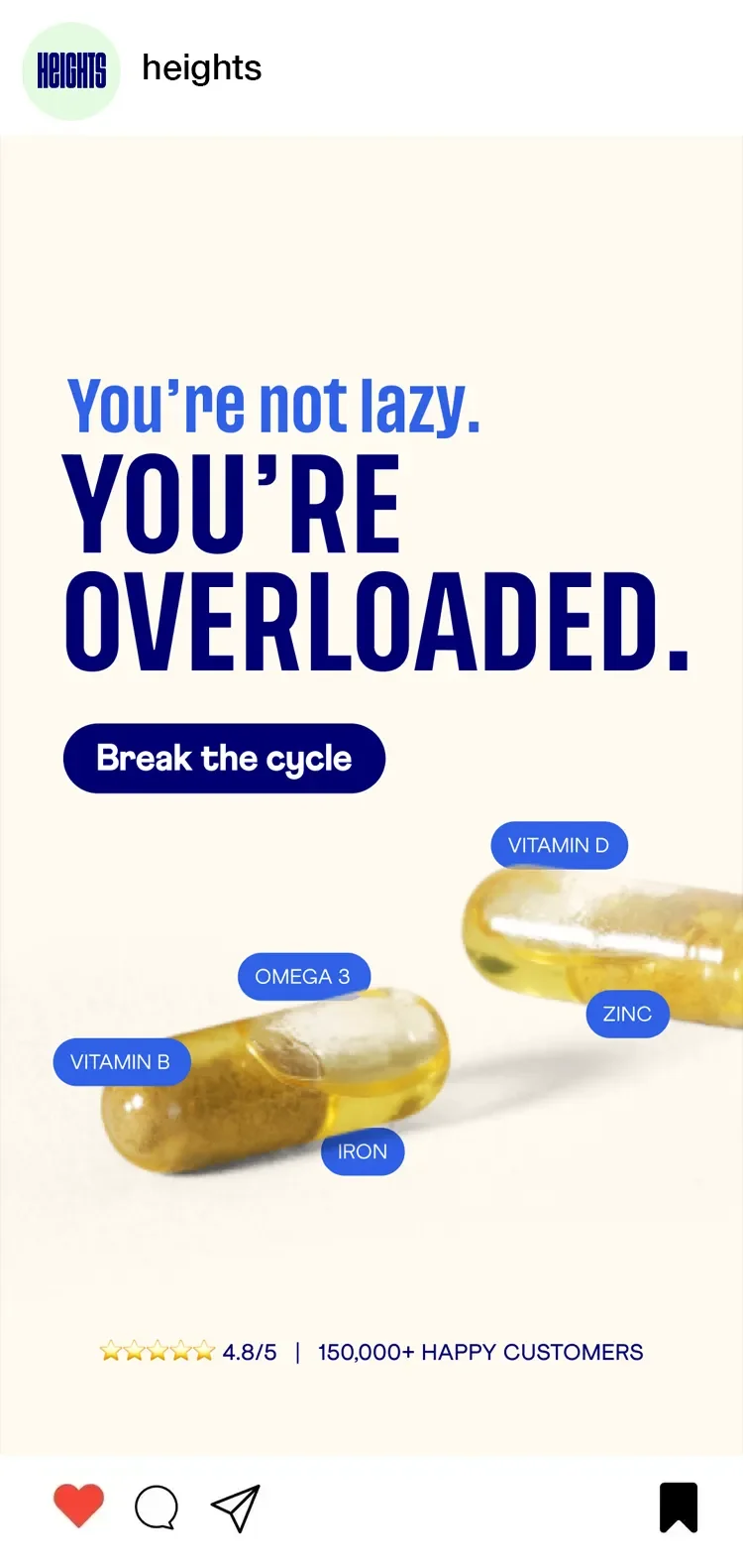
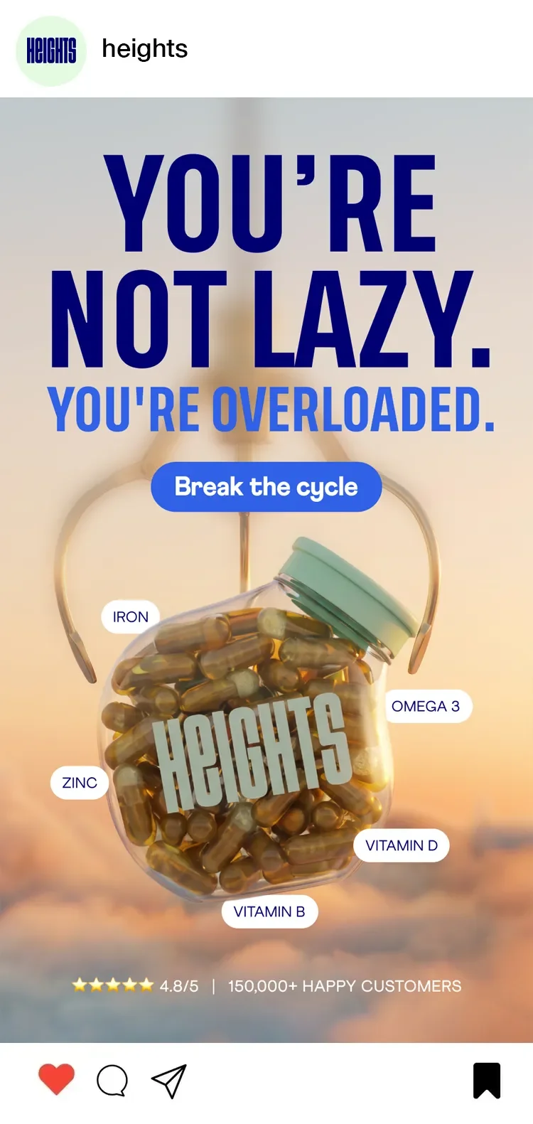
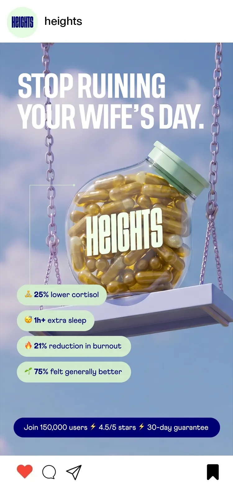
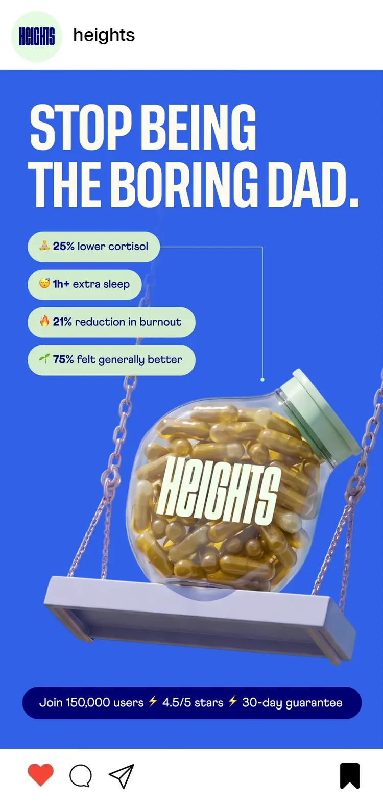
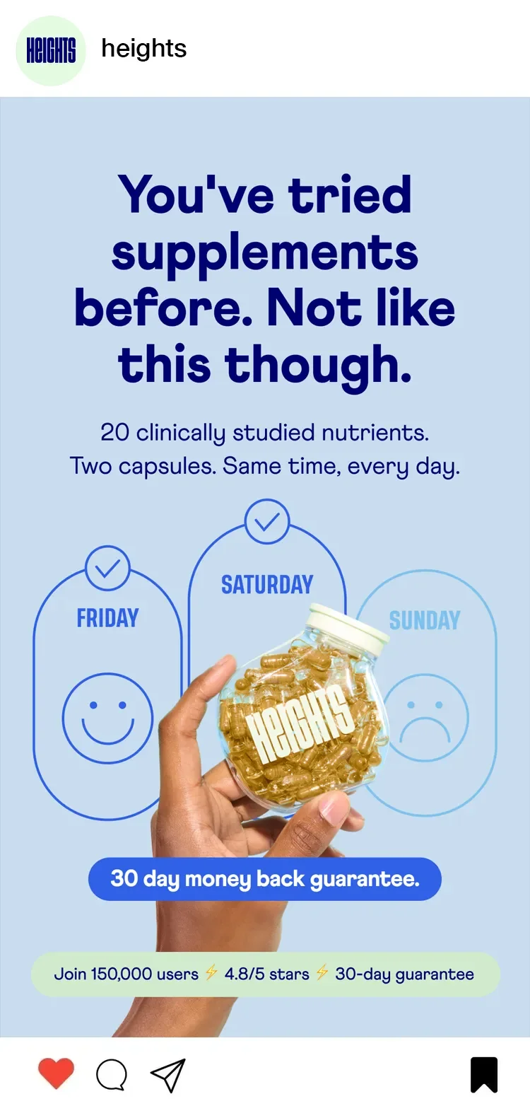
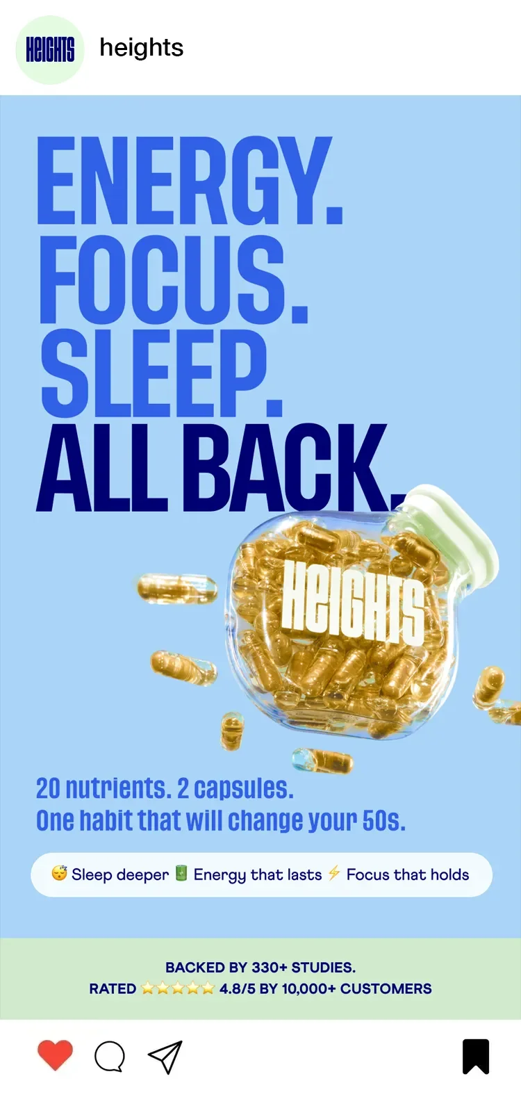
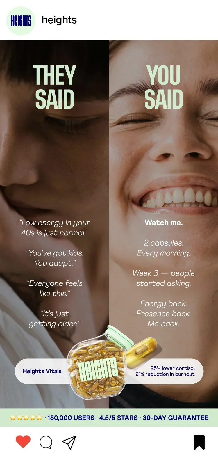
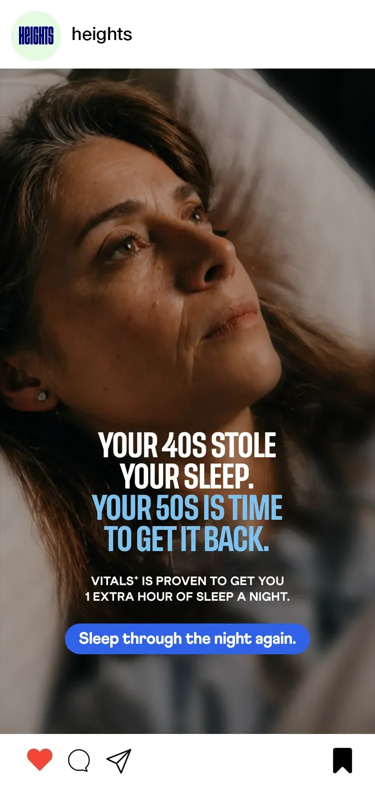
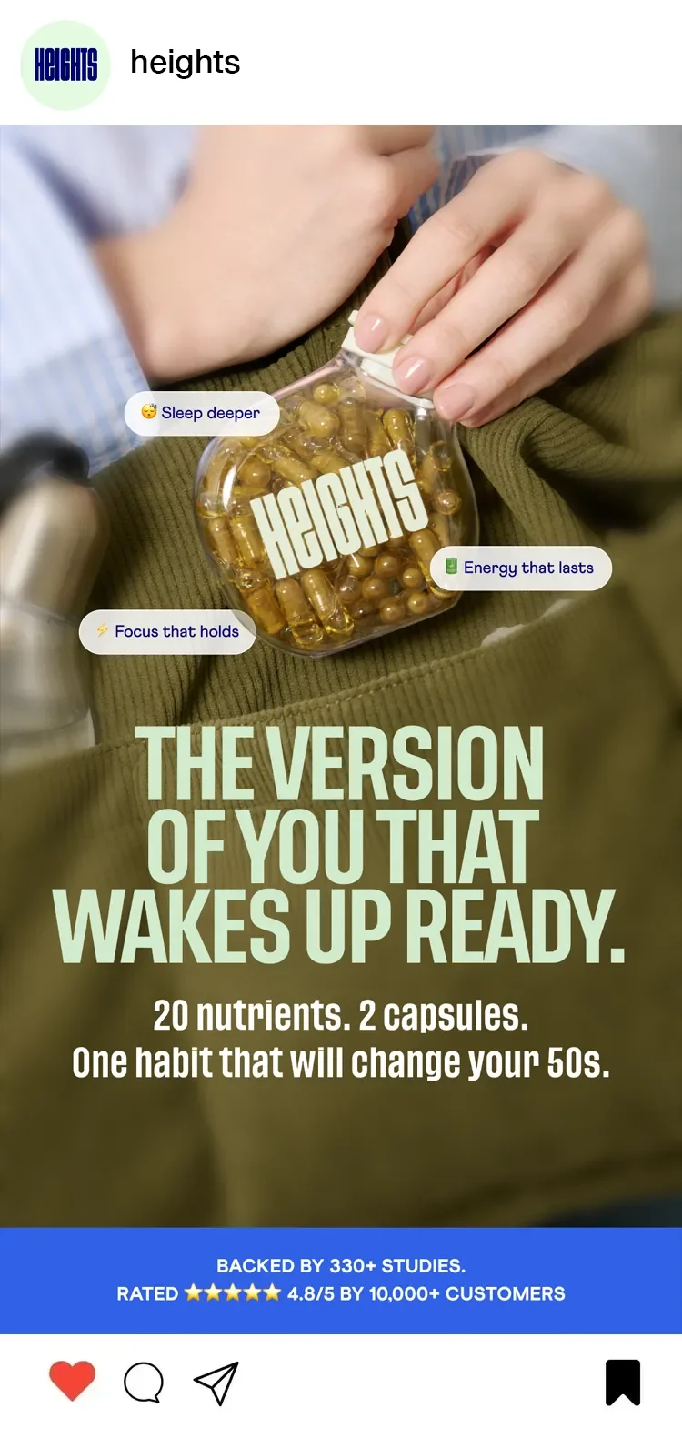
The importance of bold typographic layouts. Large hooks give people something to sink their teeth into. The chunky sans serif typefaces in Heights’ identity create impact at a glance, making it easy to create hierarchy in visuals which should be quick to catch the audience’s attention.
The value of native ads versus polished ones. Ads should feel native to wellness and creator culture as well as polished campaigns, while still maintaining brand consistency – a balance needs to be struck.
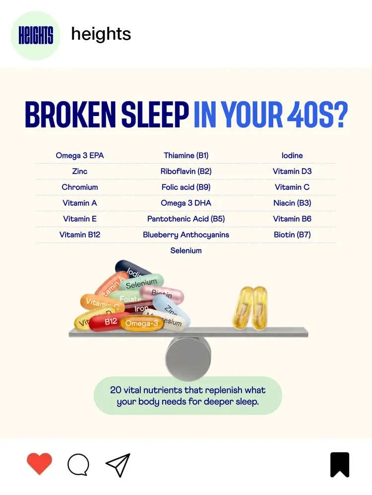
Less is more, more or less. Avoid overcrowding ads with claims or ingredient callouts, by simplifying messaging into one clear emotional or functional takeaway per creative.
Let’s work together
If you have a similar project you’d love a new design perspective on, get in touch with me at hello@chromakane.com – I look forward to finding out about your brand’s story.