Heta Architects

An architectural practice working on commercial design projects across Asia and Europe, with a focus on sustainability and innovation.
The challenge

Heta were looking to achieve consistency across their marketing assets, as well as a level of graphic design quality to match their achievements as a forward-thinking architectural firm.

The solution

I’ve worked with Heta on conceptualising key report and stage document templates, as well as a first phase of social media templates. I was also involved in creating illustrations and infographics for several bid projects, all on a freelance basis.

Scope

Creative direction, Editorial design, Social media design, Templating

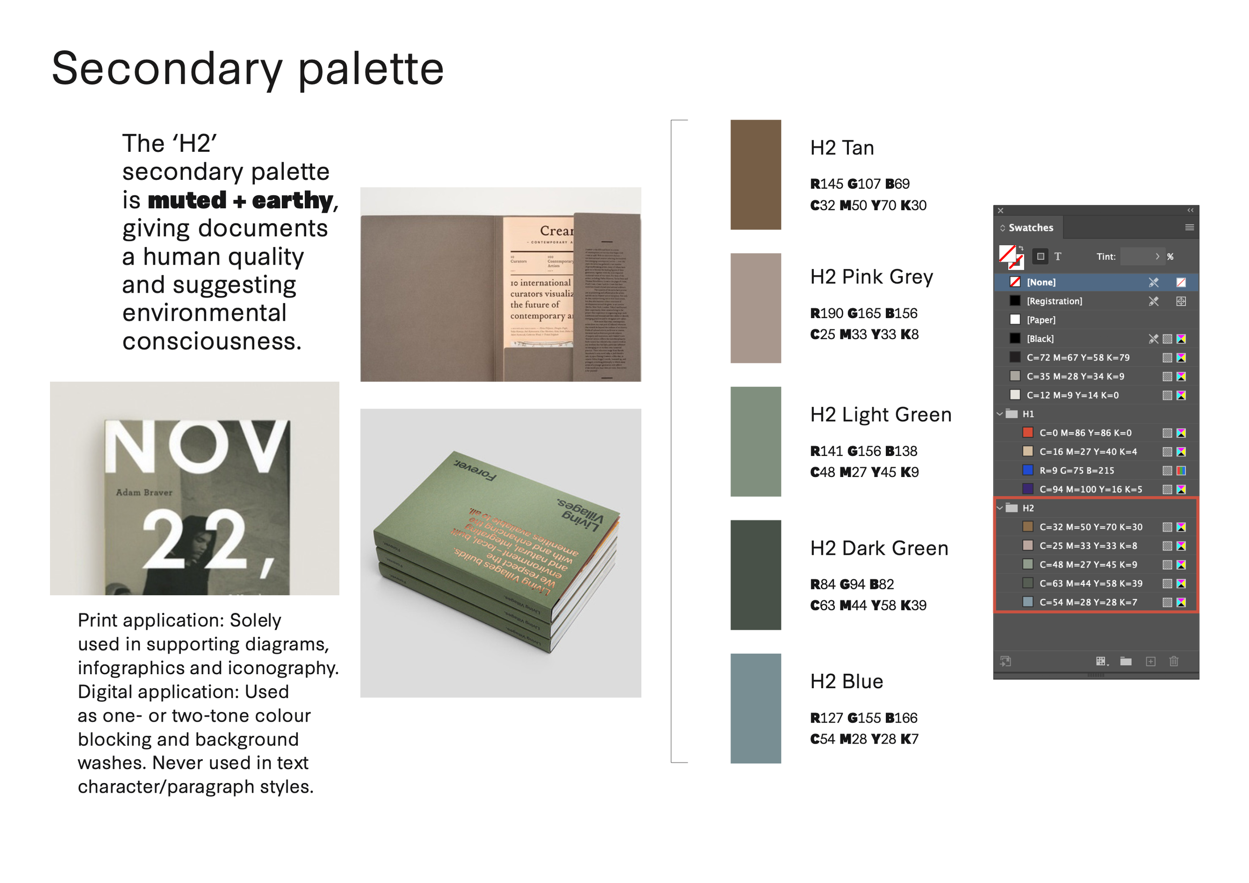
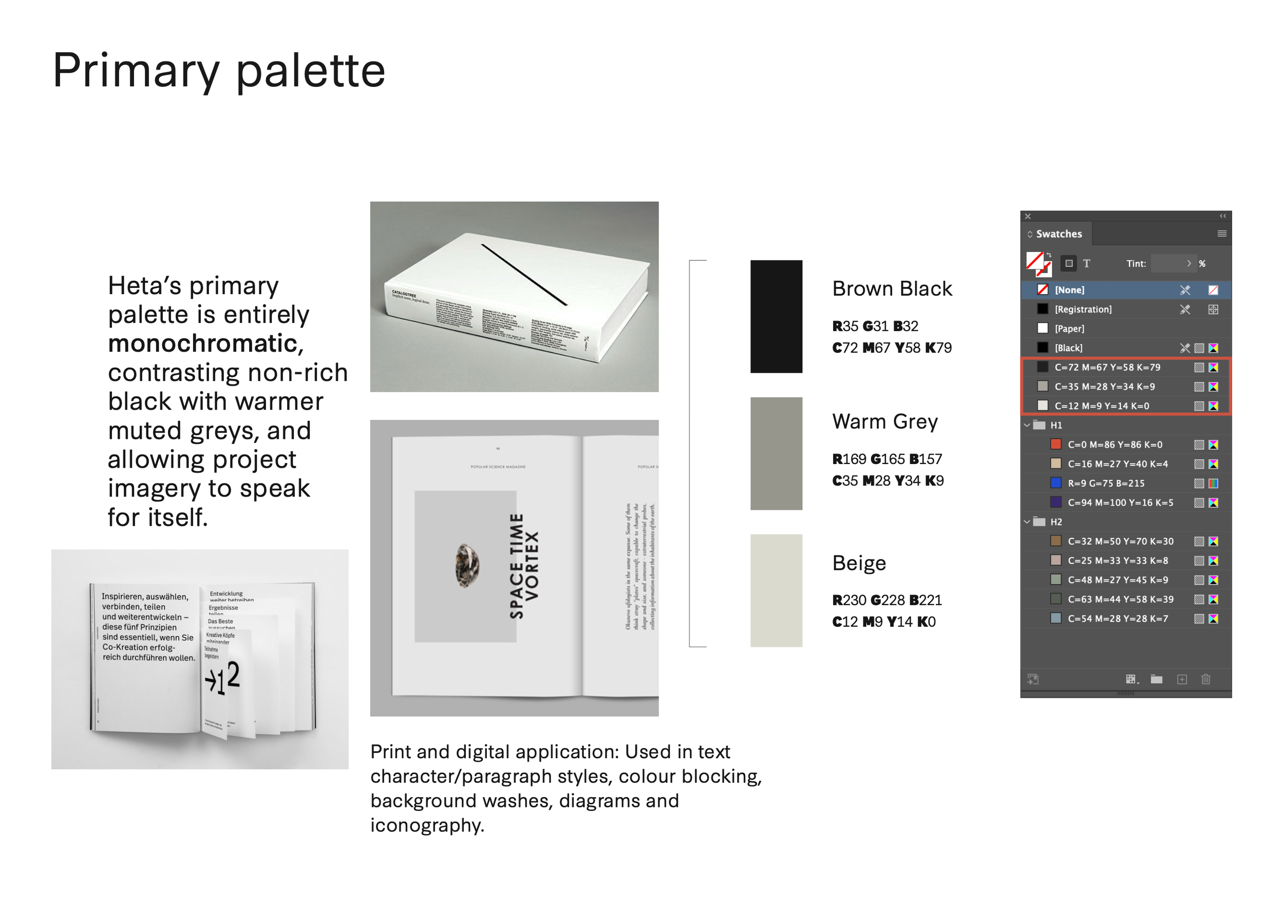
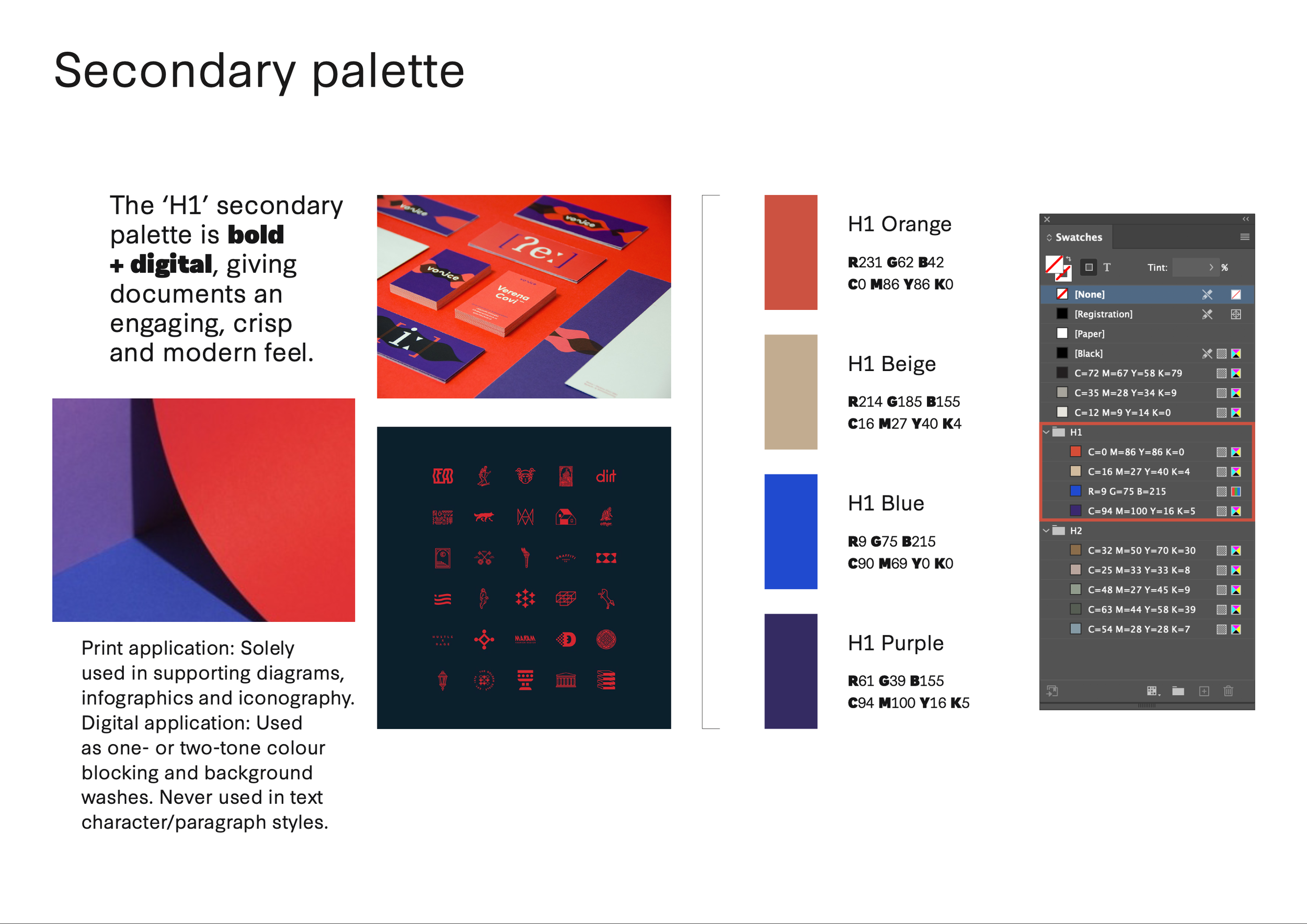
The first step to understanding how to achieve consistency across a suite of templates is to look at how a brand’s values and ethos can be expressed – such as through typography, image style, and colour. This was an important first step in this project.
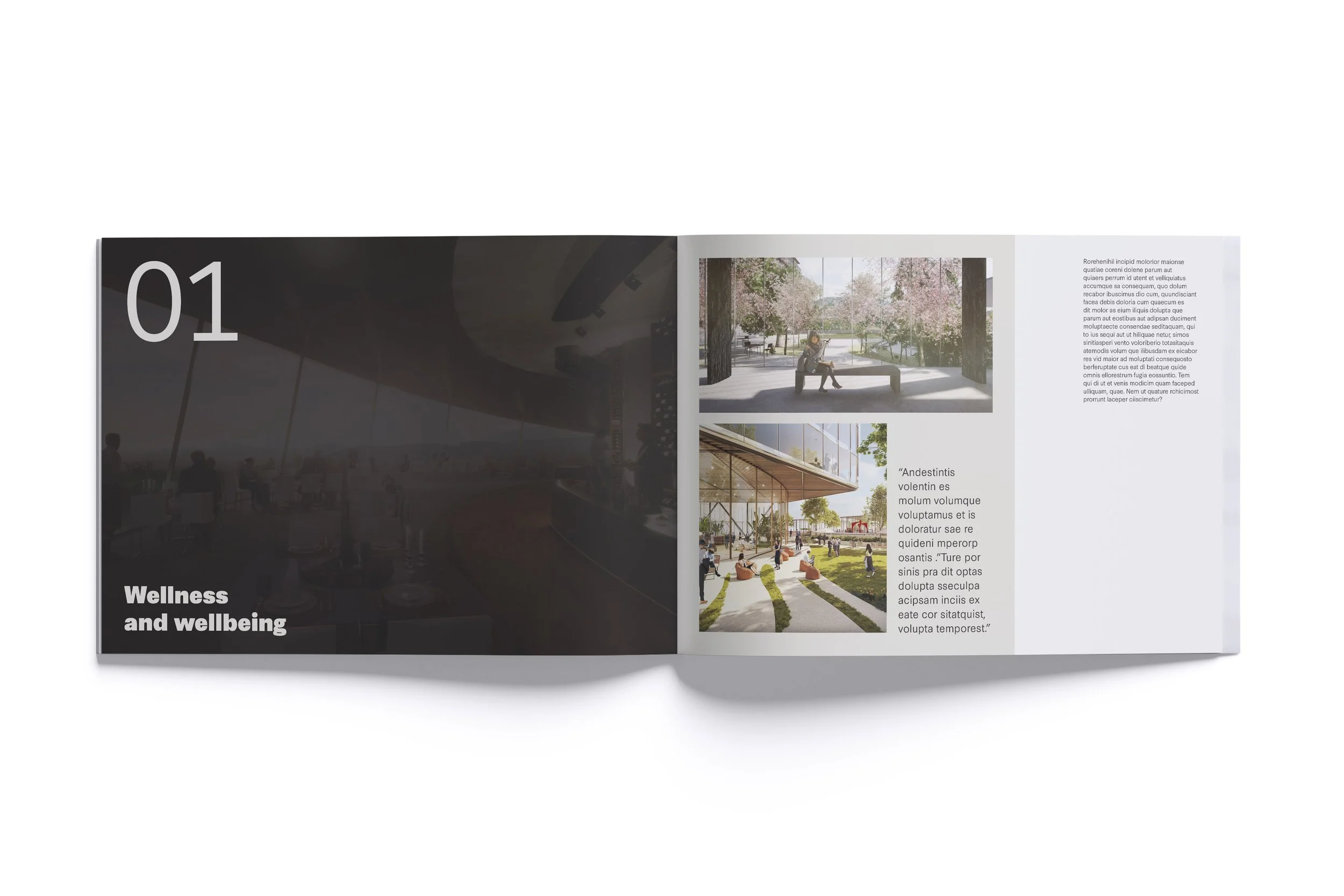
Open magazine with pages showing images of outdoor wellness spaces and the titles 'Wellness and wellbeing' and the number '01'.
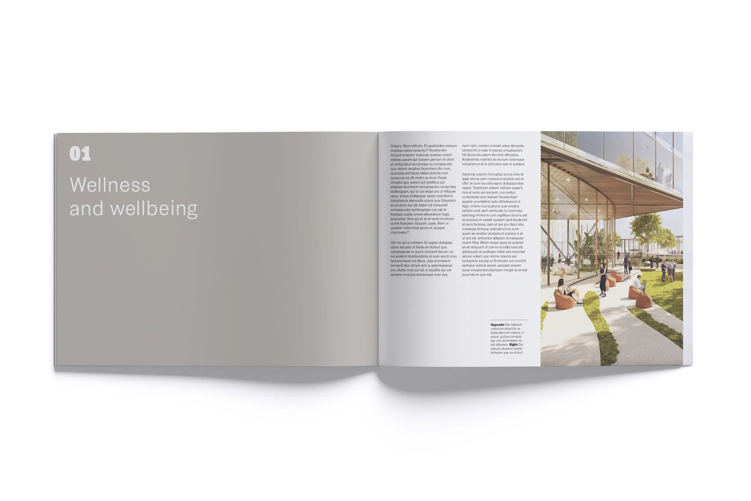
Open magazine showing a two-page spread, with the left page titled "Wellness and wellbeing" and the right page featuring an architectural rendering of a modern building with a large glass facade, outdoor seating, trees, and people walking and sitting outside.
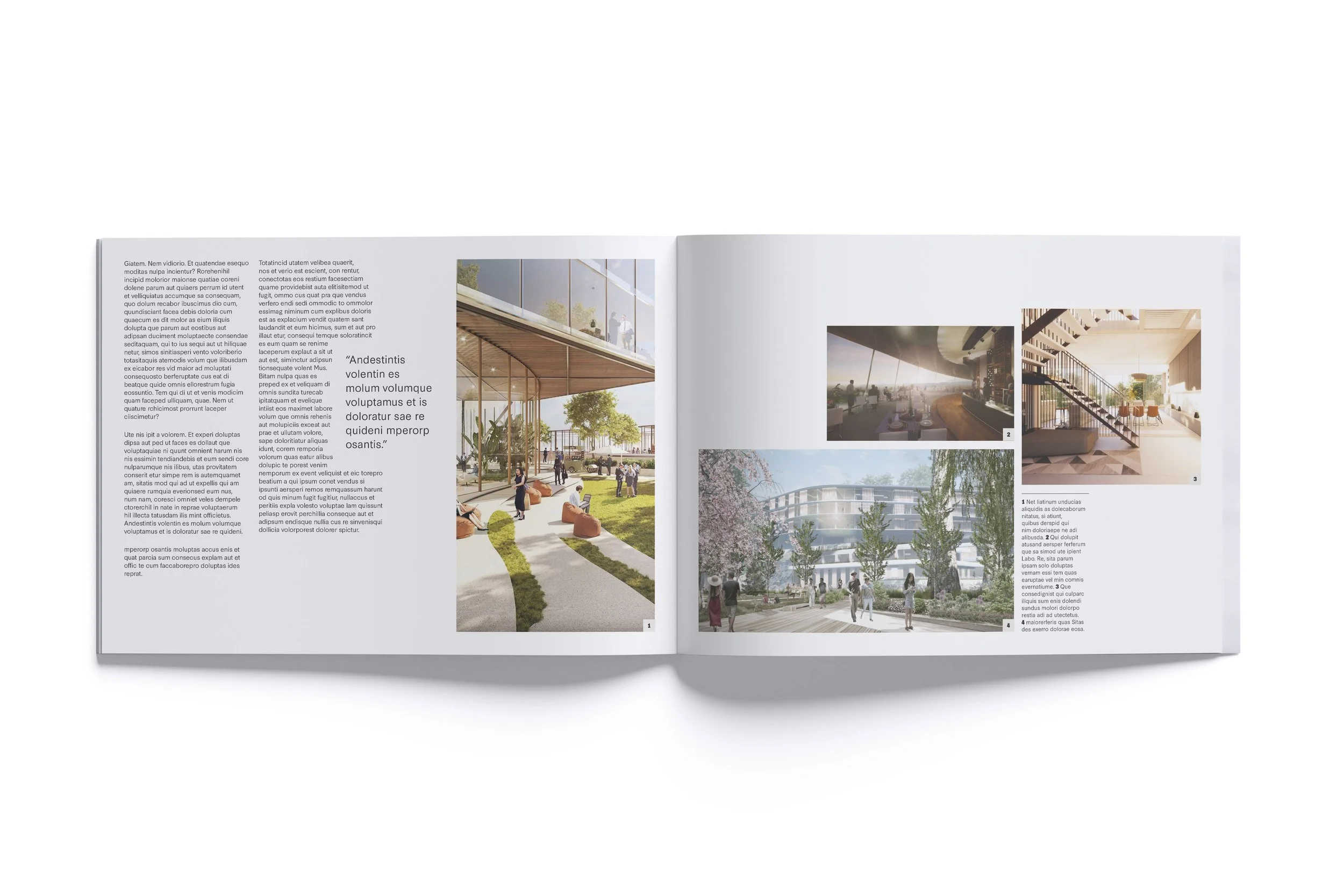
Open magazine featuring architectural designs and green urban spaces with people walking and relaxing outdoors.
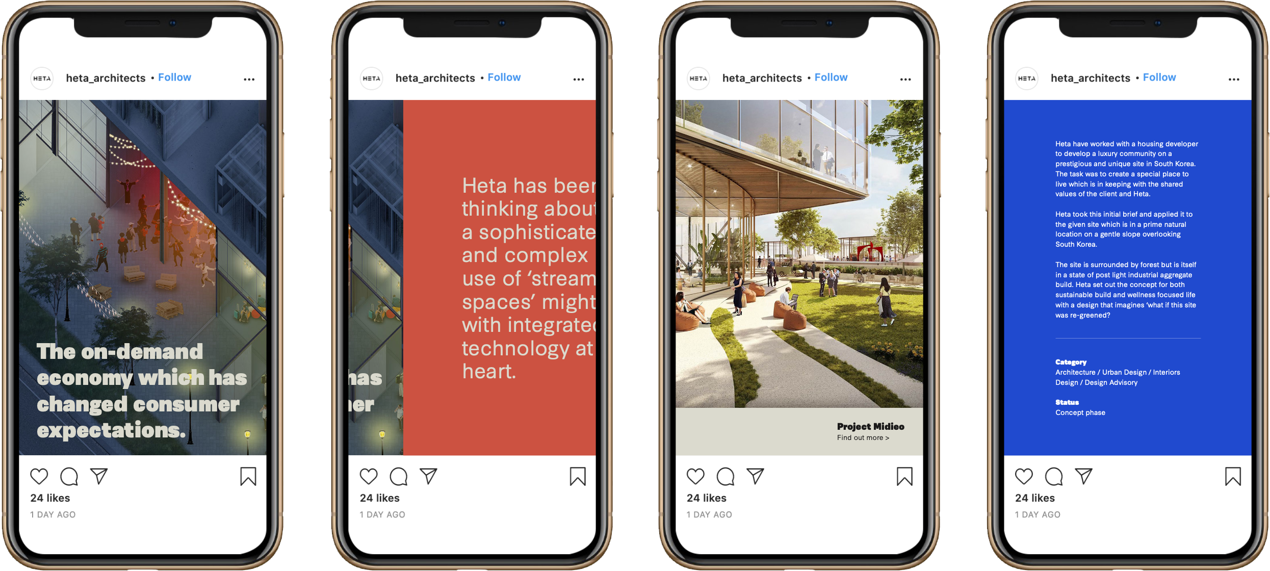
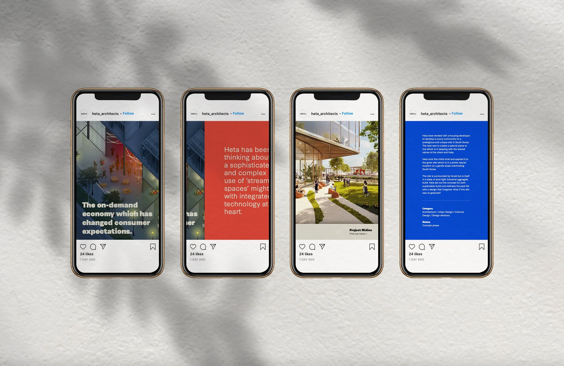
Set of four smartphone screens displaying Instagram posts about architecture and urban design, including images of buildings and text overlays.
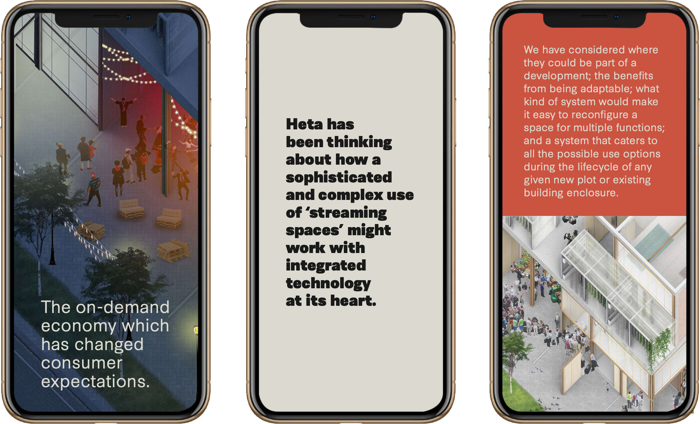
Three smartphones showing different screens: the first with an illustration of an outdoor event with people, trees, and string lights, and text about the on-demand economy; the second with a message about technology and streaming spaces; the third with an architectural rendering of a multi-level building with people and trees, and text about adaptable space development.
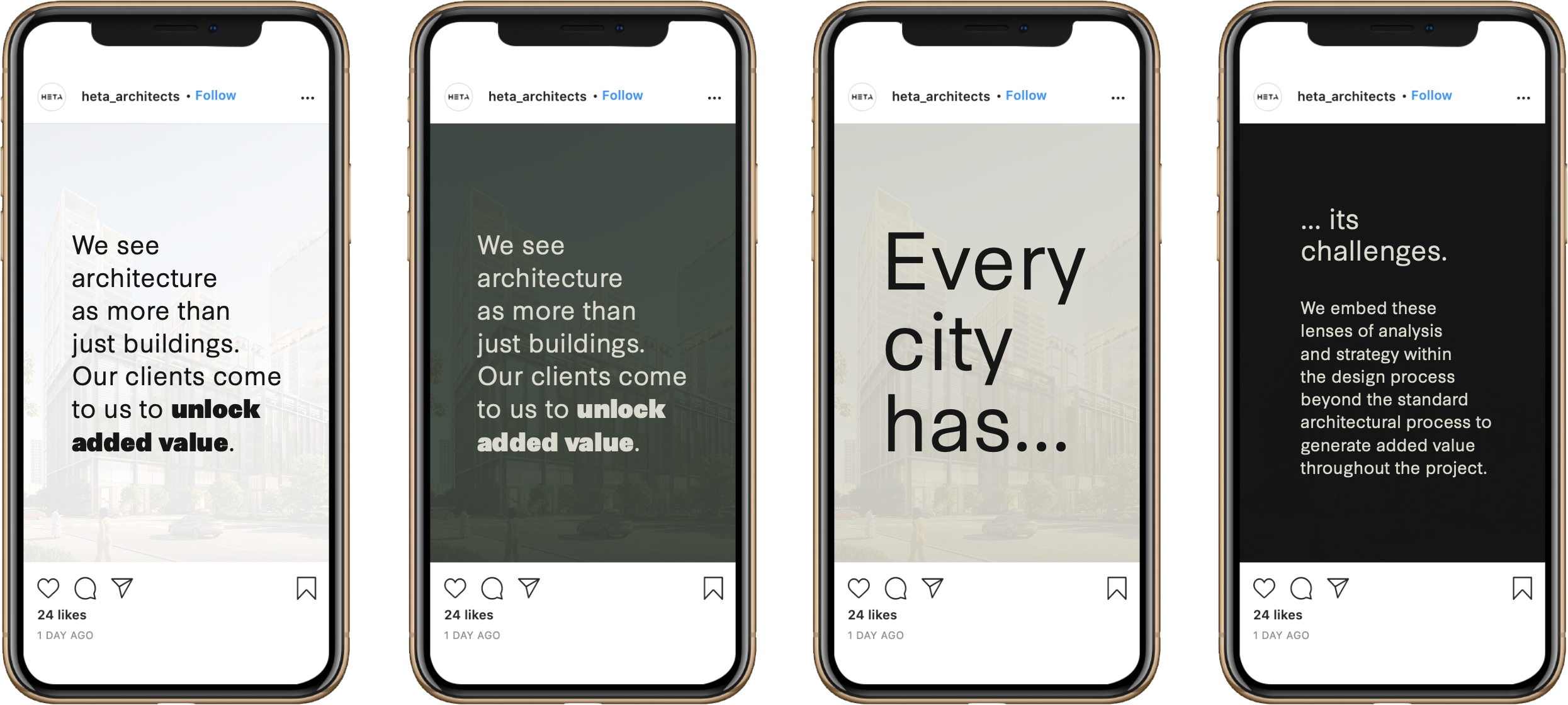
Four smartphones displaying a series of social media posts about architecture, with messages emphasizing value and analysis, and a background image of a cityscape.

This approach to template creation was also applied to social media templates (for Instagram grid and story posts), key to growing the practice’s online presence.
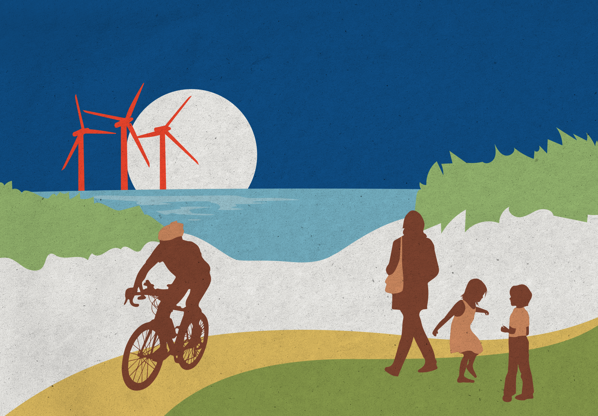
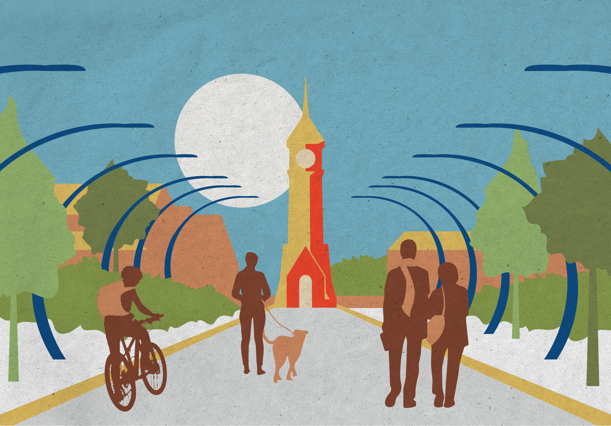
An illustration of a sunny beach scene with a full moon, wind turbines, and people engaging in outdoor activities. There is a person biking, a woman walking, and two children talking, all against a backdrop of green dunes and blue sky.
People walking and cycling on a street in a city park with trees, a church tower, and a large moon in the background.
A colorful illustration of a lakeside scene with a modern house, trees, and people relaxing outdoors during daytime under a bright sun.
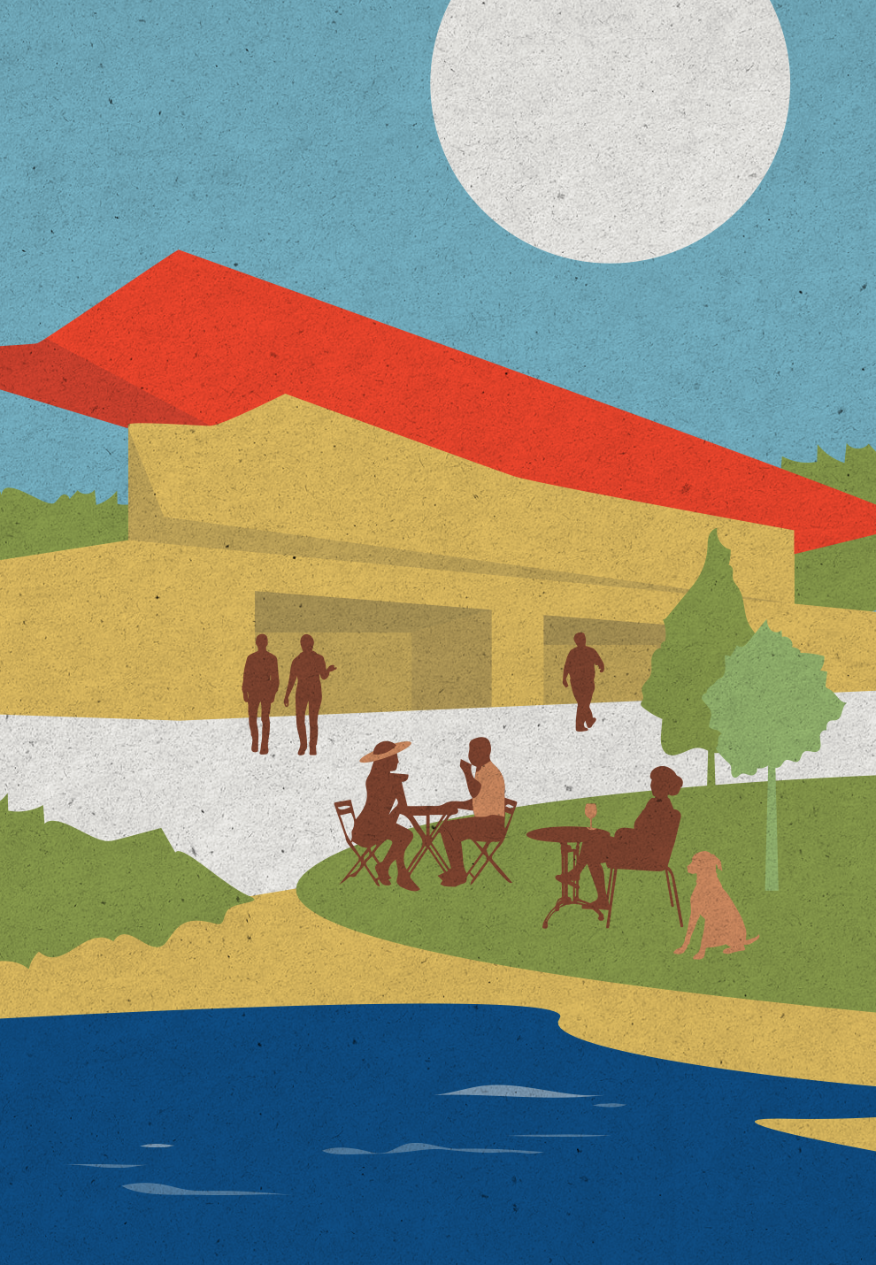
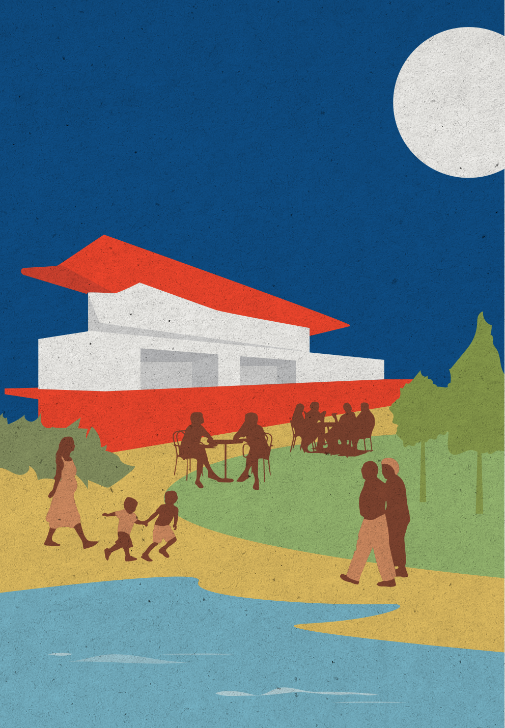
Illustration of a modern building with a red roof, people sitting and walking near it, trees, a pathway, and a body of water under a night sky with a large moon.
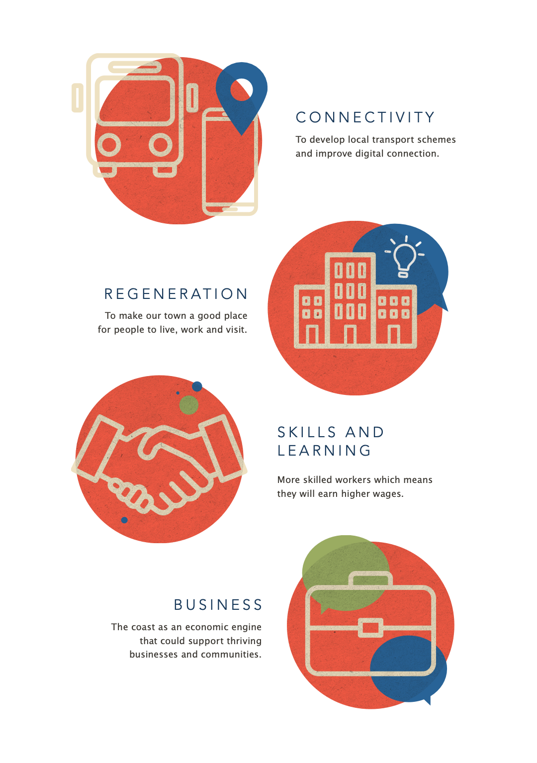
Infographic with four sections: 1) Connectivity icon of a bus and mobile device, emphasizing developing local transport and digital connection. 2) Regeneration icon of buildings with a light bulb, focusing on making towns better places for living, working, and visiting. 3) Skills and Learning icon of handshake, highlighting skilled workers earning higher wages. 4) Business icon of a briefcase with speech bubbles, representing supporting thriving businesses and communities with the coast as an economic engine.
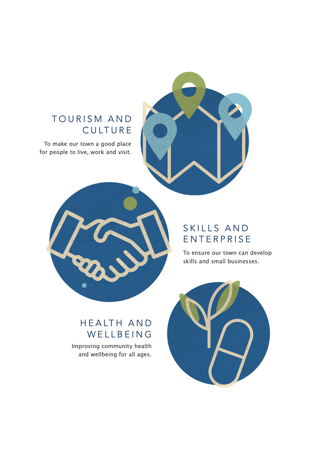
Graphics illustrating tourism and culture, skills and enterprise, and health and wellbeing.

Design takeaways

  • Let the work be the hero. Templates should create space to showcase the work, rather than distract from it, creating room to breathe by embracing generous white space and clean grid work. In the same vein, decorative graphical elements should be kept minimal and typography timeless, prioritising readability over trendiness.

  • The importance of hierarchy in storytelling. With templates, especially brochures and presentations, it is crucial to set a consistent pace for easy storytelling. Each project should follow the same narrative structure so readers know where to find information. A typical sequence might include: hero or standout imagery, project overview and key facts, design intent, detailed drawings and photography, and outcomes or awards.

  • Using illustration to create relatable moments. Particularly with bid work, illustrations can help effectively convey broad or abstract concepts. These can add human flair to a document and are therefore an important consideration, especially for early phase documents which may otherwise be lacking in visual material.

Let’s work together

If you have a similar project you’d love a new design perspective on, get in touch with me at hello@chromakane.com – I look forward to finding out about your brand’s story.