ITN Productions
An award-winning factual content producer with a portfolio spanning broadcast news, documentaries, films and more.
The challenge
I was approached by ITN Productions as the team sought to launch a new digital division, helping to create new identities for each digital channel being refreshed or newly launched.
The solution
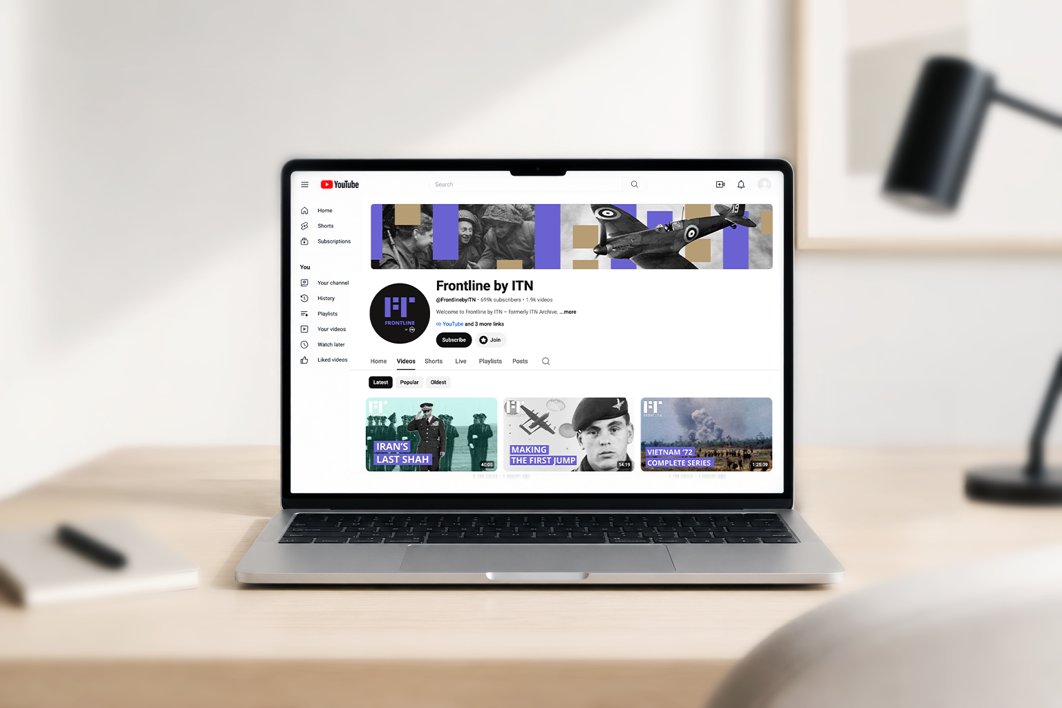
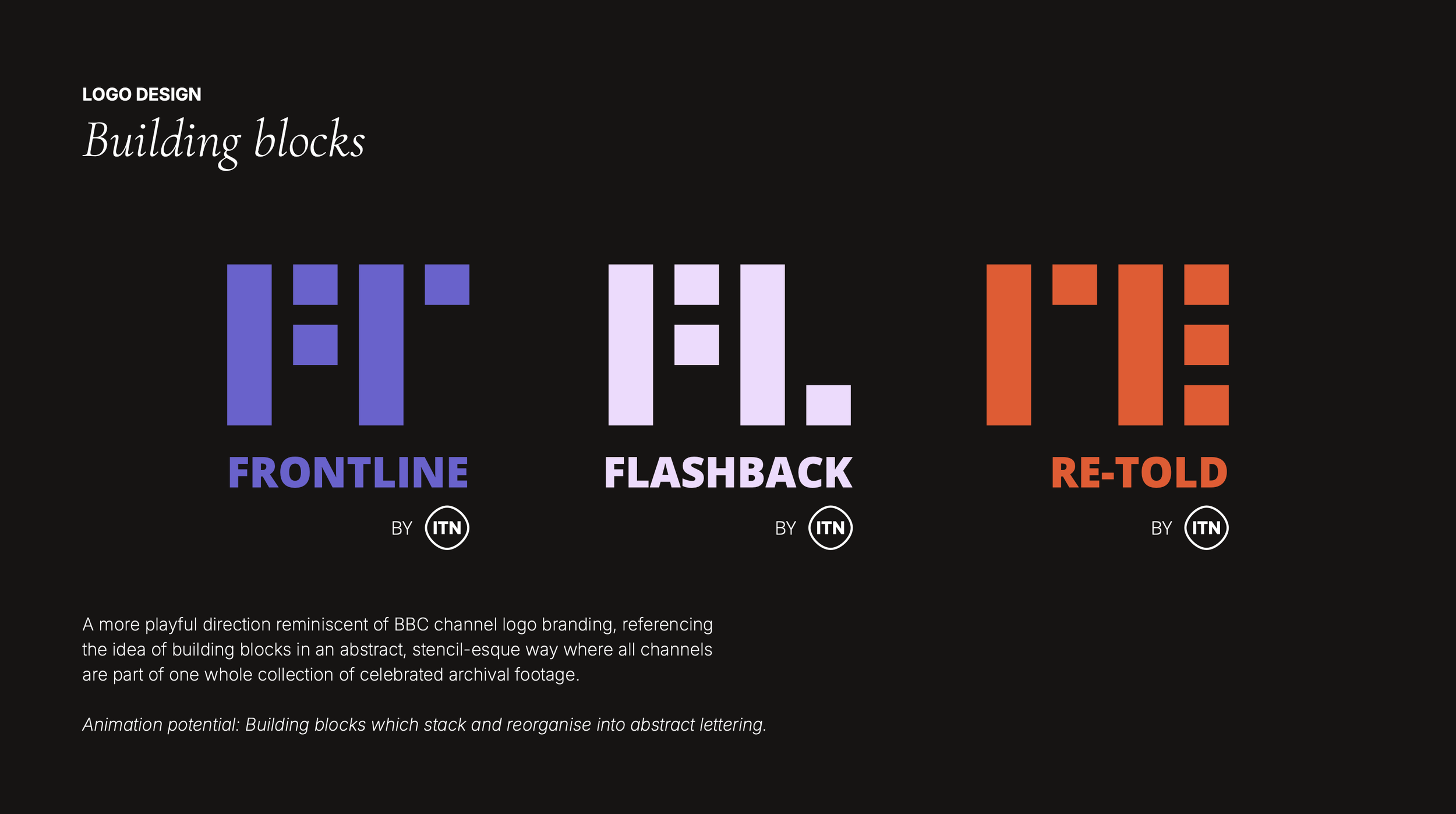
I helped create a series of mini brand identities for each of the six new channels being refreshed or newly launched: The Royal Family Channel, Archive (Flashback, Frontline and Re-Told), Onlooker and Pop Drop. As part of the extended brief, I created distinctive visual identities which felt appropriate and on brand for the content of each channel, as well as hero banner and thumbnail template graphics for the channels’ digital presence across YouTube and Facebook, ensuring all assets were properly optimised for responsive screen viewing.
Scope
Art direction, Artworking, Brand design, Logo design, Social media design, Visual identity design
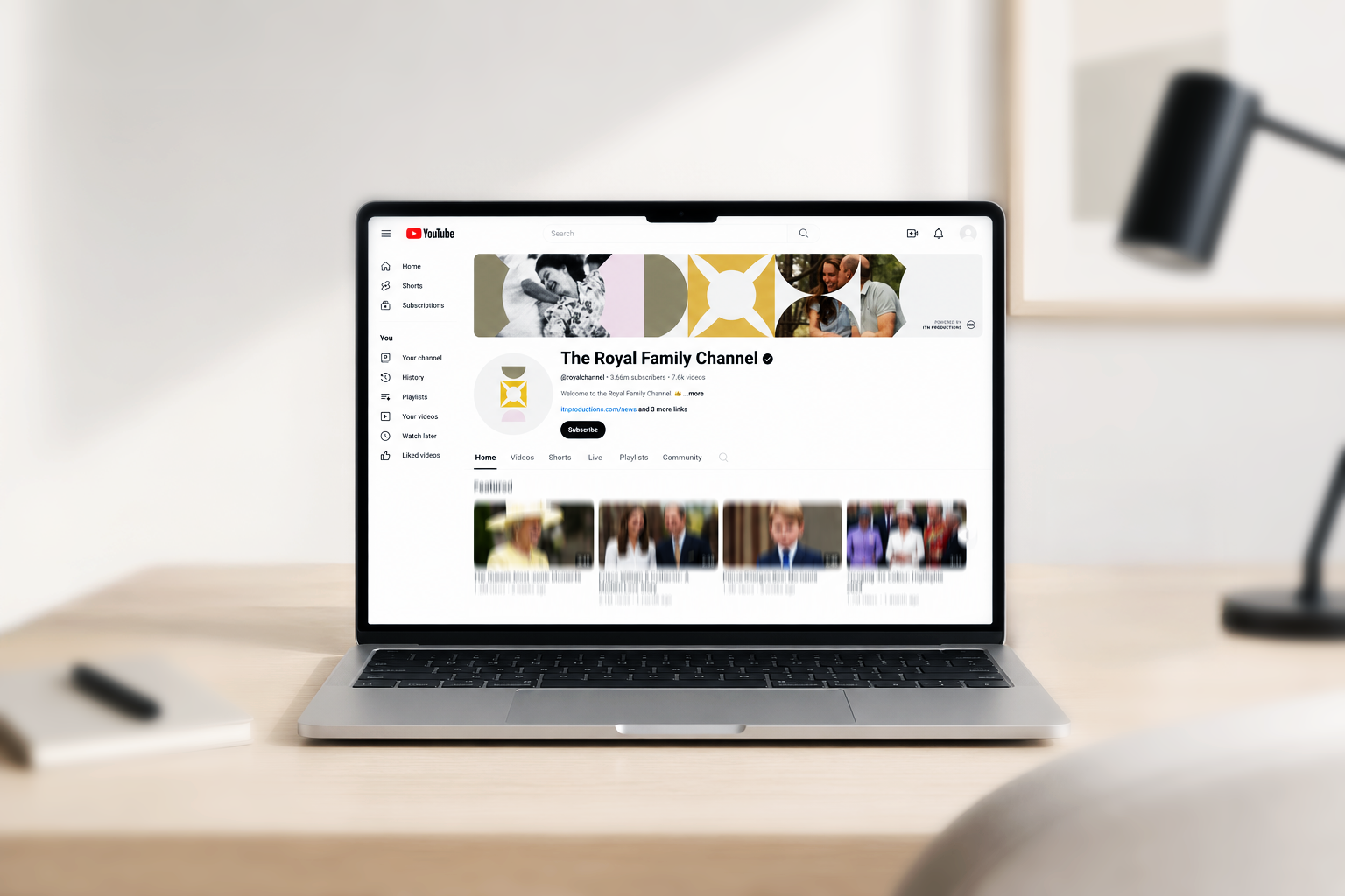
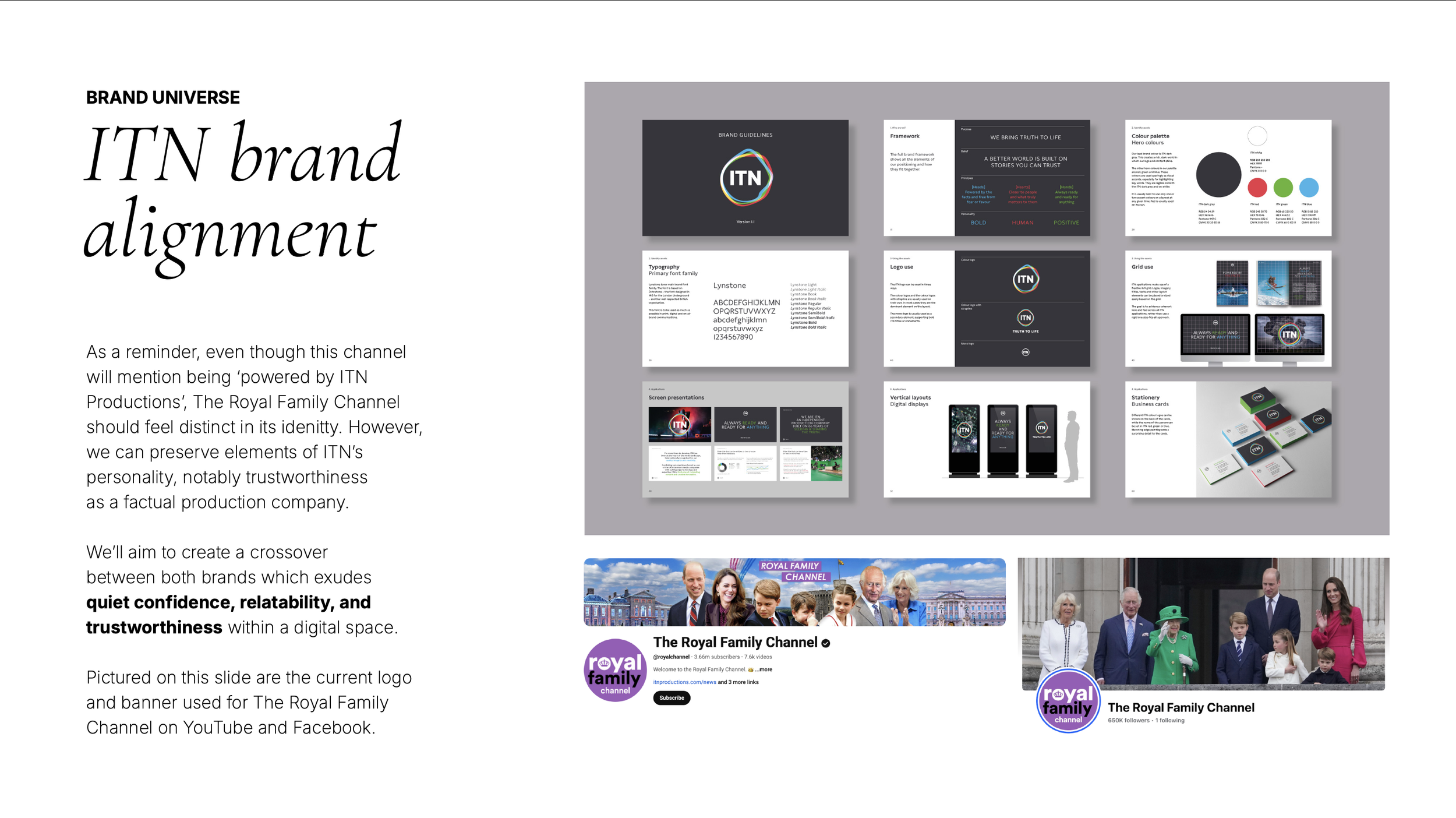
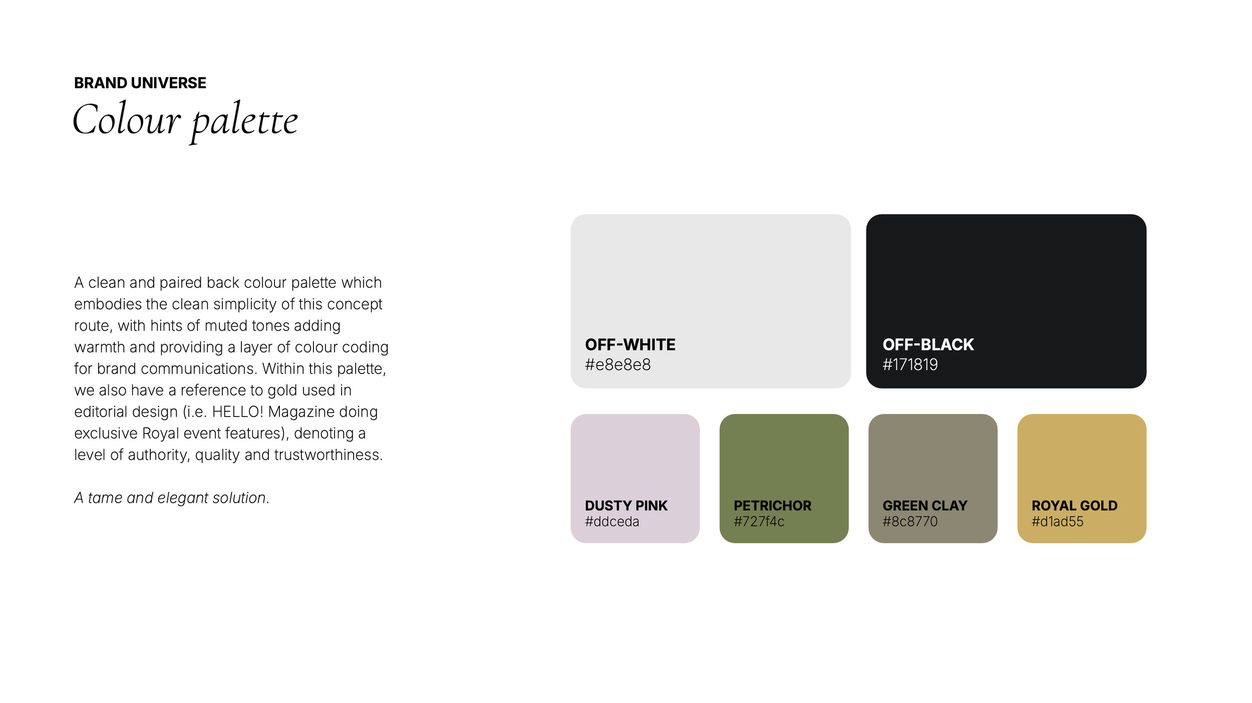
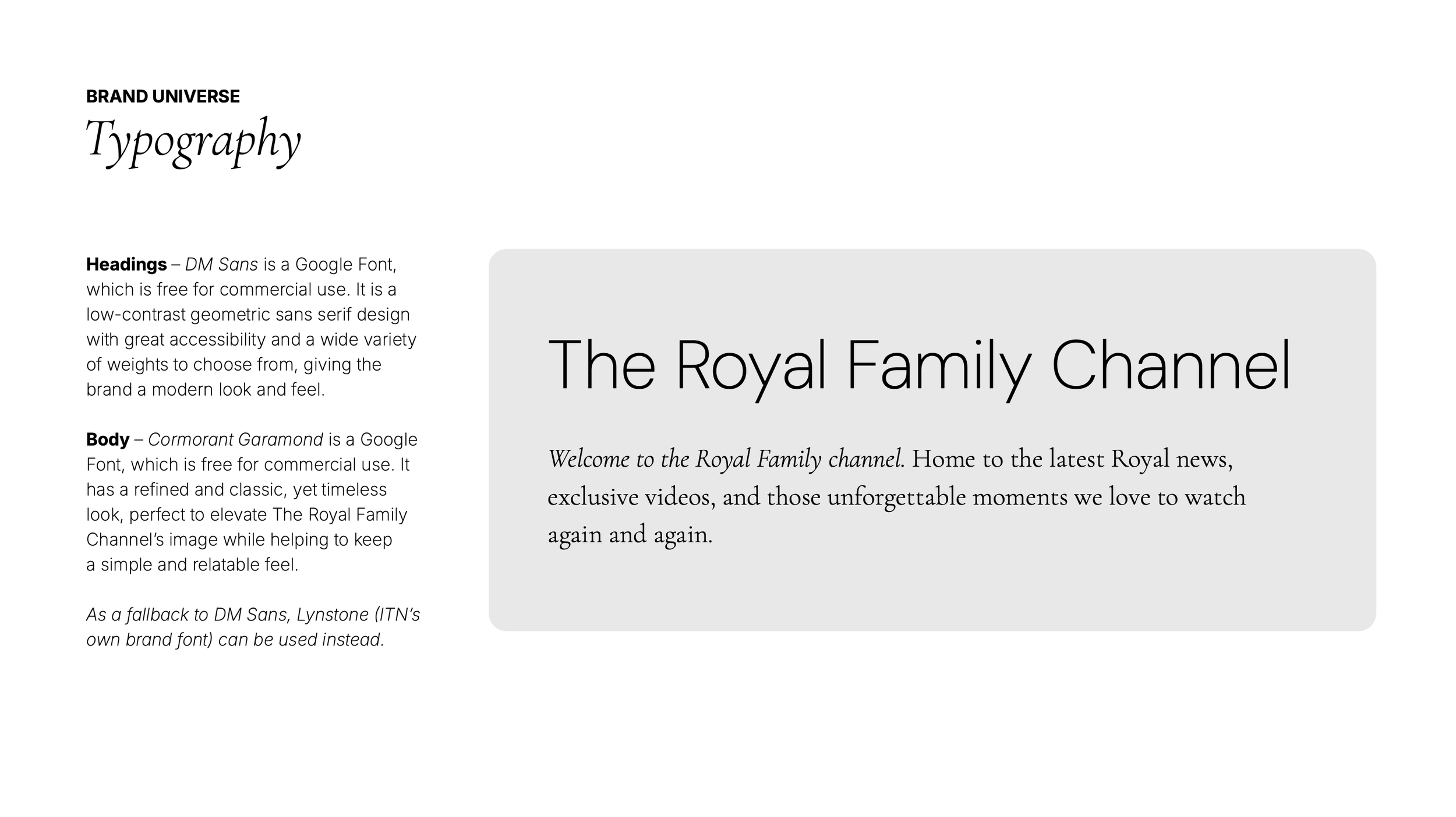
The Royal Family Channel
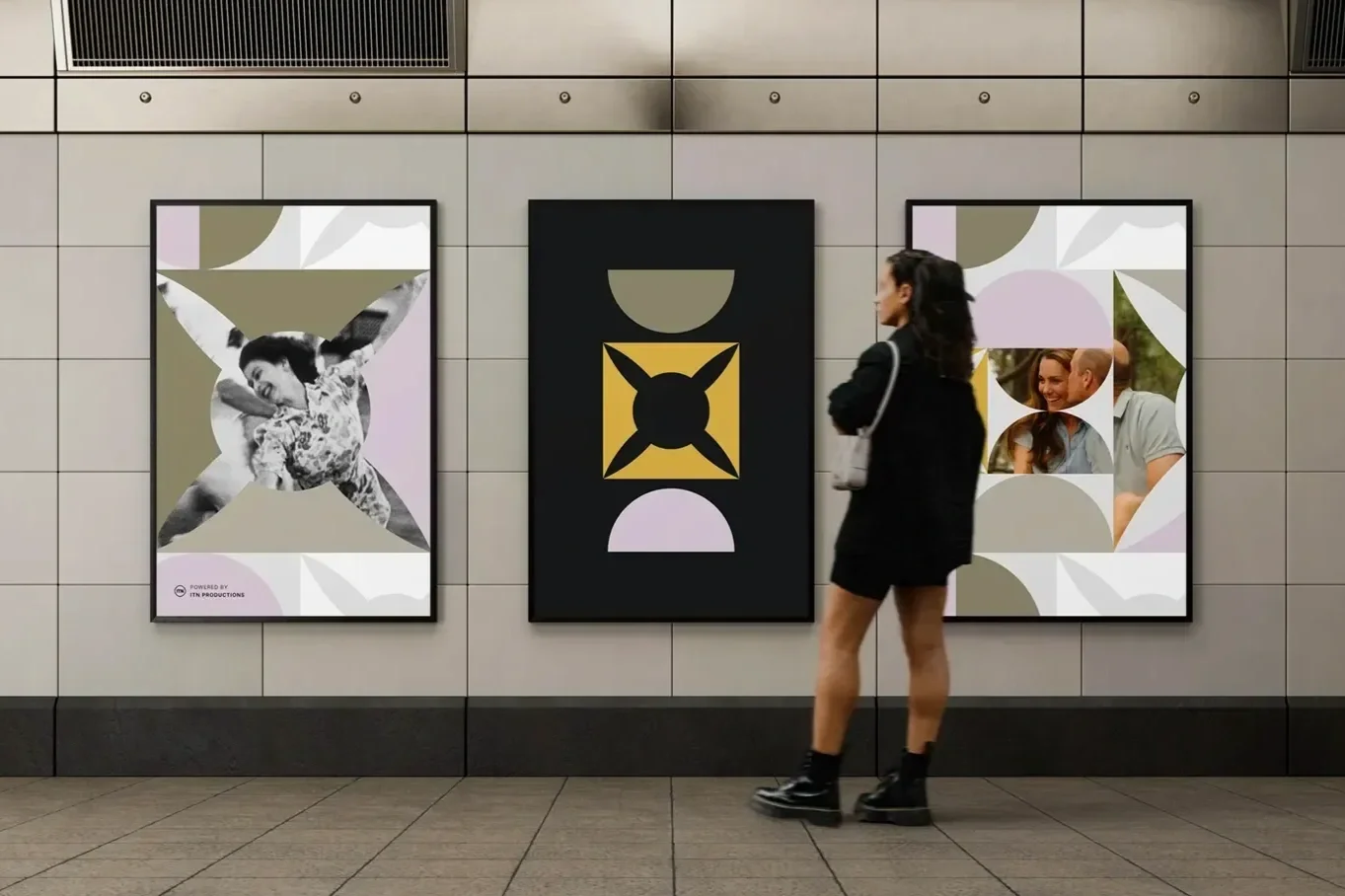
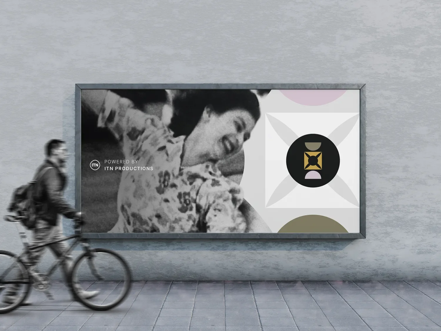
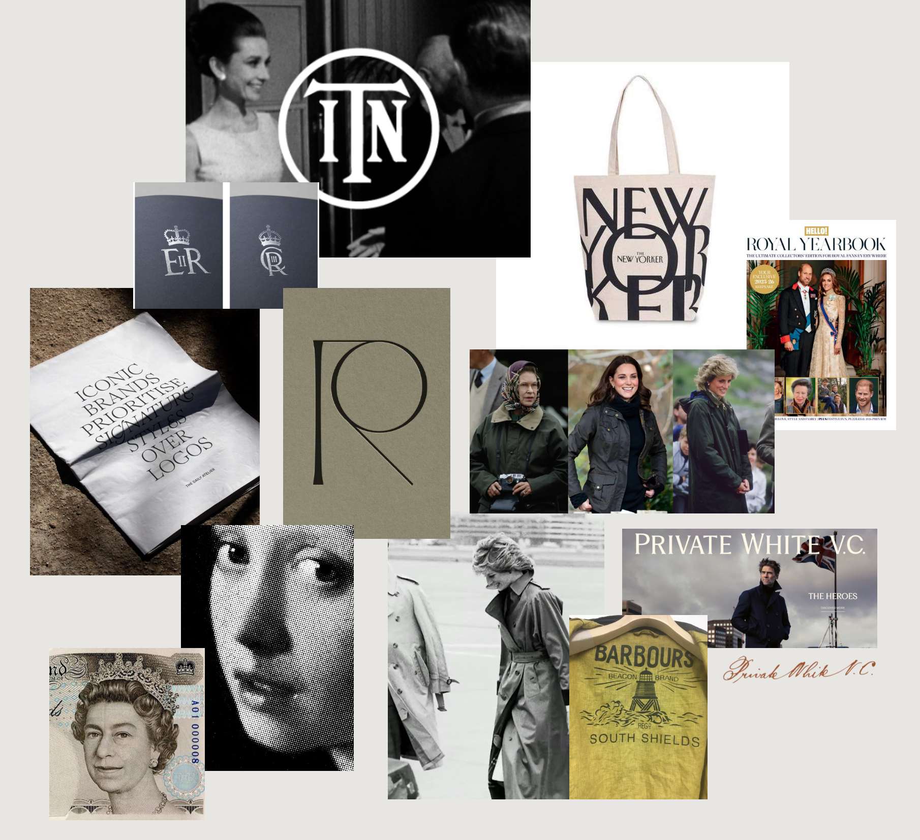
The Royal Family has established itself as a recognisable global brand, embodying core values of heritage, tradition, authority, service and prestige, all in ways which convey regality, relevance and respect.
Rebranding ITNʼs The Royal Family Channel across social channels was therefore an exercise in expanding these values whilst keeping aligned with the channelʼs existing demographic, the everyday 60-year-old American Woman, and which also makes the Royals more human and relatable. ITN wanted a channel which feels modern, regal and unmistakably British. Classy, but fun, exuding warmth.
The Archive Channels
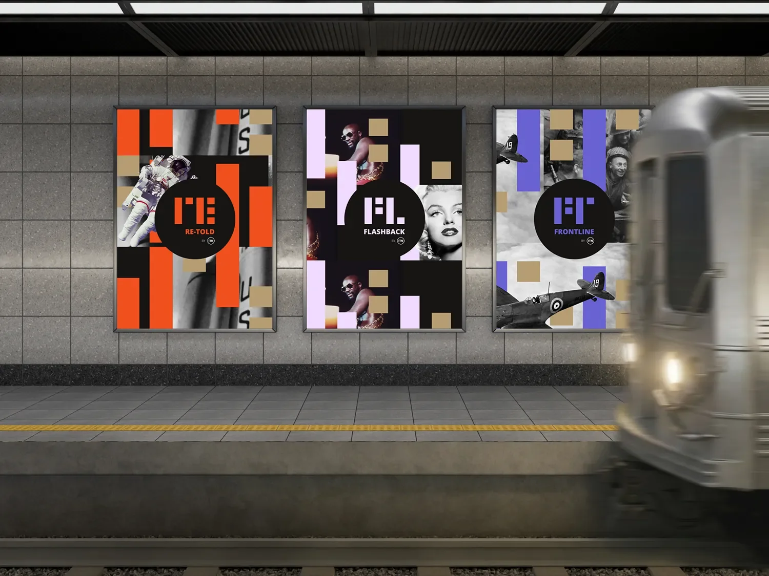
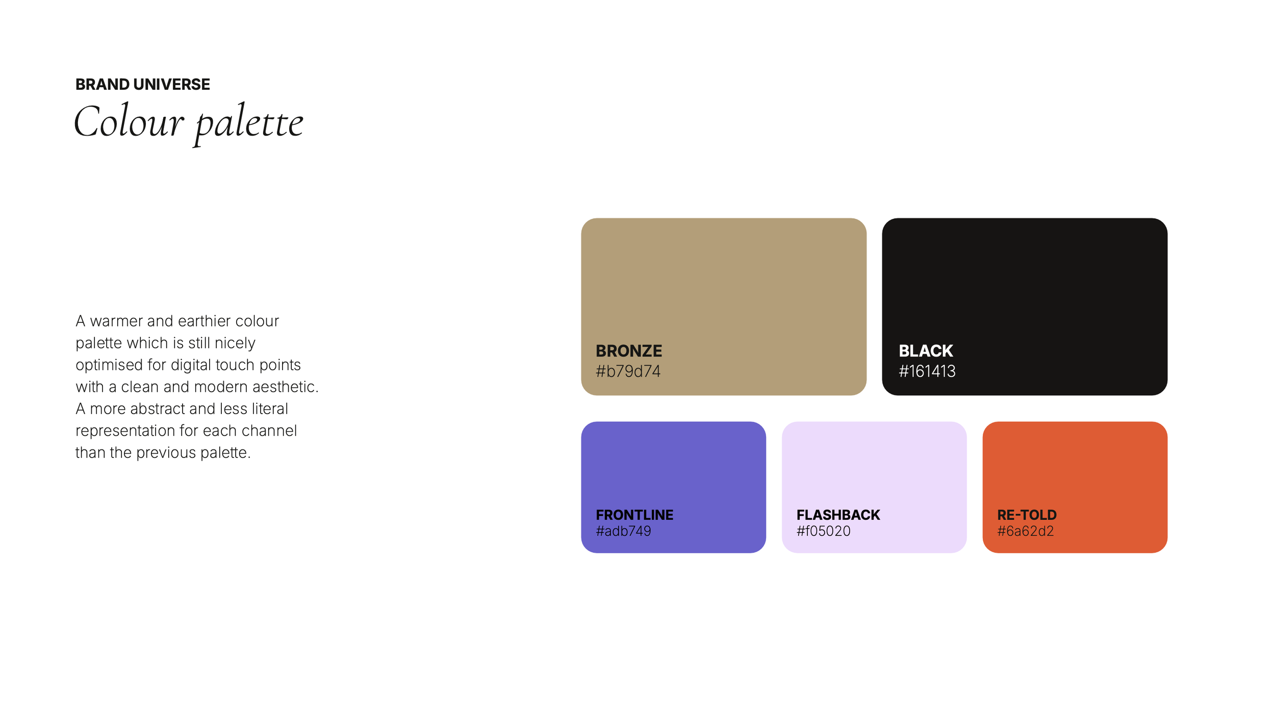
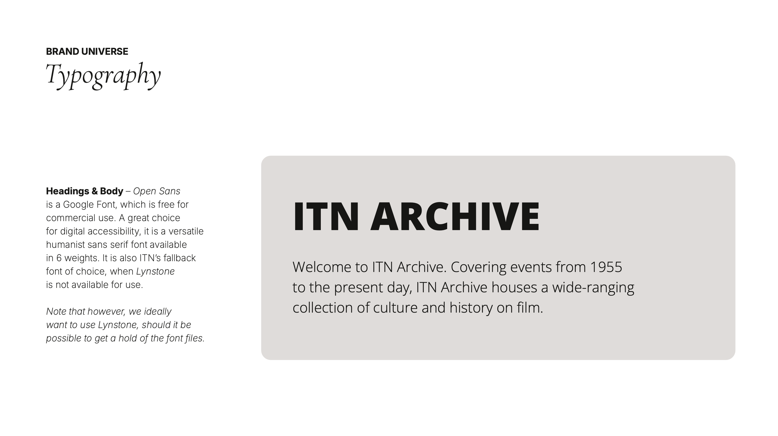
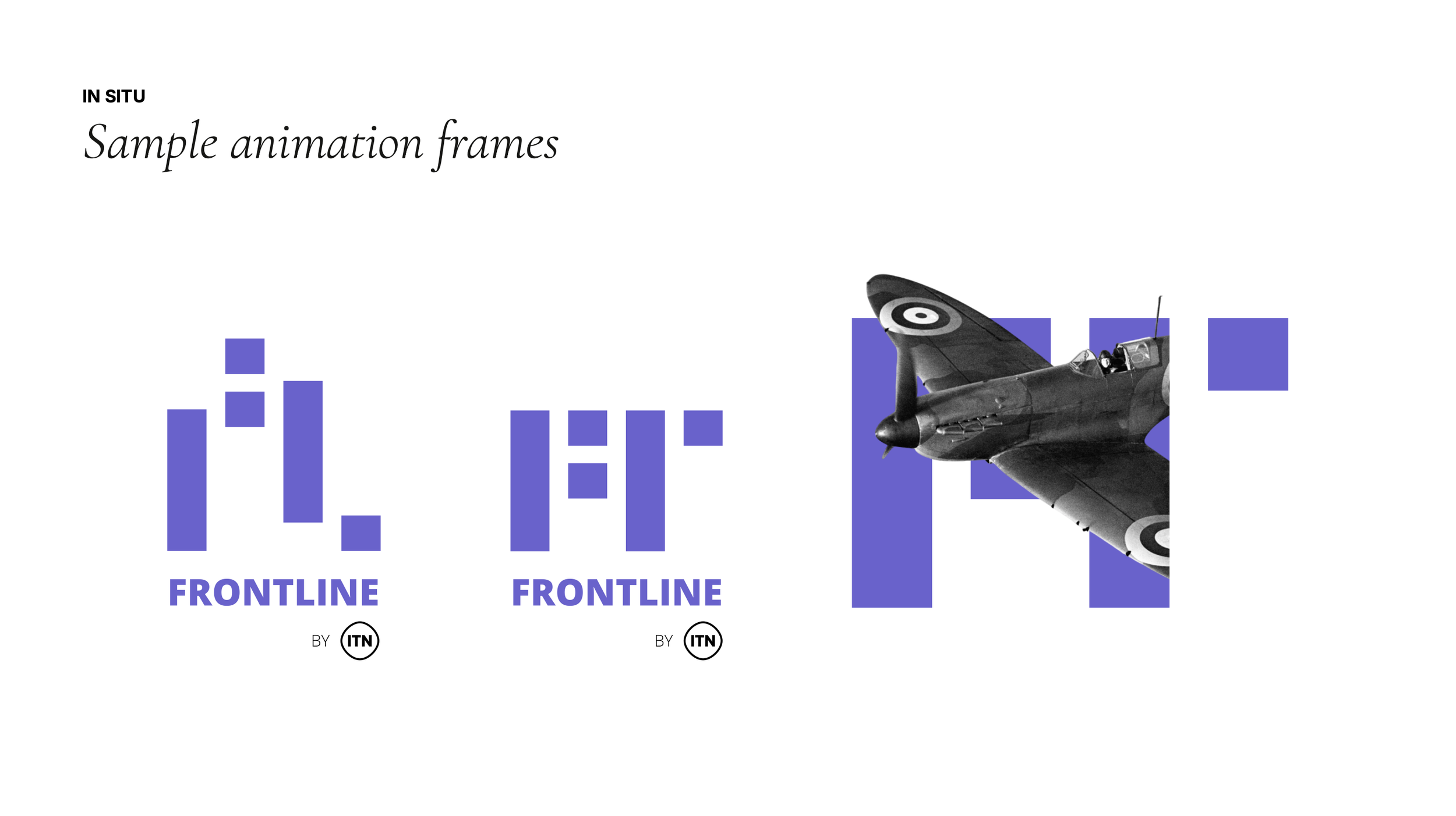
An evolving archive of precious footage: the challenge with this brief was to create an identity where past global politics meets present, as well as pivot the channel from conflict-heavy media to include other tones including archival pop culture and social history.
These new channels still needed to feel relevant to the original target demographic, a male history buff in their 30s, but also expanding with new audiences (pop culture and social history fans – intelligent, curious millennials).
Onlooker
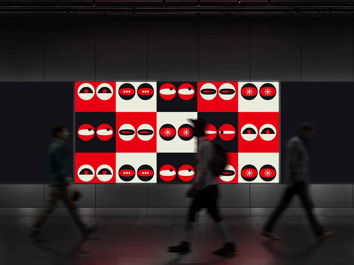
Satire journalism in the UK has evolved from risky pamphlets and caricatures into a mainstream, multi-platform force that shapes political discourse. From Private Eye to modern digital outlets, it remains a powerful tool for critique, humour and public engagement.
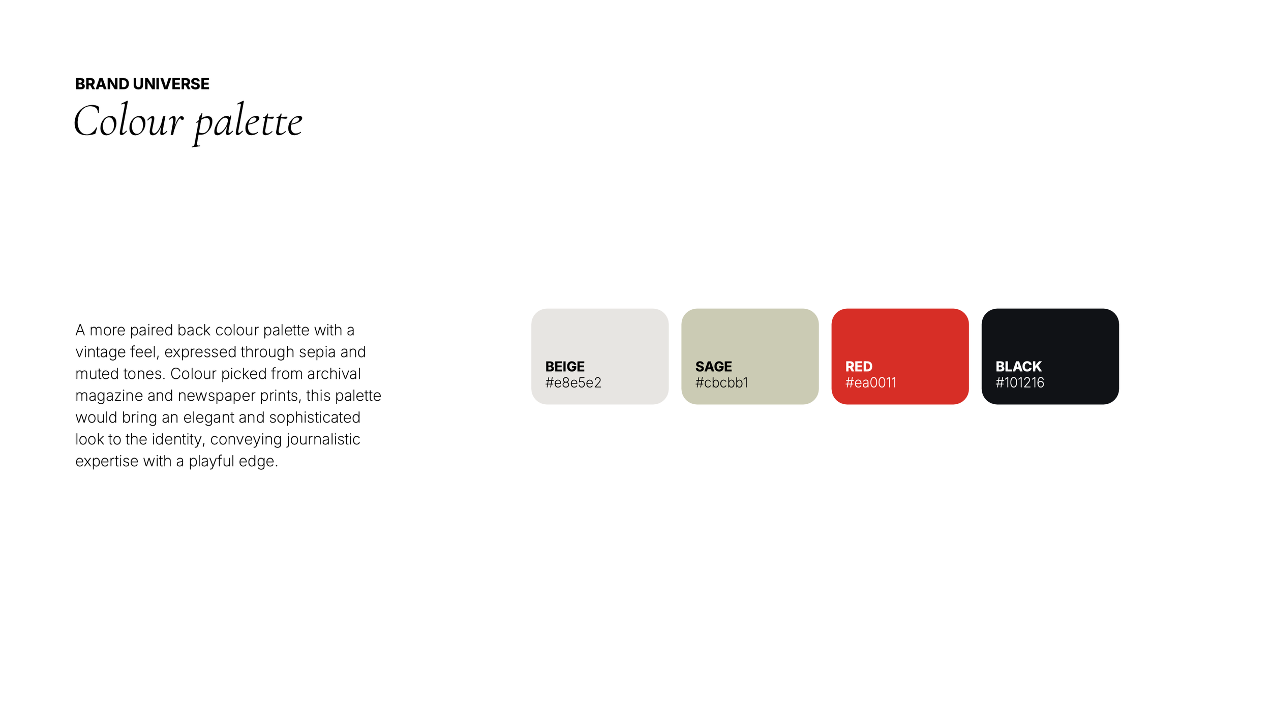
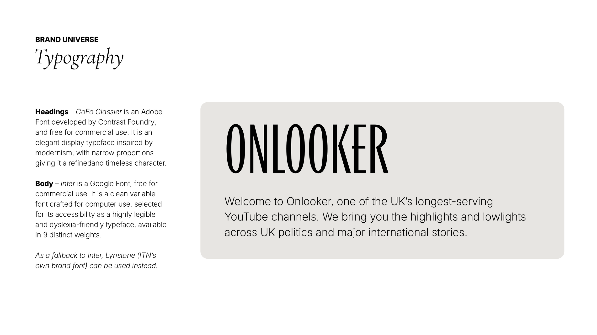
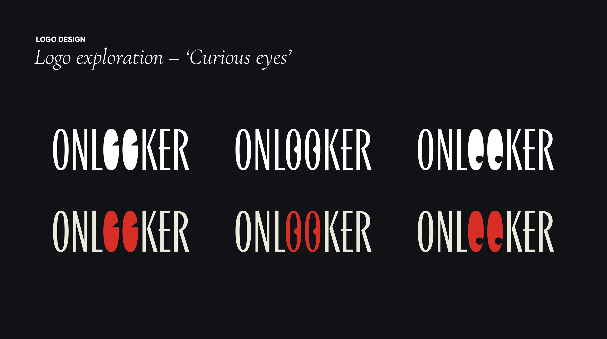
As the On Demand News channel moves into a bolder positioning – authority with a sense of humour – its visual identity needed to evolve accordingly. Beginning with its new name, Onlooker, and the visual connections that brings.
Pop Drop
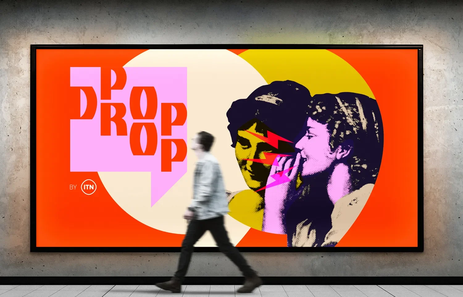
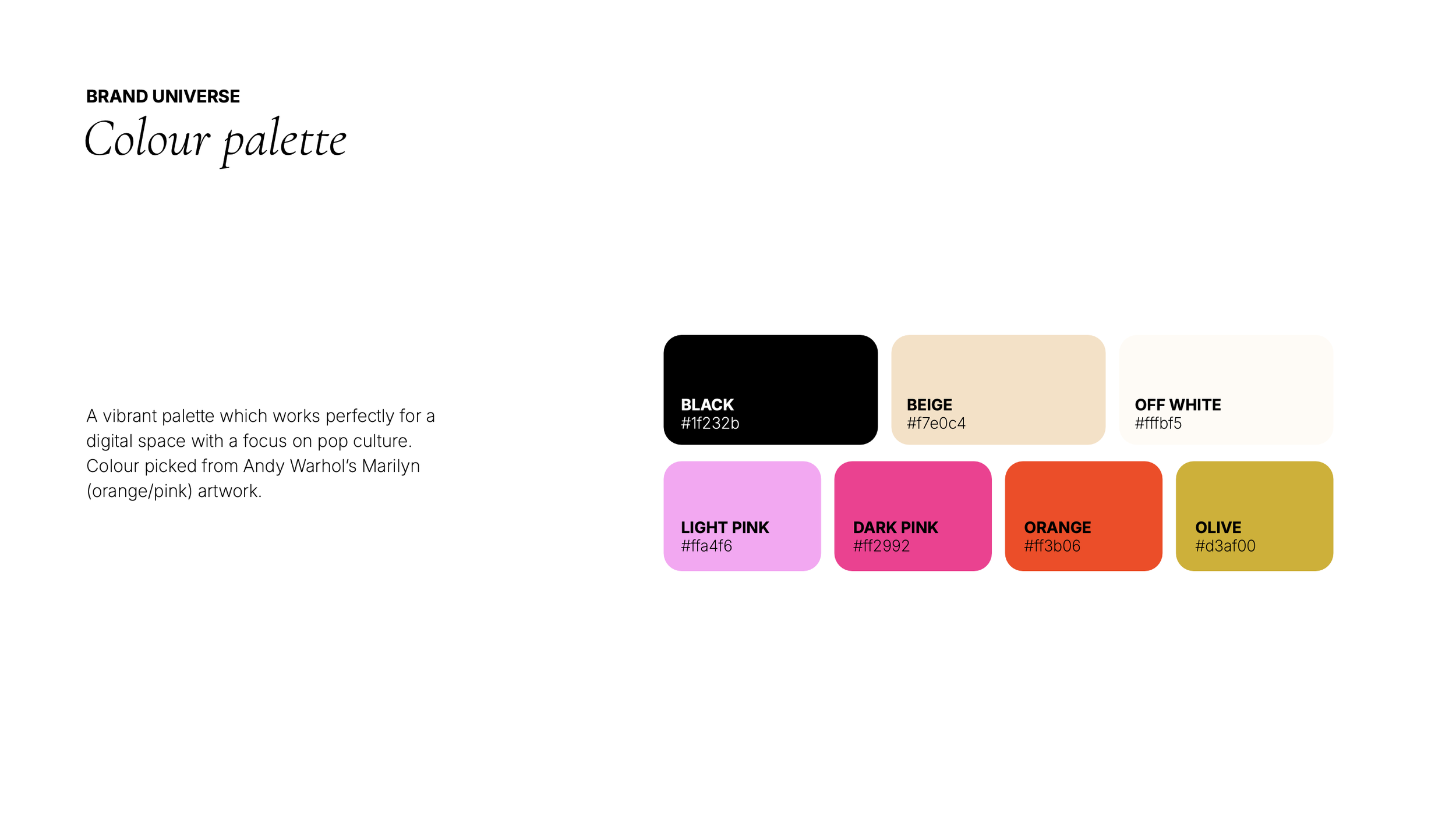
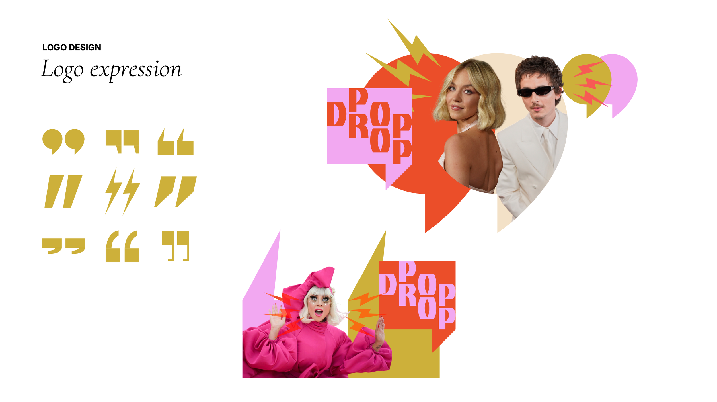
Thereʼs something about air quotes and pop art speech devices: theyʼre cheeky, witty, and ironic. Perfect to encapsulate the “did you hear what she said?ˮ gossip energy of the Pop Drop channel, which takes a side eye look at celebrity news. An expressive and playful concept, with a pop art collage aesthetic, perfect for the target audience in the mood for an insider scoop.
An entirely new voice to match the channelʼs new name, Pop Drop: ITN wanted a look and feel which is cheeky, funny and a little bit dramatic in a lighthearted kind of way.
Design takeaways
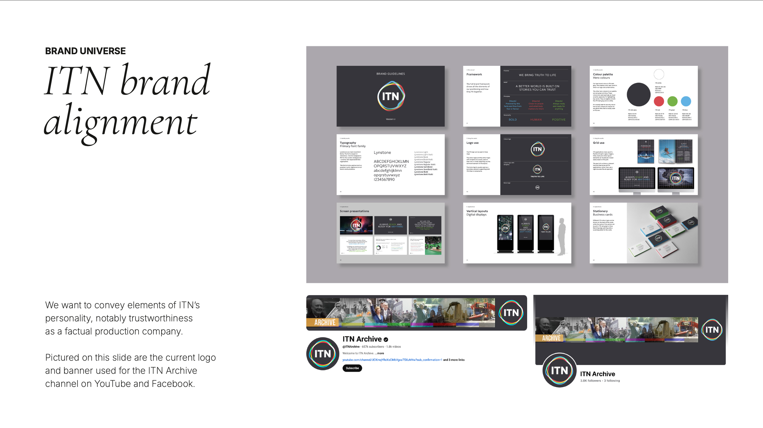
An exercise in adaptability. With these digital channel brands, the sky was the limit where visual expression is concerned. However it was still important for these to feel tonally connected to ITN and within the brand’s world.
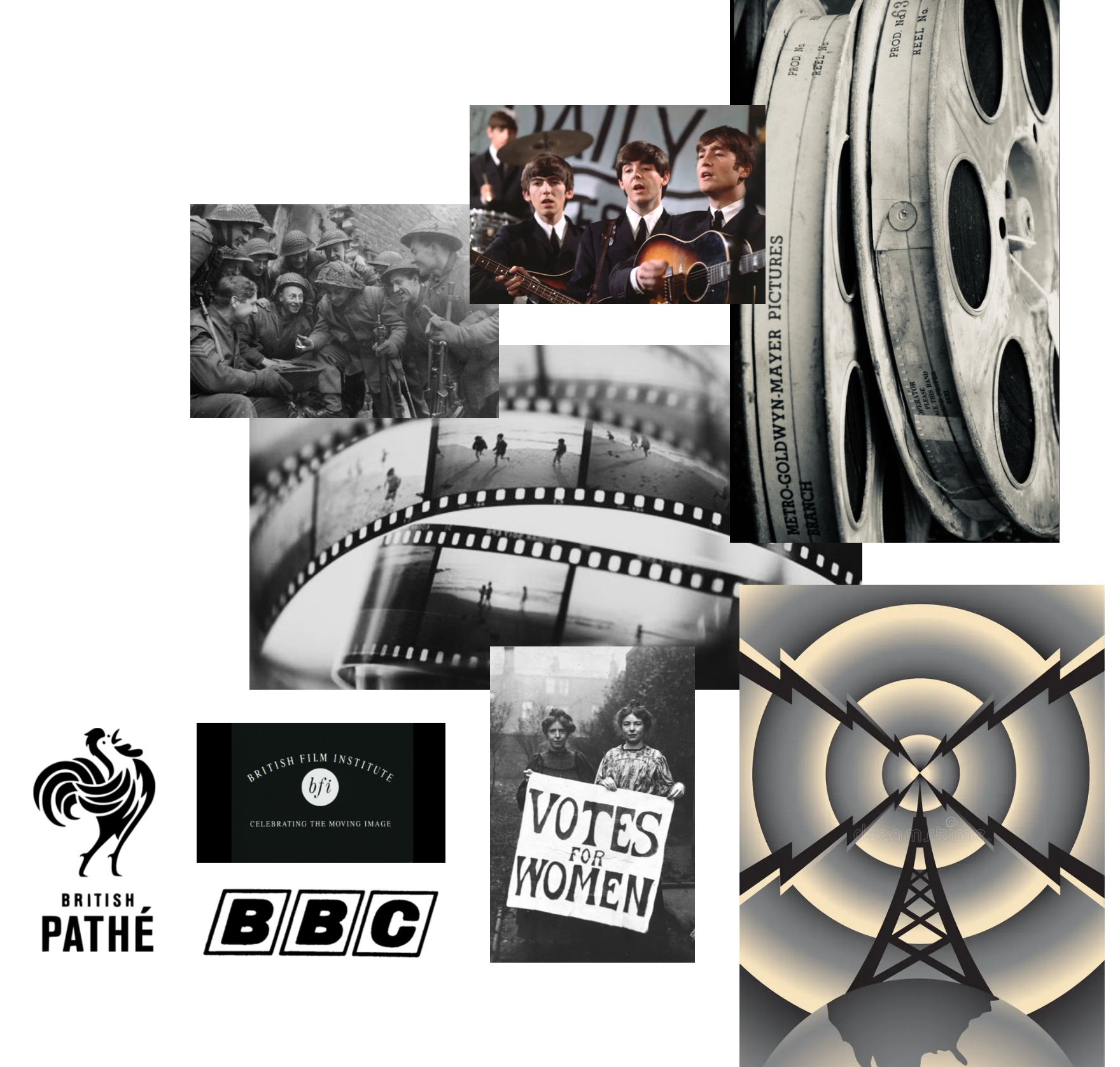
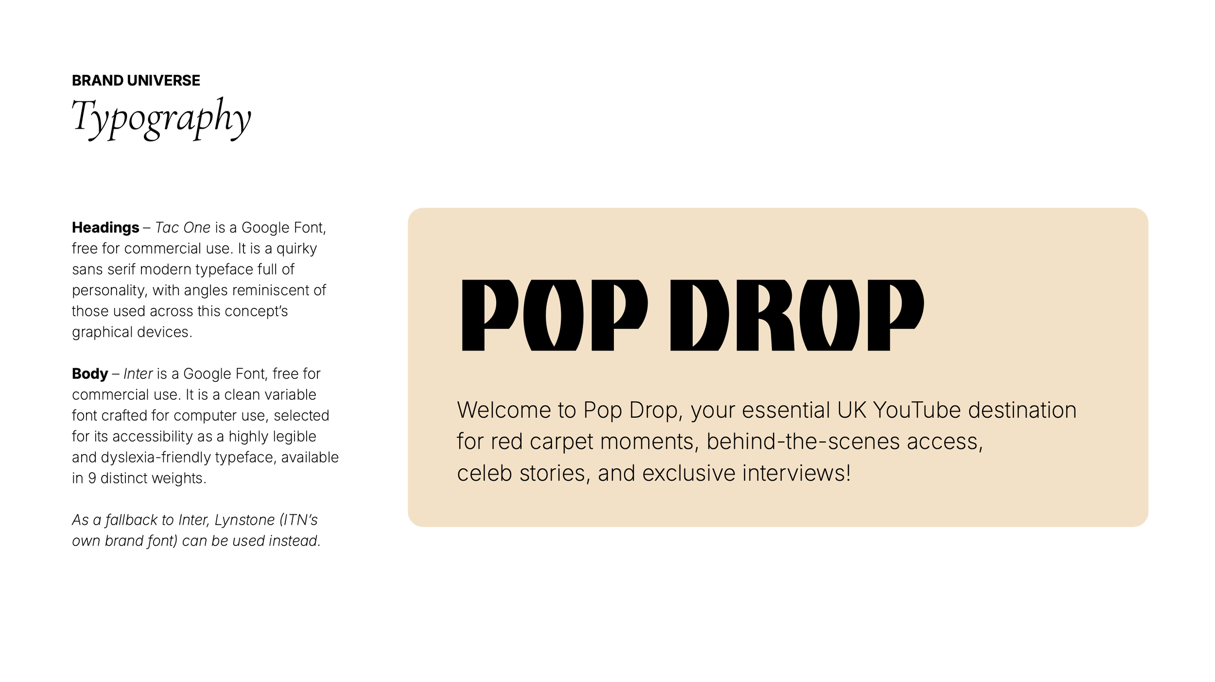
Playful identities which dig deeper into historical storytelling. With each of these channels, I would need to take inspiration and ideas from various aspects of British journalistic culture – from the evolution of satire to modern day celebrity reporting. This research opened up worlds of visual associations on which to build exciting and vibrant identities including logo, colour and type treatments.
Let’s work together
If you have a similar project you’d love a new design perspective on, get in touch with me at hello@chromakane.com – I look forward to finding out about your brand’s story.