
Metapack
A global delivery solutions provider, offering flexible shipping solutions for retail brands.

The challenge
As an industry leader, Metapack is always looking to stay ahead of the curve, notably through its insightful reports and expert-backed The Delivery Conference which runs annually. It is therefore crucial for designs to convey this expertise, as well as feel approachable and accessible.
The solution
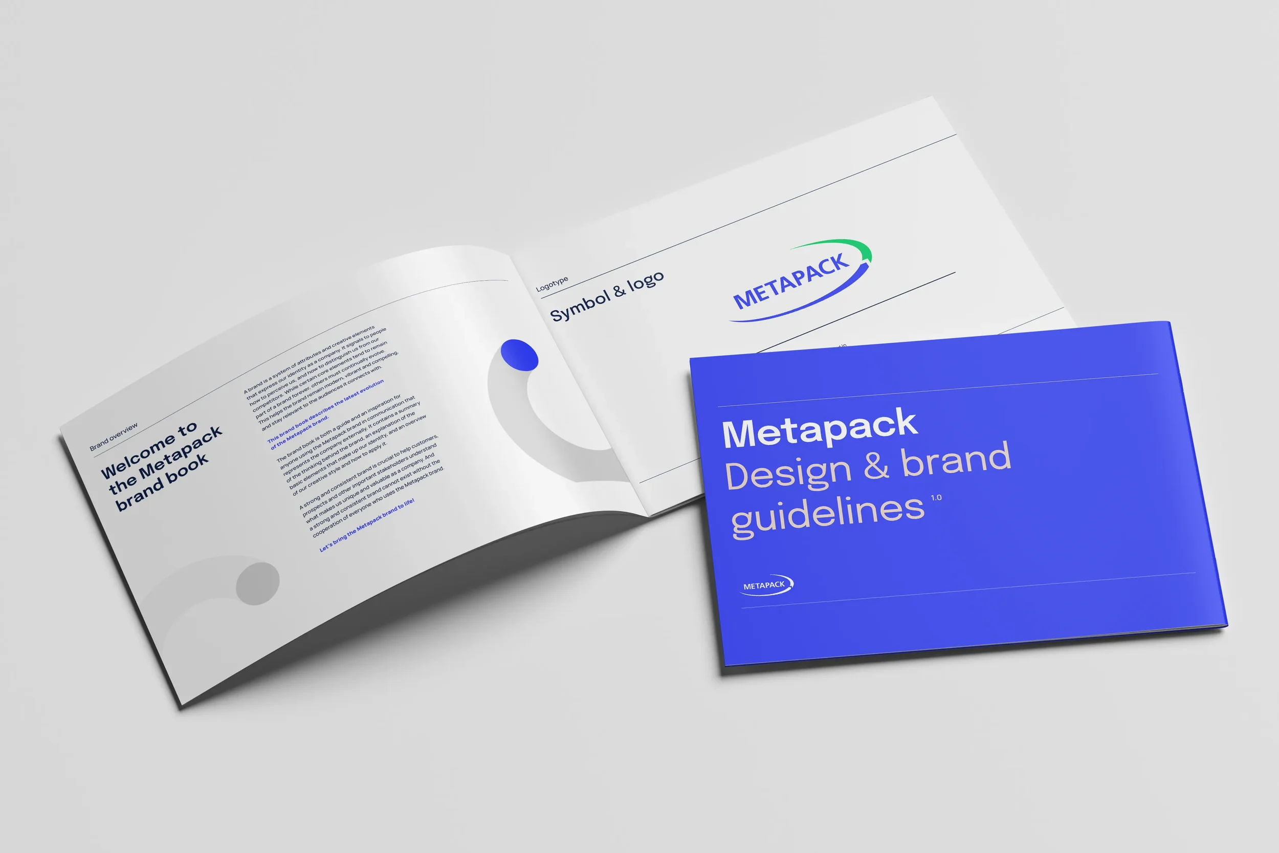
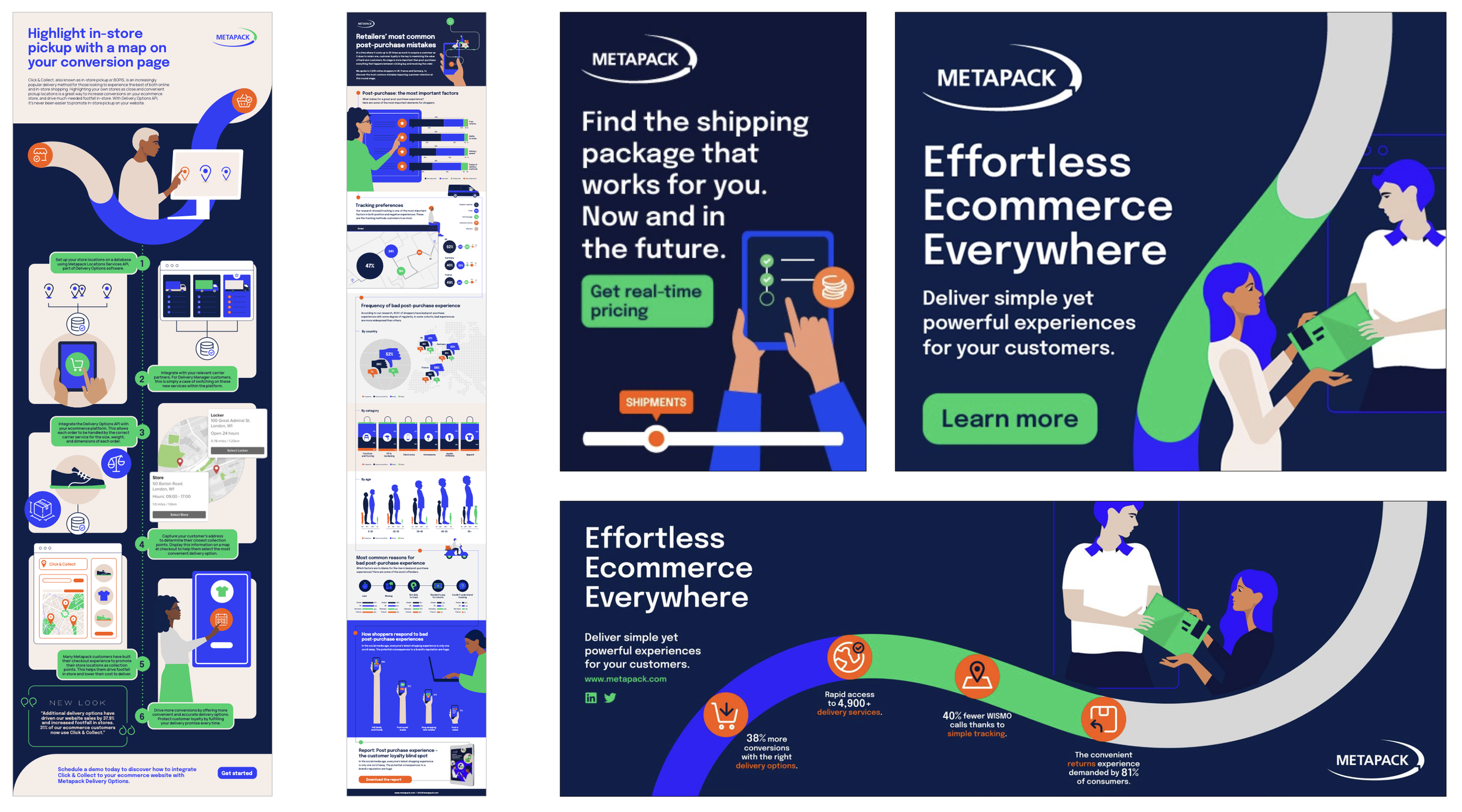
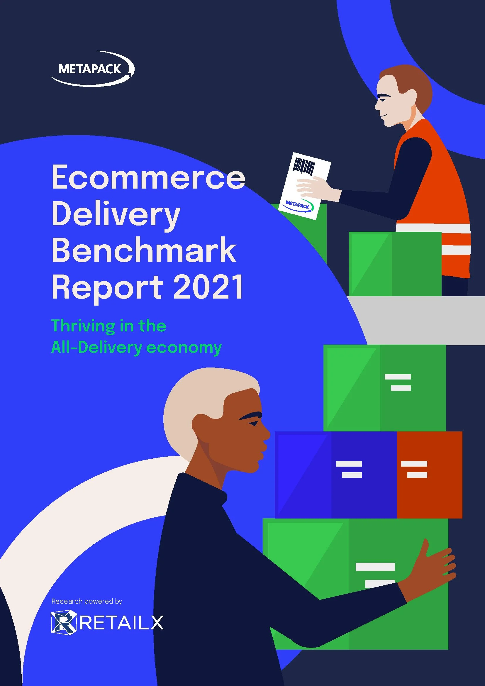
As Metapack’s visual designer, I was the brand guardian responsible for updating the style guide and creating all print and digital brand assets – from annual reports and performance ad banners, to various event and conference graphics. I also project managed a light rebrand from concept to implementation, in collaboration with external design agency Sketchdeck, rolling out refreshed brand assets with a more diverse and inclusive human-centred illustration system at its heart.
Scope
Brand design, Editorial design, Icon design, Illustration, Infographics, Performance marketing design, Presentation design, Report design, Social media design, Style guide development, Templating

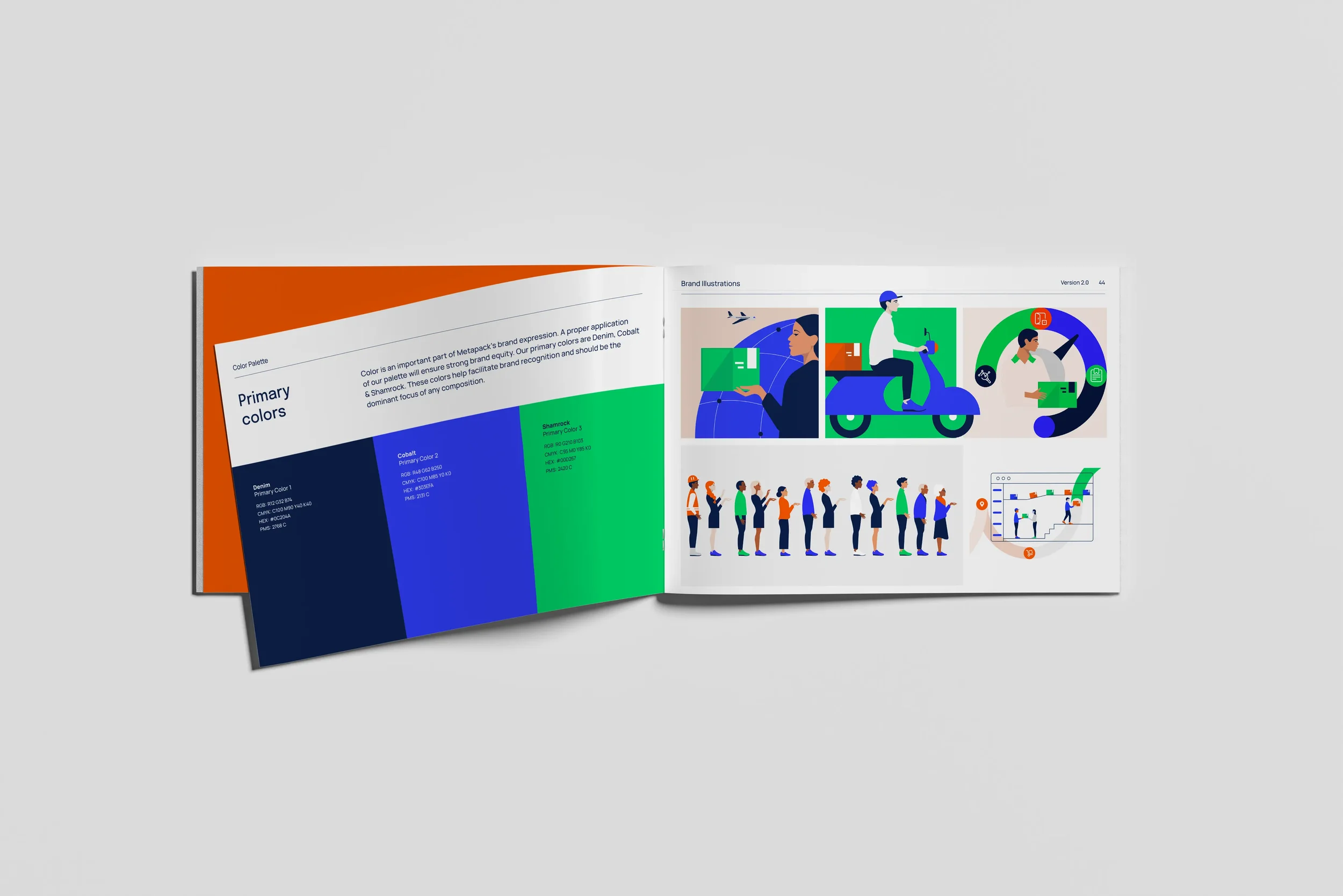
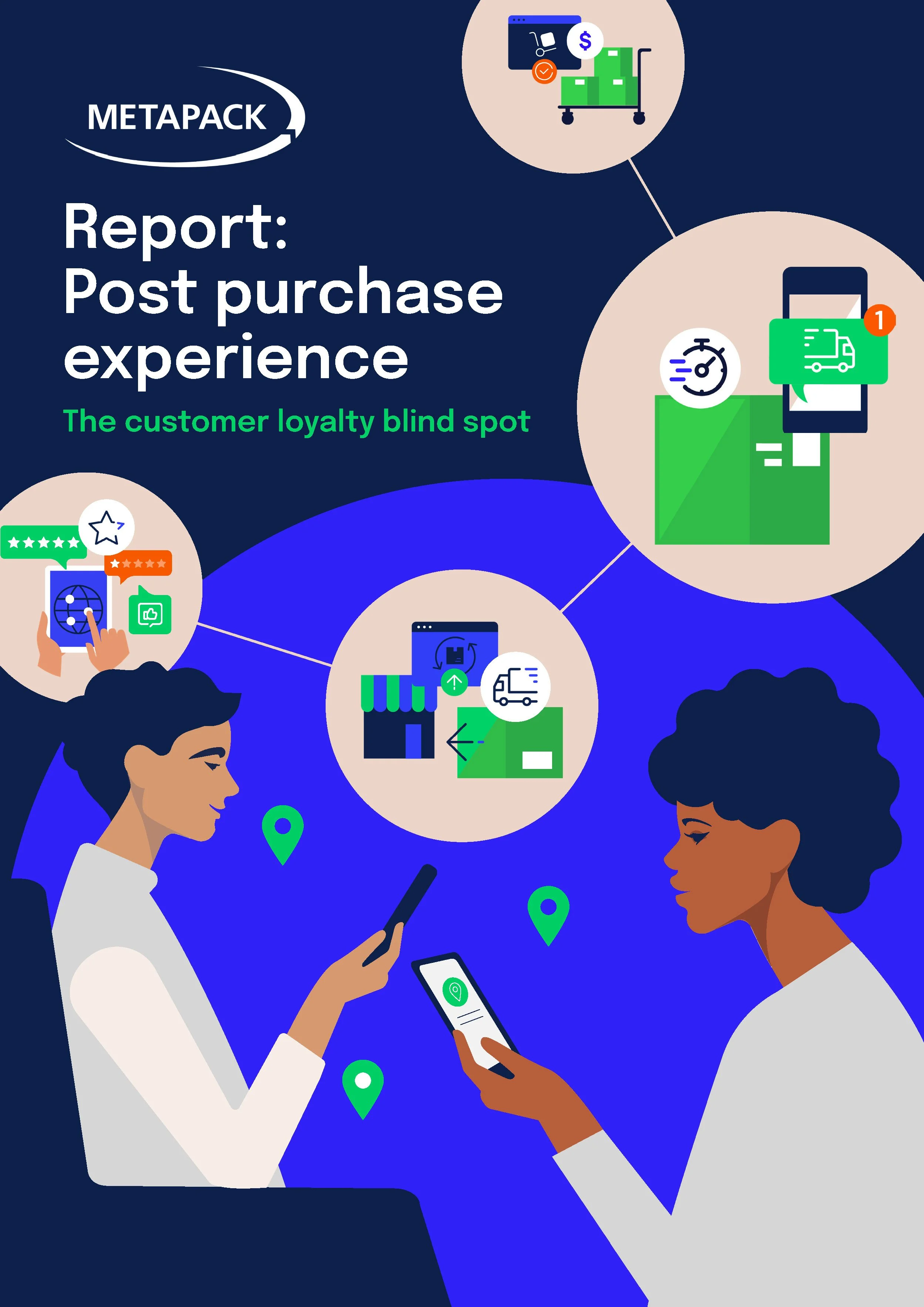
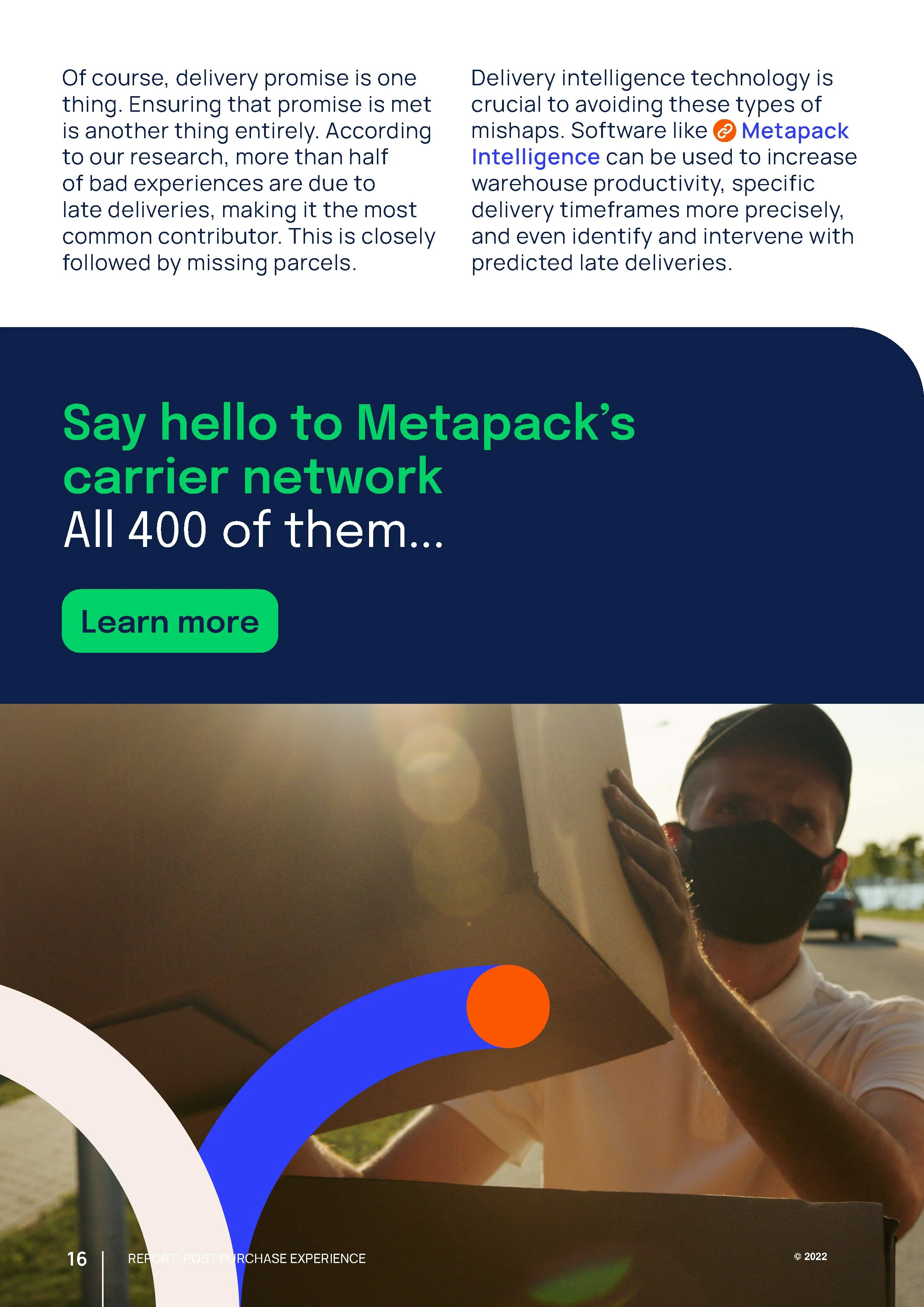
The thread underlining Metapack’s visual brand is this concept of a cycle path, representing the delivery journey from brand to customer. These cycle graphics are circular and rounded, defining the overall aesthetic for Metapack’s new brand identity.
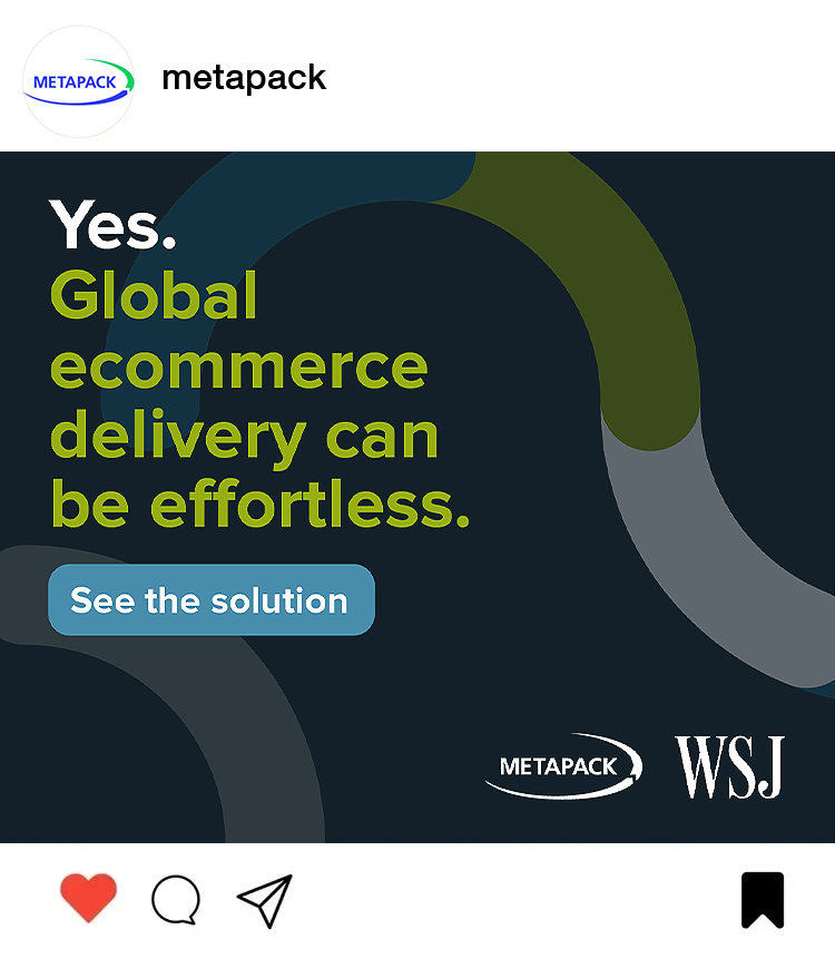
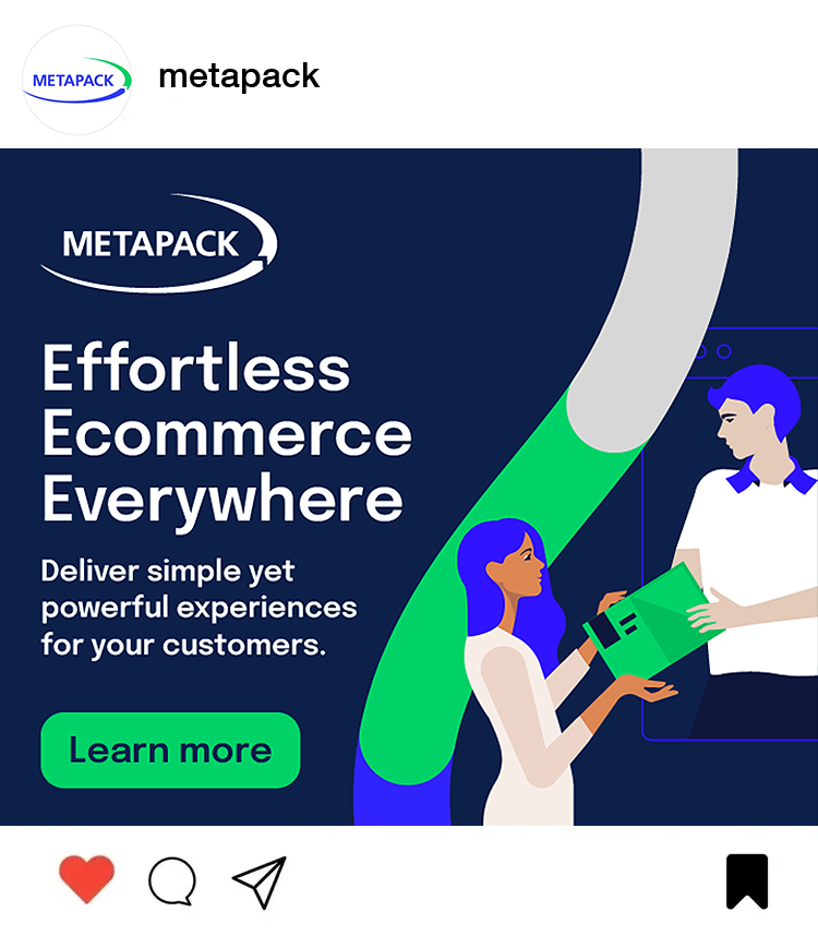
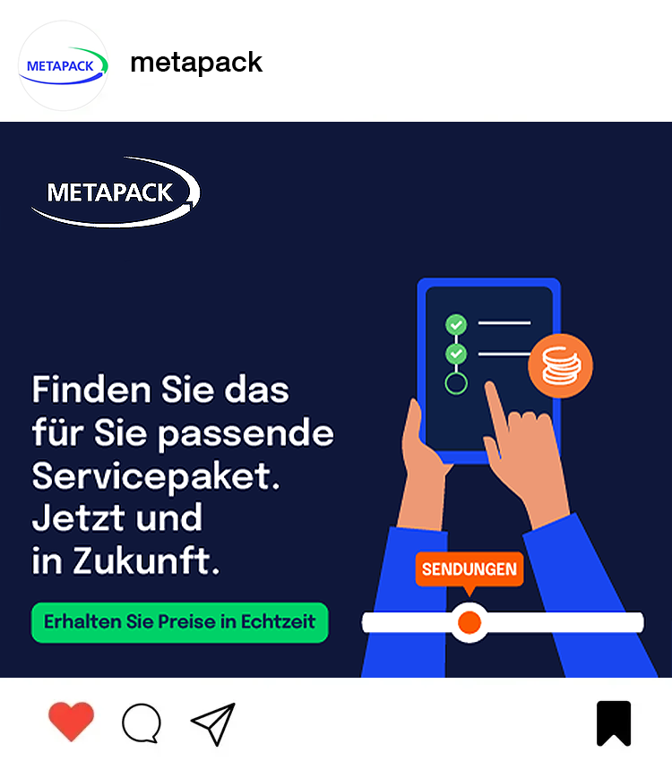
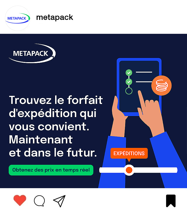
Performance marketing campaigns often required localisation to foreign markets and channels, and were therefore created in a number of language variants – an exercise in typographic and layout consistency.

Design takeaways
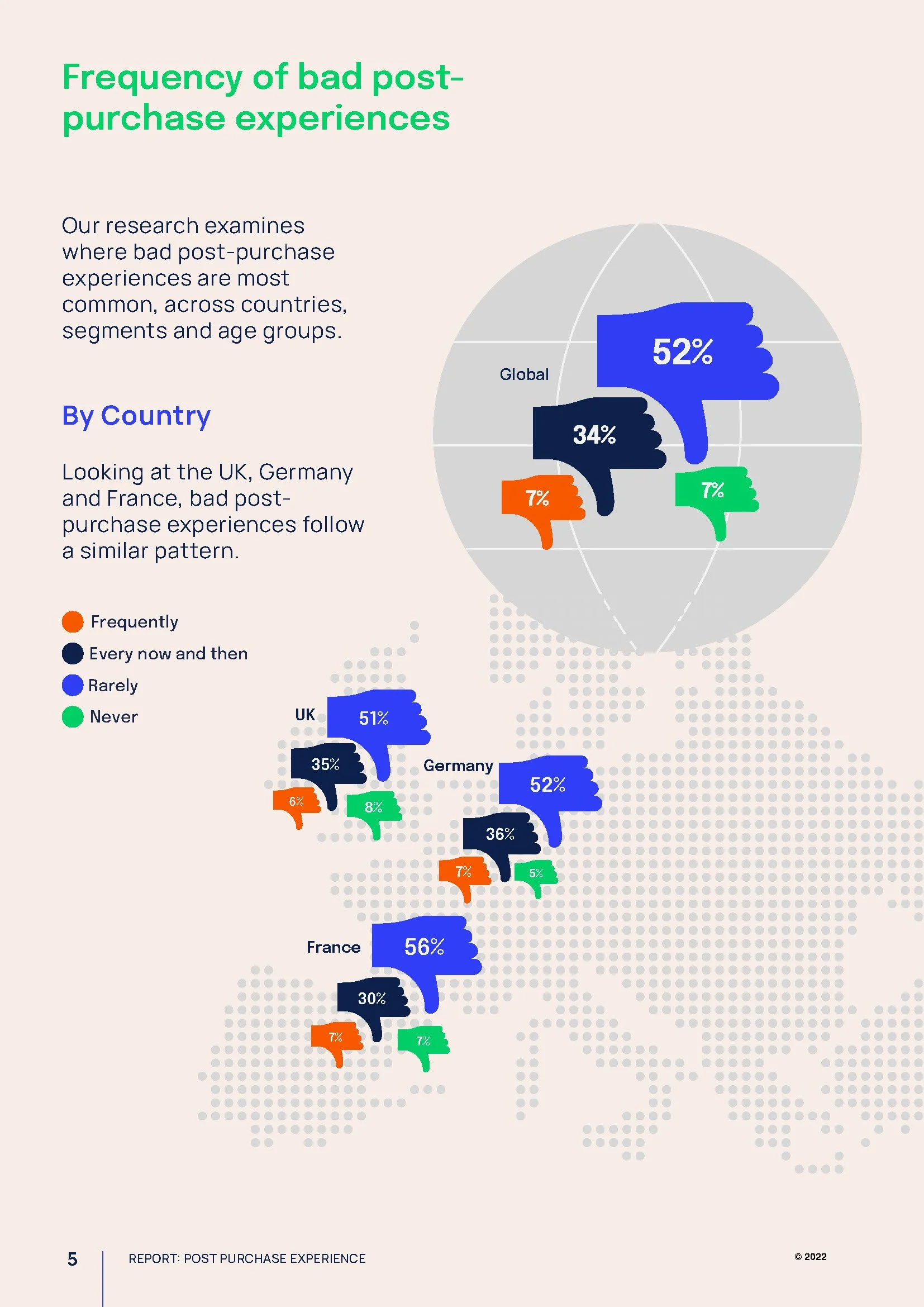
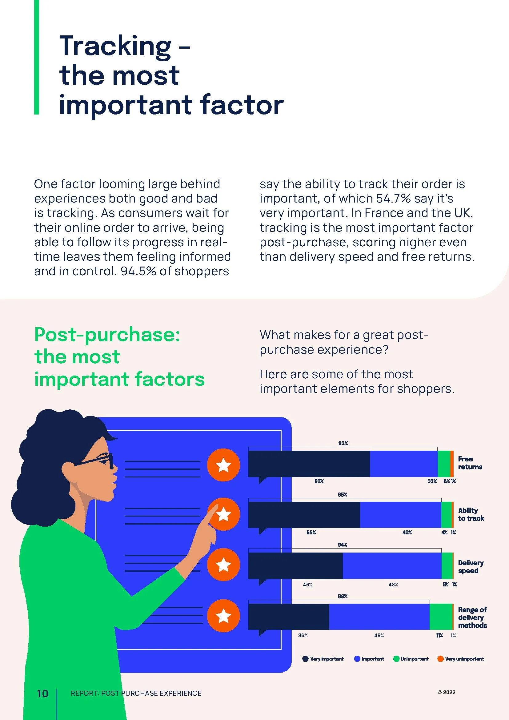
A big part of my role at Metapack was designing reports. These were often very dense in information – including a lot of copy and diagrams which needed to be translated into easy-to-digest layouts and infographics. I learned how much adds could be added in several practical and strategic ways, for example: improving comprehension, increasing reader engagement, supporting faster decision-making, enhancing retention and recall, and generally improving accessibility and shareability of each document.
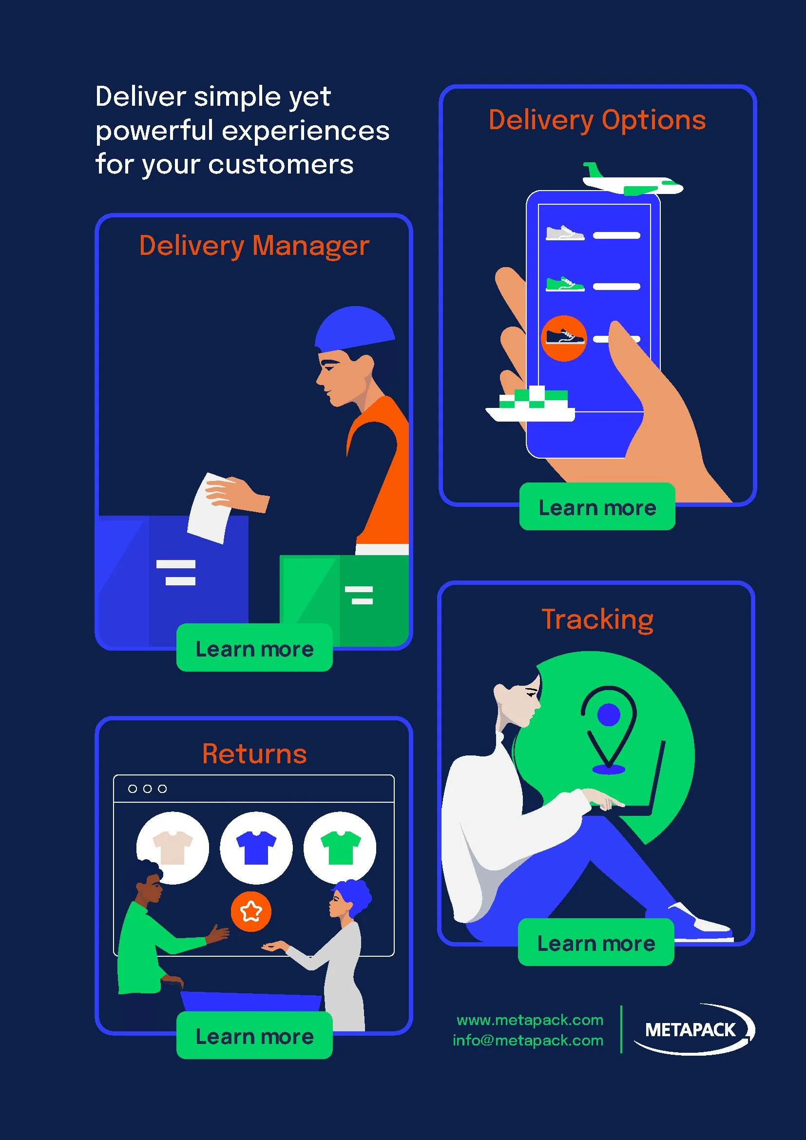
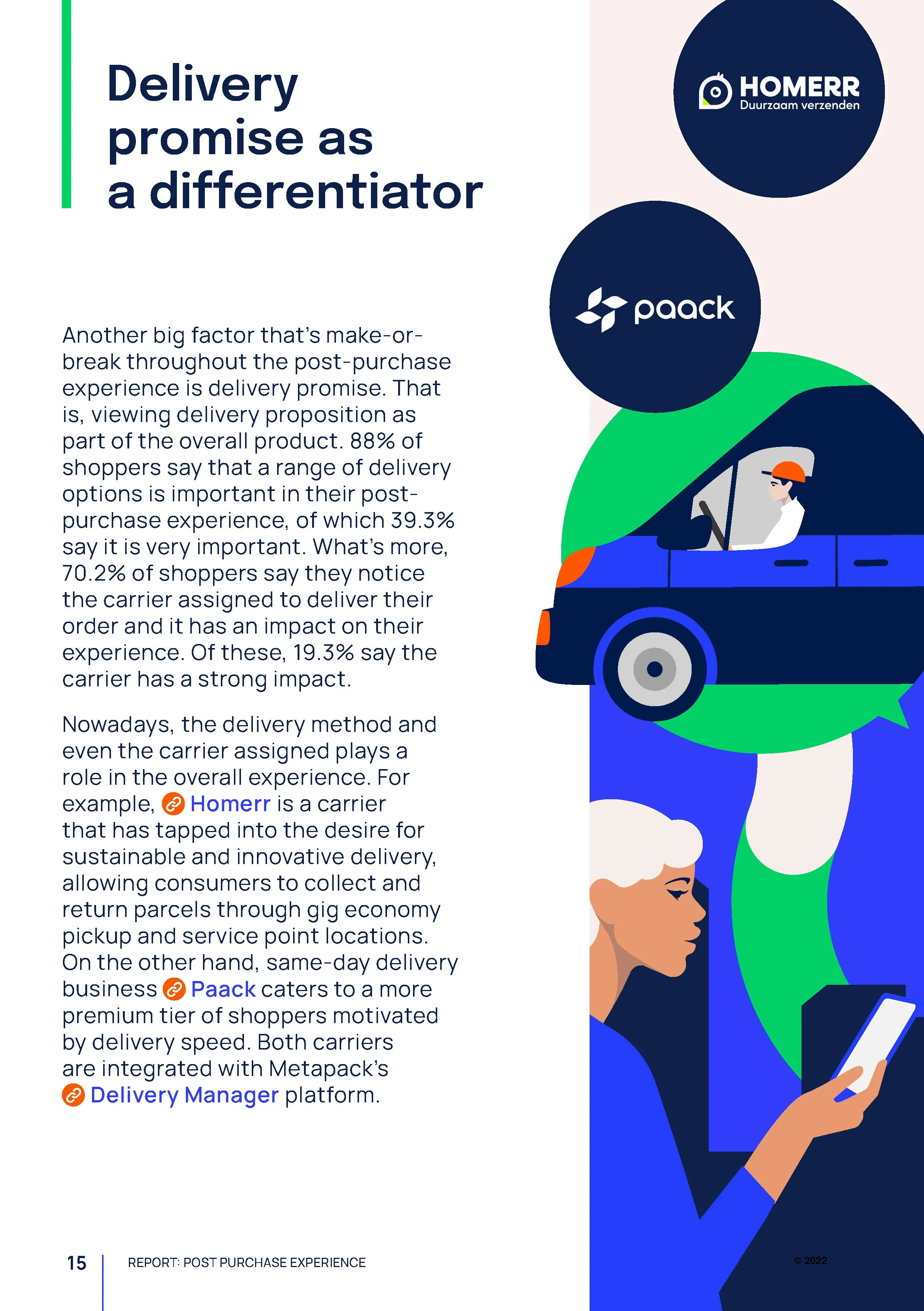
Illustrations, made to be as inclusive as possible, added a soft human angle. Illustrations can soften a highly technical e-commerce brand by making the experience feel more human, approachable and emotionally engaging without sacrificing expertise. In this case, human-centered illustrations helped humanise complex technologies and processes, and inject emotional personality to the brand.
Let’s work together
If you have a similar project you’d love a new design perspective on, get in touch with me at hello@chromakane.com – I look forward to finding out about your brand’s story.