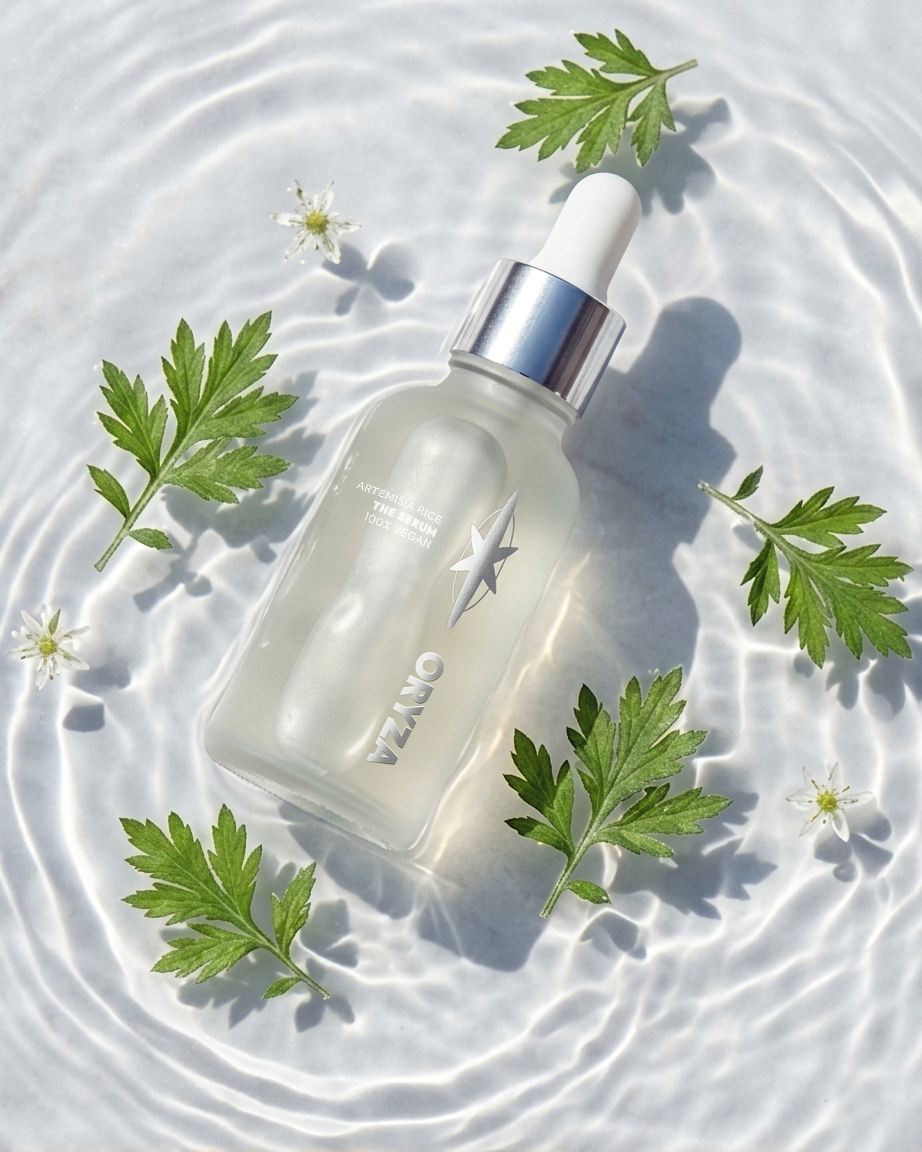
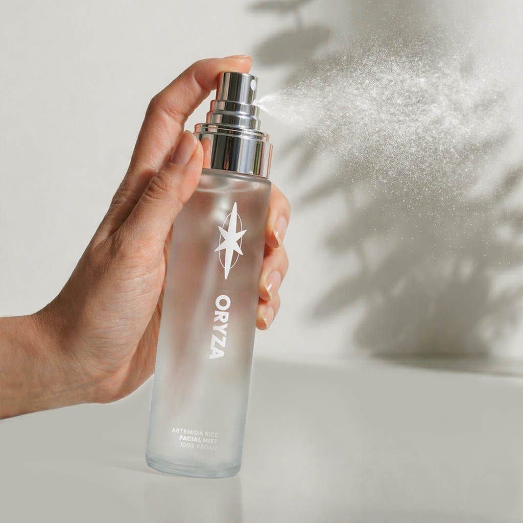
Oryza Skincare
A natural and vegan beauty brand, using rice to brighten and hydrate the skin barrier. An antioxidant-rich approach to achieving the popular ‘glass skin’ look.
The challenge
The term ‘clean beauty’ has come a long way since its phase as a buzzword. Consumers are more conscious than ever. There’s been a noticeable shift in the skincare industry towards ‘conscious science’, alongside a growing awareness of centuries-old traditional ingredients in Eastern skincare, together setting a trend to minimise greenwashing and vague labelling.
The solution
Advocating for clean and natural skincare, this beauty brand concept presents a playfully minimalist identity, reviving and modernising a traditional ingredient for a younger target demographic which may not be aware of its benefits. The logo mark takes on two symbolic meanings: rice with a glass-like shine.
*Gen AI was used as a tool to support in the creation of stylised, conceptual art direction imagery.
Scope
Art direction, Brand design, Brand naming, Brand strategy, Concept design, Creative direction, Logo design, Packaging design, Tone of voice
Rice has been a staple in East Asian routines for centuries, and for good reason. It’s packed with specific compounds that target brightening and soothing.
Oryza Skincare modernises this traditional ingredient for a younger demographic.
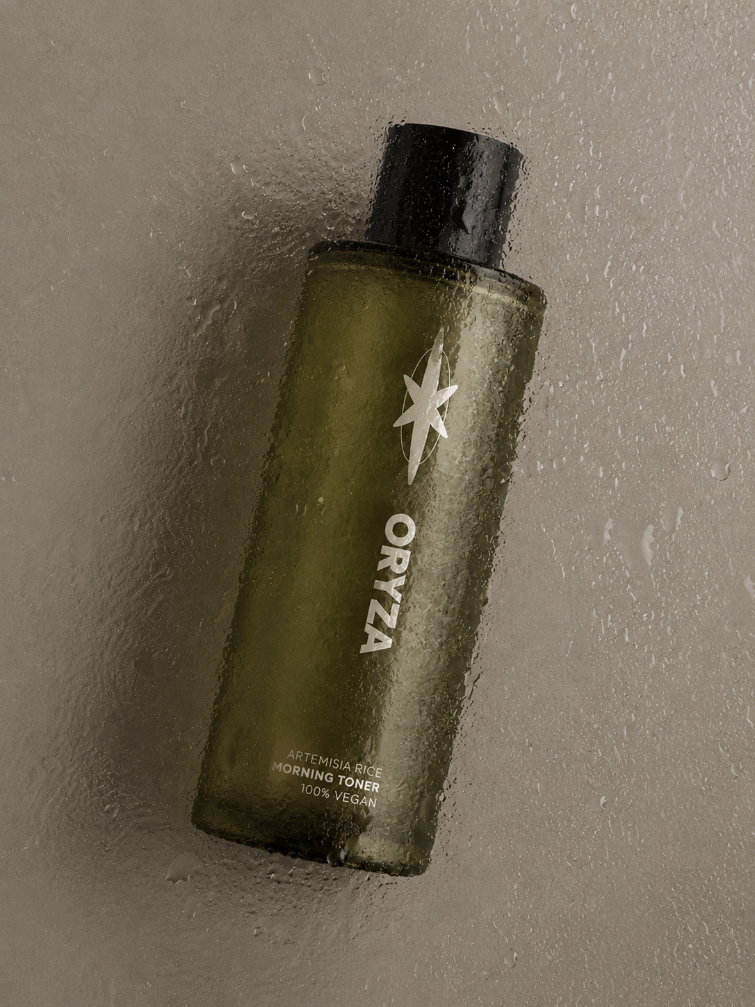

Purity without depleting natural resources. Oryza Skincare is a conscious brand which taps into the next generation of clean beauty – biotech over botanical.
89%
inhibition of elastase activity, an enzyme linked to wrinkles and loss of elasticity, from boiled rice water extracts (Source) – making rice an excellent traditional ingredient with anti-ageing efficacy.


Design takeaways
Premium through minimalism. I learned that using restrained typography, soft neutral colors, and clean layouts helped communicate purity, wellness and luxury more effectively.
Texture plays a major role in beauty branding. Incorporating tactile elements like embossed grain patterns, matte finishes or soft-touch materials helped reinforce the sensory identity of rice as a calming and nourishing ingredient.
Cultural references need balance. With this project, there was a need to honour rice’s cultural heritage whilst creating relevance for a global consumer market.
Let’s work together
If you have a similar project you’d love a new design perspective on, get in touch with me at hello@chromakane.com – I look forward to finding out about your brand’s story.