TravelLocal
TravelLocal is a global travel provider, on a mission to helping people reimagine travel by connecting them directly with travel experts.
The challenge
TravelLocal approached me with a need to create visual consistency across some of their key, public-facing Marketing assets.
The solution
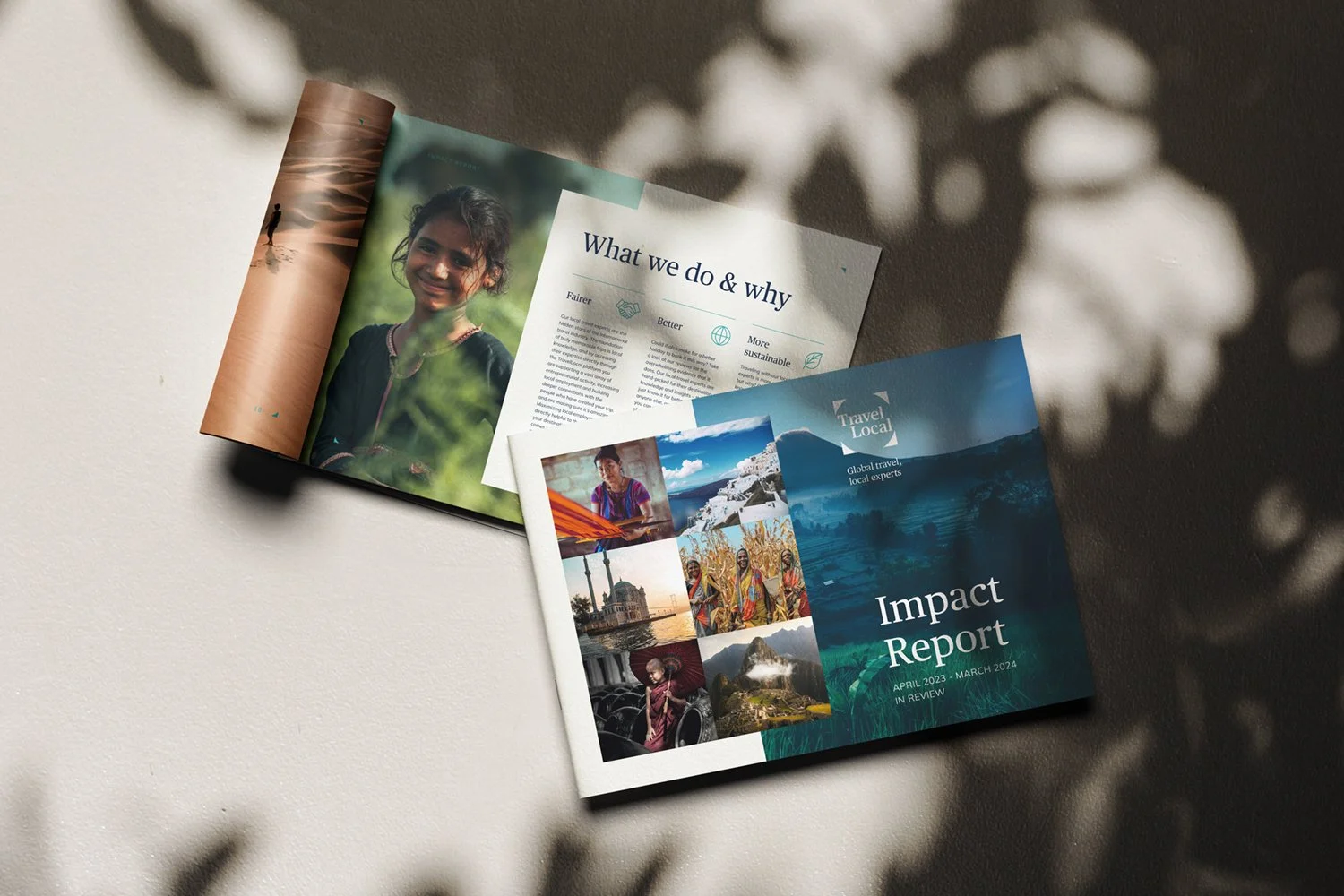
I helped TravelLocal strengthen their existing brand identity with informative, engaging and accessible annual report and digital infographic templates. The one main challenge was designing documents for dual use: these would need to be digital-first, but also optimised for print. One other requirement for these briefs is image sourcing, maintaining a consistent look & feel which matches the brand’s aspirational values.
Scope
Creative direction, Editorial design, Icon design, Infographics, Templating
“Jessie brought a positive attitude, working closely with several stakeholders in our team, was very responsive to feedback and was quick to turn the work around.”
– Abbie Cohen, Brand & Content Manager

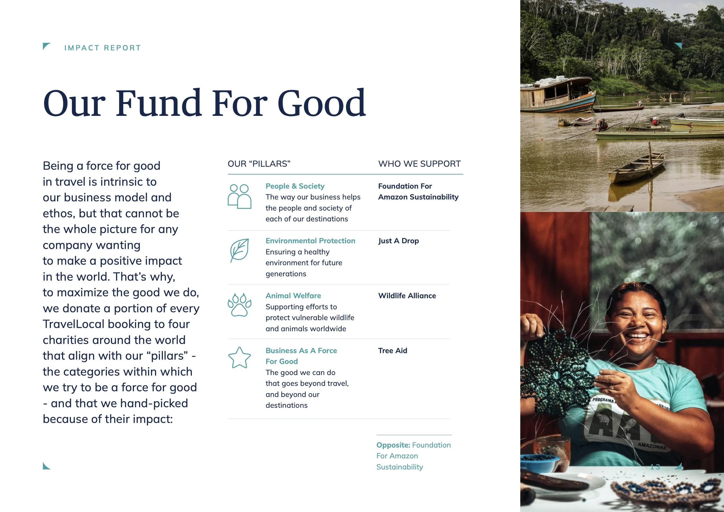
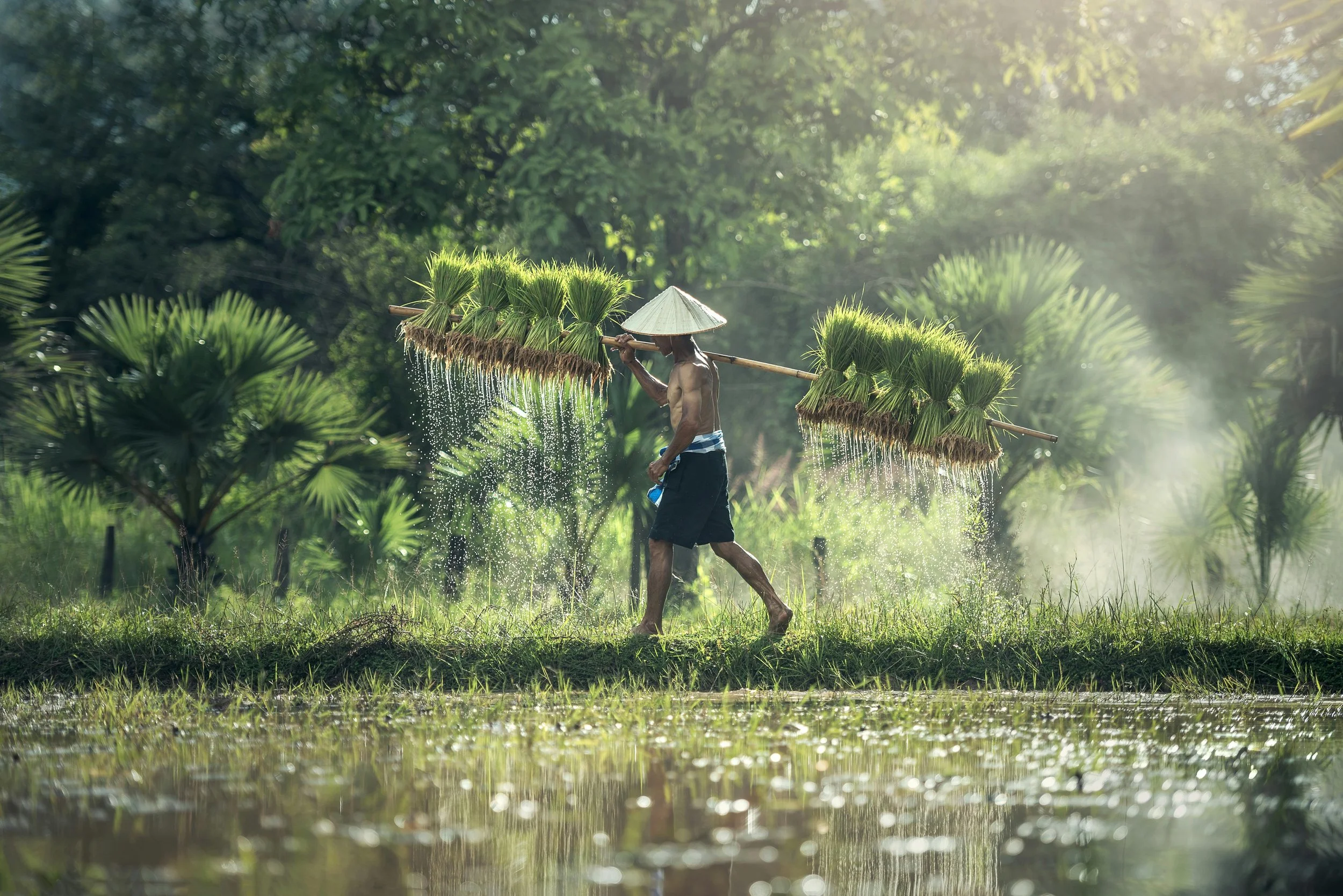
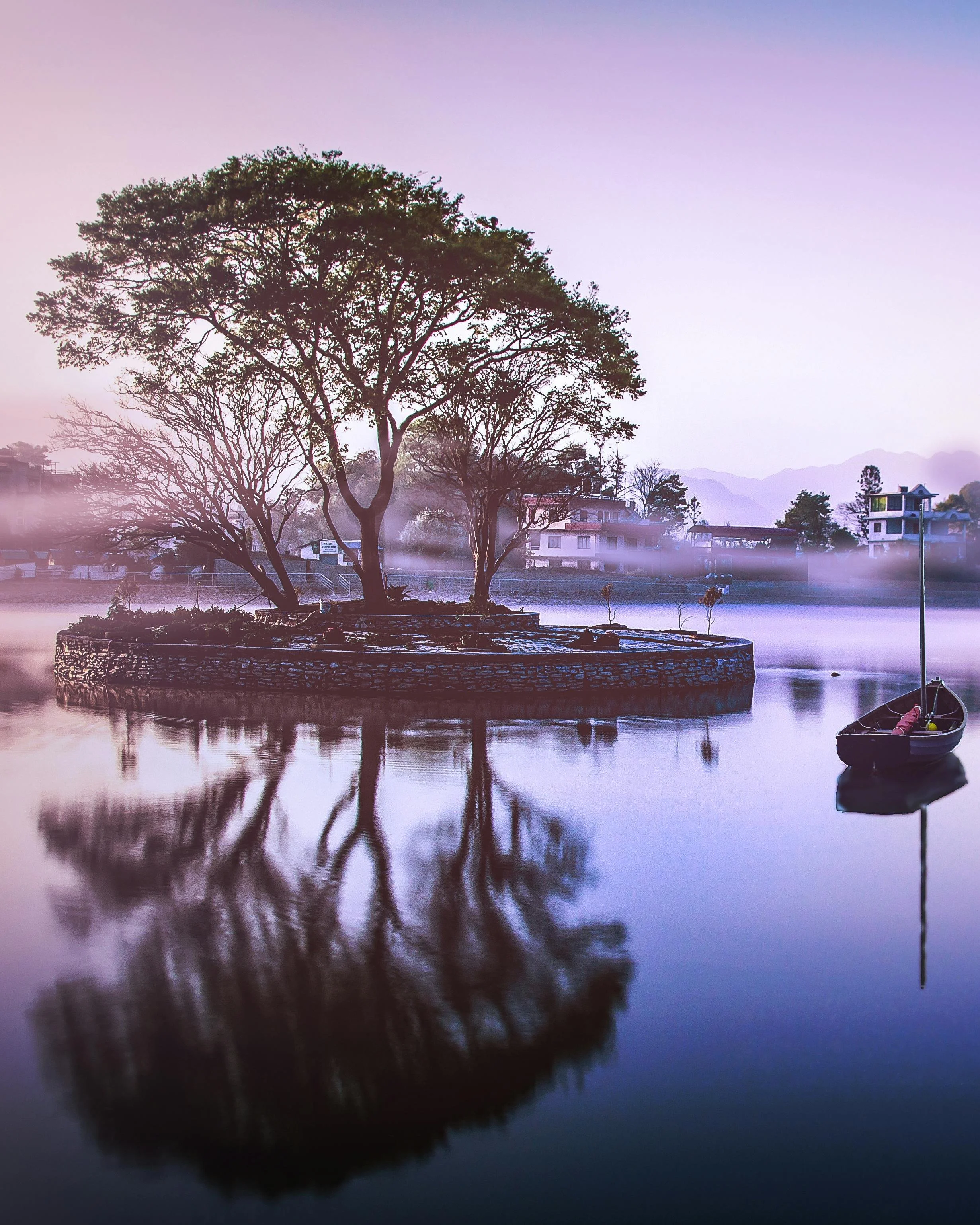
Art direction was an important consideration for the client, as the project required image sourcing, making sure those chosen were aligned with the brand’s style guide.

Separately, an infographic was needed to bring TravelLocal’s brand guidelines to life in an easy-to-digest format – communicating key information about the brand quickly, clearly and visually.
Design takeaways
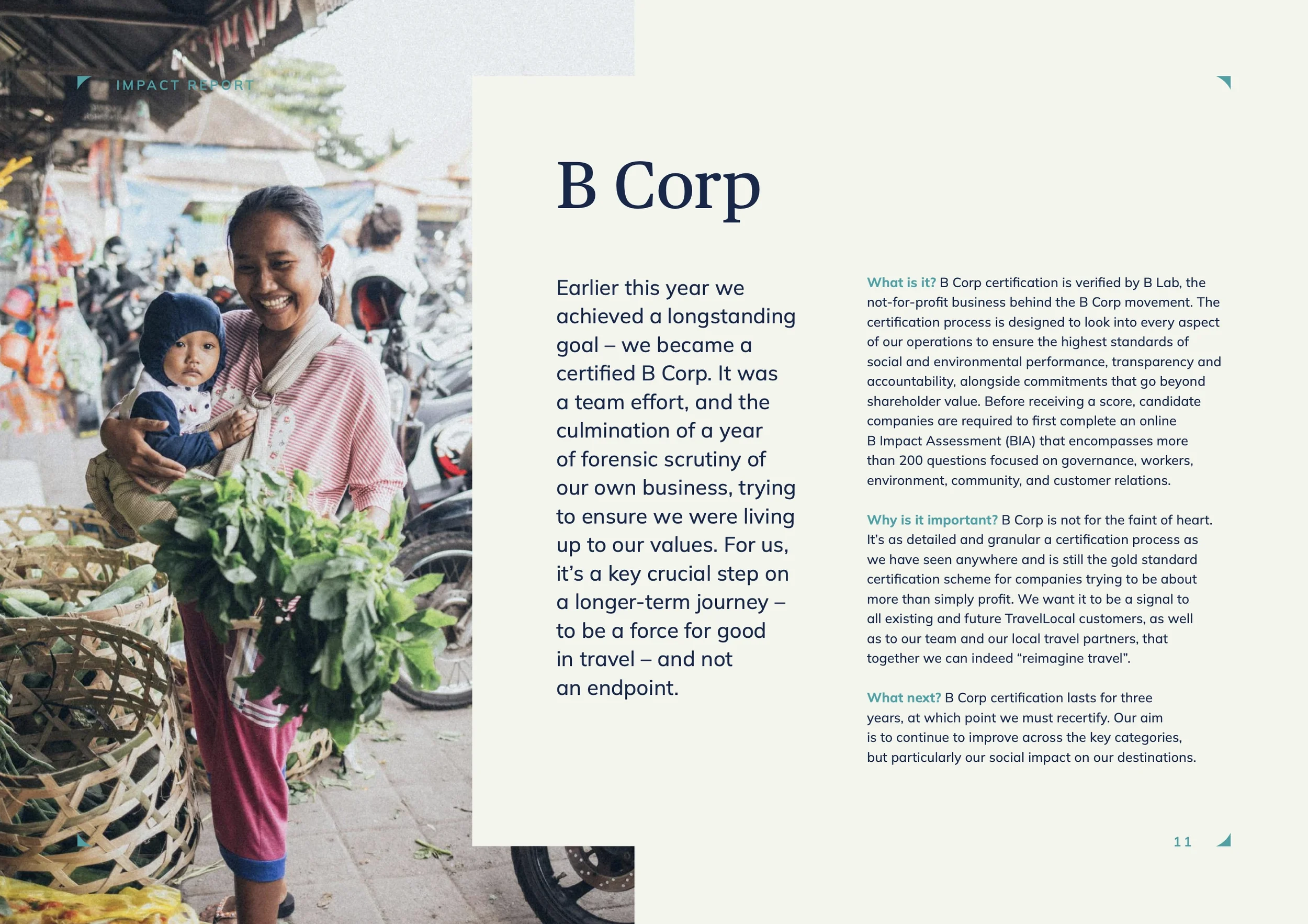
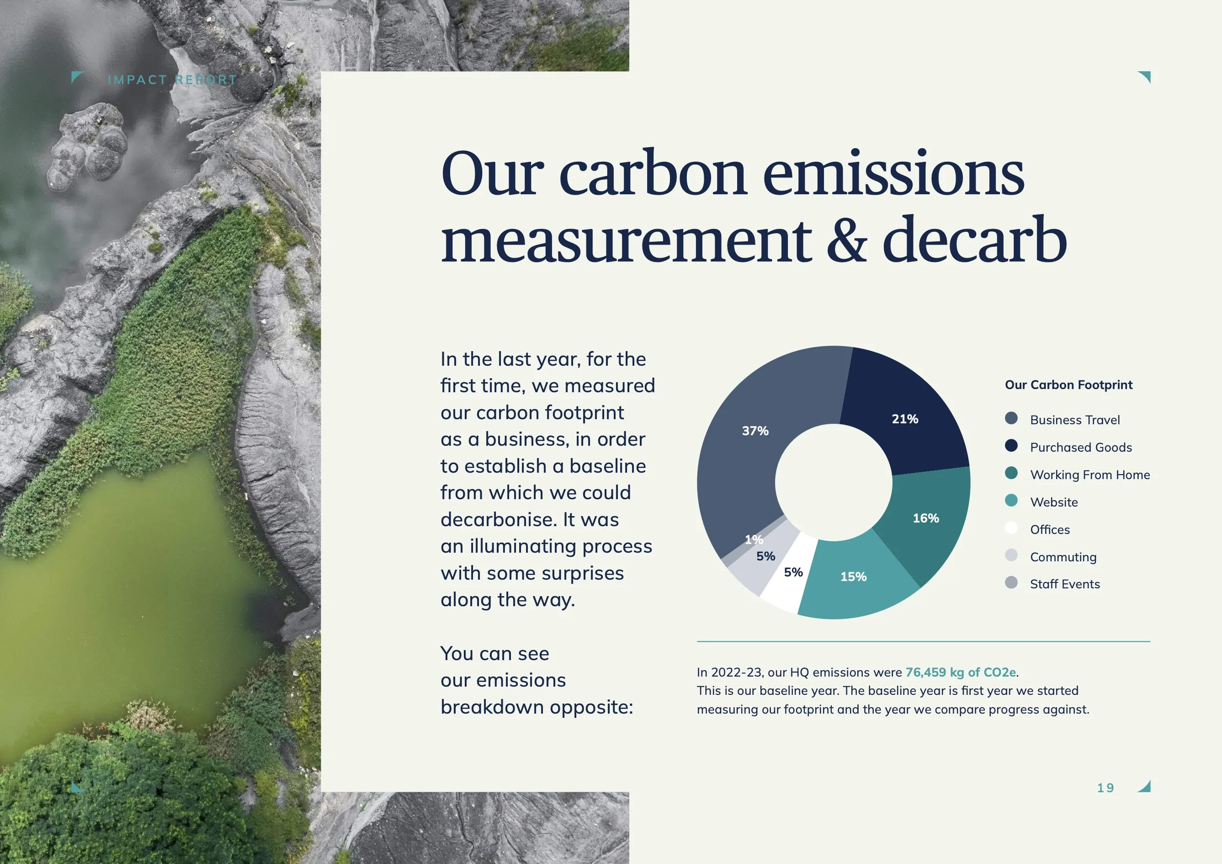
Visual hierarchy improves readability. Using scale, typography, spacing and colour coding made complex sustainability data easier to scan and understand quickly.
Credibility relies on transparency. Including sources, timeframes, and methodology was essential for building trust in the impact report. Without this, even well-designed visuals can feel misleading or superficial.
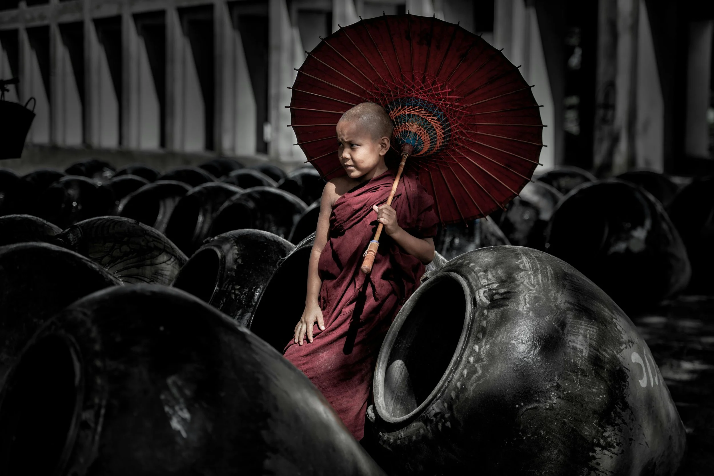
Sustainability communication should feel human. Combining numerical impact data with photography, traveler stories, or community outcomes made the report feel more authentic and emotionally engaging.
Let’s work together
If you have a similar project you’d love a new design perspective on, get in touch with me at hello@chromakane.com – I look forward to finding out about your brand’s story.