Typography guidelines everyone should know when creating a brand identity
About
Typography is a cornerstone of a strong brand, because it directly shapes how a brand is perceived. From building recognition, personality and an overall cohesive identity, through to improving user experience through accessibility and readability, typography is much more than just aesthetics or formatting words on a page.
Share
Guideline 1 – Establish consistency and hierarchy
An important first consideration is that typography should feel unified everywhere, across every brand touch point. The same set of typefaces should be used across website, ads, social media, packaging, and more. It should also be obvious at a glance what should be read first, second, third, etc. By making best use of weight, size and spacing, we’re helping guide the user’s eye across key information. When an entire body of text is the same size, readability could take a hit, so consider dividing your styles up accordingly: first headlines, then subheadings, followed by body text, then captions and footers.
Key takeaway: It is helpful to create a typography style guide as part of your brand guidelines, and to work these into your brand templates, ensuring consistency and hierarchy are considered as part of your wider set of visual design systems.
Guideline 2 – Contrast is king, and less is more
Choosing one font for headings, and another for body text, can help create visual contrast and interest, as well as contribute to strengthening hierarchy and clarity. When selecting contrasting font styles, look for a shared mood (where all fonts together read harmoniously and work towards expressing a brand’s personality and tone of voice), as well as complementary proportions (x-height and width). You might consider mixing bold and thin weights, or serif and sans serif styles. Either way, keep things simple: stick with a combination of 2 or 3 typefaces maximum in one design system. Unless you’re opting for a bold and maximalist identity where eclecticism works in your favour, too many fonts will begin to clash and may result in an unpolished or unprofessional look and feel.
Key takeaway: Good font pairings create harmony. Avoid subtle differences which look accidental (for instance, pairing two similar serif styles).
Guideline 3 – Top tips for accessibility
If people can’t easily read your design, that unfortunately means it’s failing to communicate. Here’s how you can improve typographic accessibility:
Alignment: Proper alignment creates structure and professionalism. Though not obligatory, left-aligned text is easiest to read, especially for long content, and centered text works nicely for larger and shorter elements such as titles and pull quotes. Avoid sporadic changes in alignment as this may only confuse readers.
Line length: 45-75 characters per line is considered the ideal range, and 60-70 characters per line the ‘sweet spot’, according to various typography and readability studies. The goal here is to make sure your line lengths allow a break in reading rhythm as well as minimise user fatigue.
Contrast: In addition to font styles which balance each other out visually, you’ll also want to make sure you’re creating contrast in terms of size (where headings, subheadings and body texts are distinctly different enough in scale) and colour (for instance, between text and background colours).
Scale: Your typography rules must work for all applications, from the smallest mobile screens through to out-of-home billboards. Make sure you’re testing readability at different sizes and scales depending on your brand’s touch points, and avoid using thin fonts for the smallest font sizes in your style guide.
Key takeaway: Good typography is essential for clear communication: use consistent alignment (preferably left-aligned for readability), keep line lengths within an optimal range, create strong contrast in size and colour, and ensure your text remains legible across all screen sizes and formats.
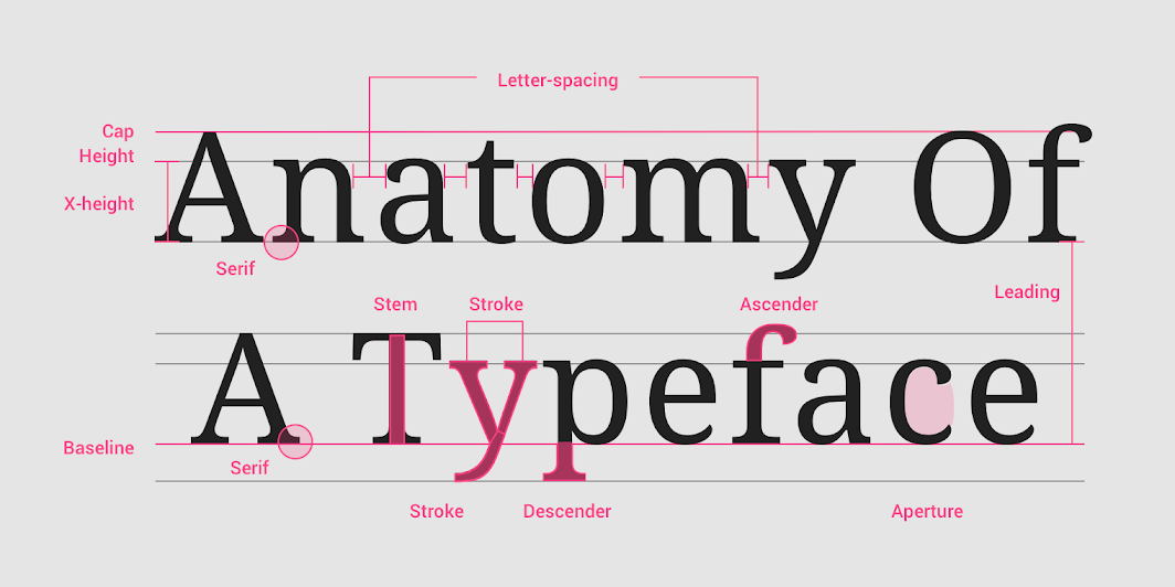
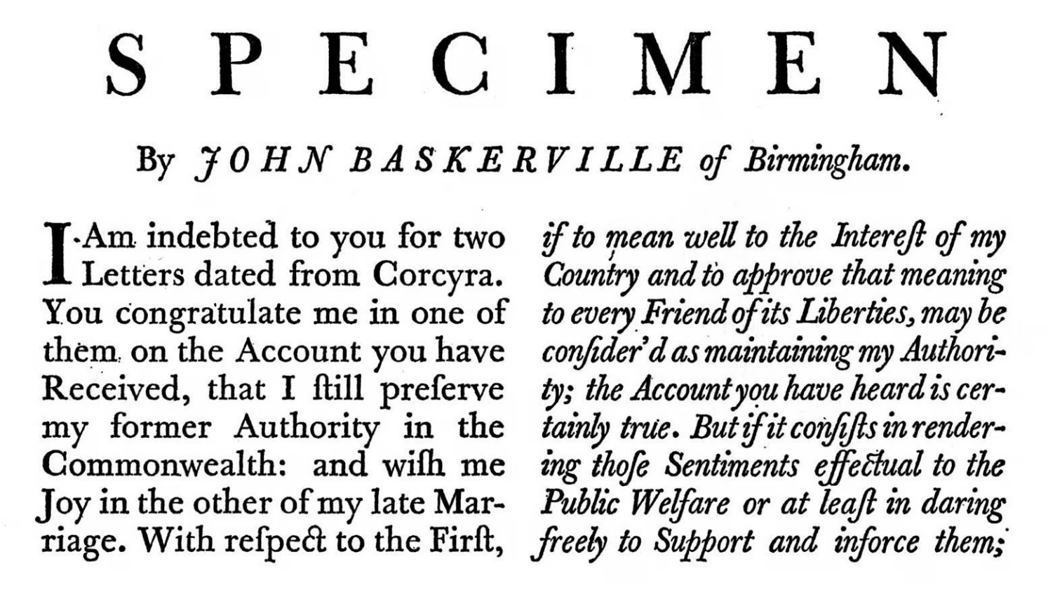
Did you know? Typography has an entire anatomy. This ‘anatomy’ essentially describes a classification system created over time to help analyse and design letters into functional parts. Technical constraints would help improve consistency of type across technological, cultural and artistic applications. (Image source)
Guideline 4 – Typography expresses brand personality
Font psychology is the study of how typeface choices influence emotions, behaviours and perceptions, shaping brand tone by evoking emotions. Indeed, fonts communicate a whole range of emotions:
Serif fonts convey traditional, trustworthy, editorial traits, through serifs (or strokes) which reference calligraphy and newspaper printing – ideal for luxury branding
Sans-serif fonts convey modern, clean, minimal traits, through a cleaner and more legible presentation (especially when displayed on screen) – ideal for tech branding
Script fonts convey elegant, personal traits, through handwritten styles bringing a more tangible, human touch (again, especially when displayed on screen) – ideal for artisanal and lifestyle branding
Display fonts convey bold, expressive traits, through impactful stylisation from unique and quirky shapes to extreme weights – ideal for entertainment and creative branding
Key takeaway: Font choices shape how a brand feels and is perceived: serifs signal tradition and trust, sans-serifs feel modern and clean, scripts add elegance and personality, and display fonts create bold, expressive impact. So selecting the right typeface helps communicate your brand’s tone instantly.
Guideline 5 – Typography is more than just typography
Despite the rules, there’s one thing to keep in mind. Typography isn’t just for reading: it’s design. While text can be used as a focal point, it can also be experimented with to create a more unique look & feel for your brand. And remember, experimentation is key! Let type carry your brand’s visual identity as much as possible, so that it can play a key role in building trust and recognition, and don’t hesitate to use it creatively to craft more assets for your brand – such as a stylish monogram.
Key takeaway: Typography isn’t just about readability, it’s a powerful design tool. Use it creatively and consistently to shape your brand’s identity, build recognition, and add distinctive visual character beyond just words.
Guideline 6 – Other common pitfalls to avoid
Here’s a quick-fire round up of some other common mistakes you’ll want to avoid when approaching typography design, additional aspects you’ll want to consider along with the previous five guidelines:
Don’t use all caps for longer paragraphs. The risk here is slower reading and visual fatigue, forcing the brain to work harder because of overwhelming shapes which prevent quick word scanning.
Don’t artificially stretch or squash a font. Typefaces have been carefully designed and crafted with precision, with specific spacing and balance, to create visual harmony. Altering their shape can weaken legibility, and ultimately credibility.
Don’t overuse display fonts. These are highly stylised and attention-grabbing styles, so use them sparingly as a way to show a pop of personality or visual interest on the page. Too much of a bold or quirky style can easily create visual clutter, negatively affecting legibility, as well as dilute their statement or wow factor by being applied too often.
Never stop playing. Using the guidelines above as an aid, work your grid to your advantage to play with type, image and layout compositions. These elements can interact in infinitely exciting ways, so think of typography as a tool for visual storytelling, using image and layout as faithful companions to improve visual flow. ✺
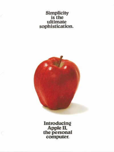
Elegant simplicity: As far back as the 70s and until modern day, Apple has always been known for its pure, minimalist design aesthetic – which the brand’s typographic considerations only enhance.
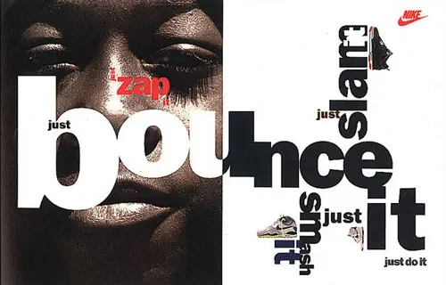
How playful can you get? David Carson is one graphic designer whose name is synonymous with post modernism in the industry, with a portfolio characterised by bold, experimental application of type.
Discover more ideas